


![]() Dead by Daylight Logo PNG
Dead by Daylight Logo PNG
“Watch out, monsters!” warns the Dead by Daylight logo. Who left this terrible mark? A monster chasing the player? Or maybe he didn’t notice how he had turned into something frightening and evil? The emblem represents a clash with inner fears that must be overcome.
Dead by Daylight grew out of “Behaviour Interactive”, a Canadian studio whose roots go back to Megatoon in 1992 and Multimedia Interactive in 1994. After several ownership changes, the company became “Behaviour Interactive” in 1997, then worked as Artificial Mind & Movement from 2000, making projects for Konami, Ubisoft, Disney, Nintendo, EA, and Activision.
The studio tested original games with Scaler in 2004, Wet in 2009, and Naughty Bear in 2010. That same year, it restored the “Behaviour Interactive” name. The idea behind Dead by Daylight was direct: four survivors against one killer in real time, built around asymmetric horror rather than a story campaign. The game launched on Steam for PC on June 14, 2016, with Starbreeze Studios as publisher.
Reviews were mixed, but sales were strong. Dead by Daylight sold more than 270,000 copies in its first week and passed 1 million within two months. Its growth came from licensed horror figures, including Michael Myers, Freddy Krueger, Saw, Alien, and Resident Evil. Competitors such as Friday the 13th: The Game and Evil Dead: The Game relied on single franchises, while “Behaviour” built a flexible horror platform.
In 2018, “Behaviour” bought publishing rights from Starbreeze for $16 million. The game then added a store and later a battle pass. It launched on Xbox One and PlayStation 4 in 2017, on Nintendo Switch in 2019, and on mobile in 2020.
By 2021, studio revenue had reached C$225 million. In 2023, Dead by Daylight surpassed 60 million players, and a film in partnership with Blumhouse and Atomic Monster was announced. In 2024, the game moved to Unreal Engine 5.
Meaning and History
![]()
The multiplayer horror game was released in 2016 for Windows. Over the next few years, the development studio supplemented and improved the original game. The only thing that hasn’t changed is the logo that appeared at the very beginning and graced the cover of every new Dead by Daylight release.
It looks stylish and unusual, in contrast to the graphic design of the fictional world’s terrain. Locations are generated randomly, but they lack visual and architectural variety. The creators of the horror game paid greater attention to the plot.
What is Dead by Daylight?
It is the ultimate survival horror game, creating a horrifying atmosphere. However, unlike standard games, in this one, gamers can feel themselves not only as victims but also as perpetrators. They have the opportunity to try on the maniac’s mask and try to catch all the survivors. This is an ambitious project from the Canadian studio Behavior Interactive.
2016 – 2021
![]()
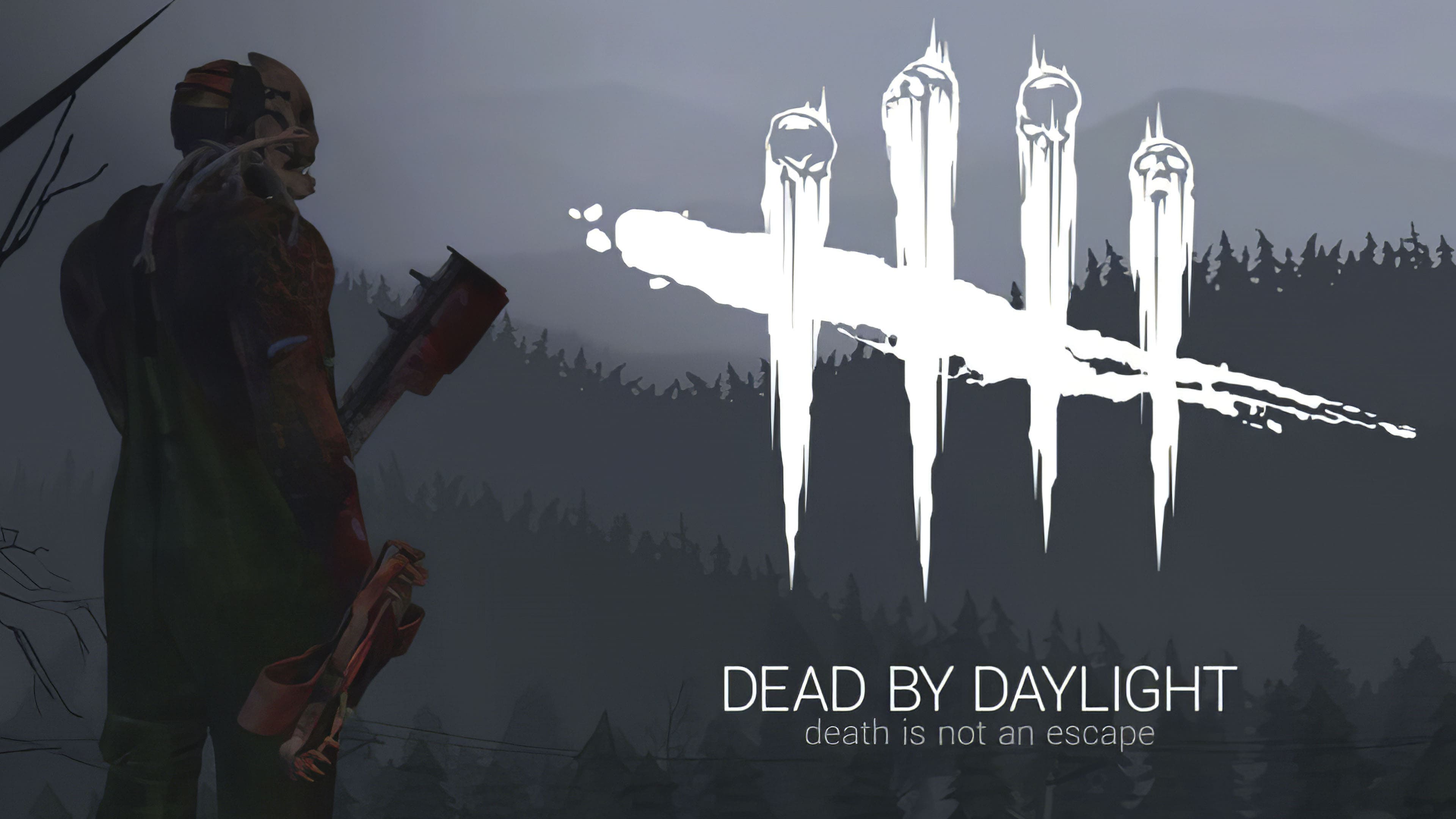
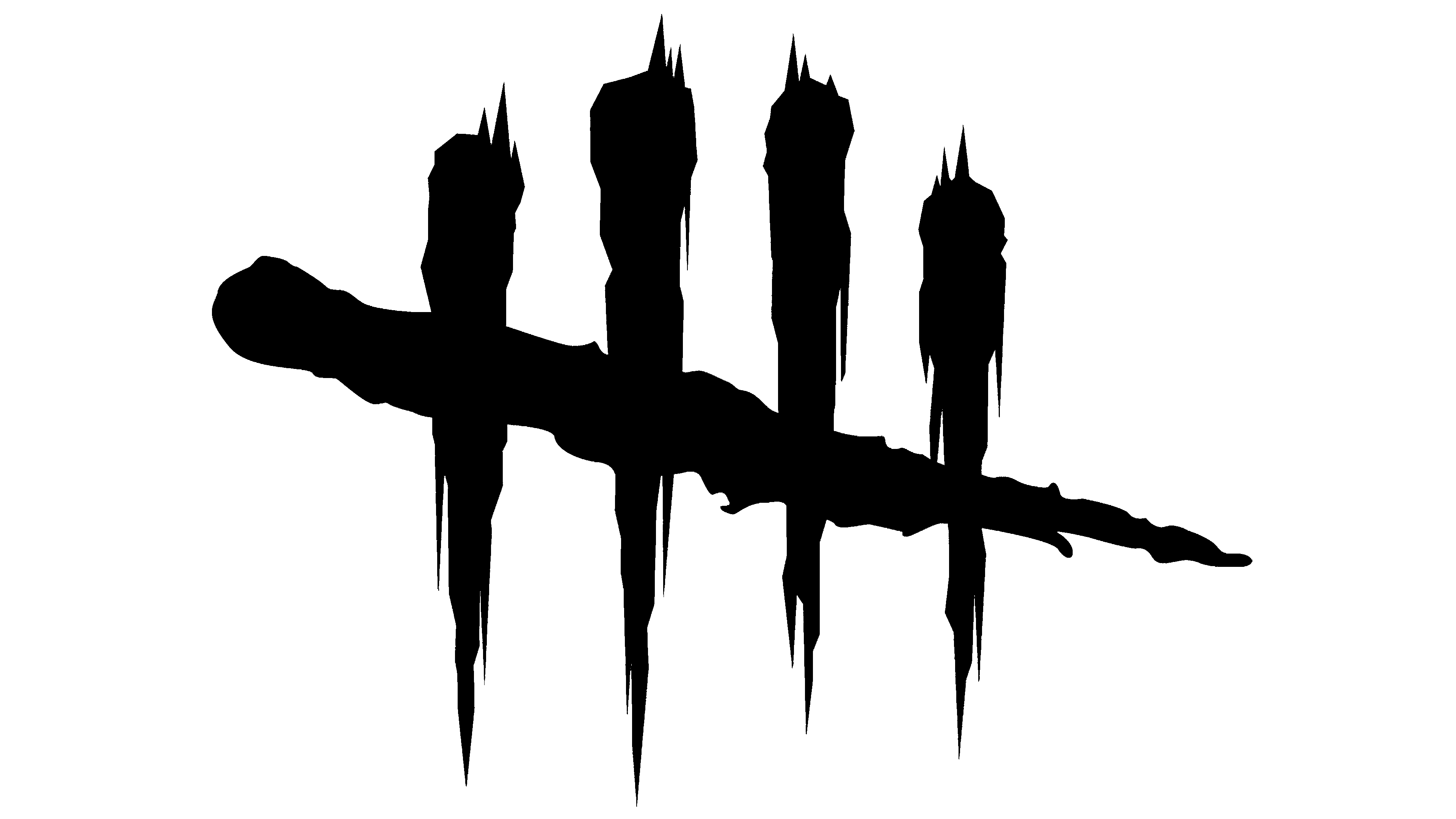
However, as the official “face” of the game, the logo has a special place in this story. The frightening pattern of blood strokes and human skulls creates a sense of horror, so gamers know what to expect. This reflects the concept of Dead by Daylight, albeit not entirely complete.
The four vertical stripes with skulls at the top look like suffering human souls. And they are very similar to the weapons of one of the many maniacs. As you know, users in the game can try to play the role of an assassin. The choice is initially limited to only three options, each with different personal skills. Among them is The Wraith, who holds a rod with Azarov’s Skull as its spine.
According to the plot, Wraith’s name was Philip Ojomo in the past, and the maniac’s dangerous weapon is his former boss’s bones. Remarkably, the emblem’s vertical elements are very similar in shape to Azarov’s Skull, except for the absence of a spine. It is unknown whether this happened by accident or if the designers deliberately made them similar to visually connect all parts of the horror in one direction.

The game’s full name is written at the bottom of the logo, marked “TM.” The font used is from the Roboto family, invented by typographer Christian Robertson for Google and its Android system. For the phrase “DEAD BY DAYLIGHT,” the designers chose the Roboto Light version, with a thin and even outline of sans-serif letters. This very simple lettering balances the visually heavy drawing. Moreover, it can be located below or on the right, depending on the context.
All elements are painted black, even a streak of blood, which can only be recognized by the spray scattered in all directions. However, the logo is white on dark backgrounds, such as game covers. Alternation of colors is allowed if necessary to improve the perception of the inscription and image.
2021 – today
![]()
The modern version of the logo was released for the fifth anniversary. All the old elements remained, but they were rearranged. In this way, the authors highlighted new priorities. For example, the phrase “Dead by Daylight” now occupies much more space than the icon. It is written in a different type of bold. Skulls with stripes flowing down, as before, resemble a trail from the claws of a wild beast, but in this case, they are presented in the form of a miniature sign; therefore, they are completely invisible. There is also a transverse line.
Font and Colors
For the updated inscription, the designers chose a typeface that resembles Cocogoose, MADE GoodTime Grotesk, and Gotham Black. Guided by their style, the developers have created an original version that meets modern requirements.
However, the corporate colors in the modernized version are consistent with the previous ones: they are monochrome, combining white and black. The first serves as a background; the second is used for the basic elements.