![]() Rocket League Logo PNG
Rocket League Logo PNG
The game’s developers chose a serious Rocket League logo so that everything on the screen feels plausible. Everything is maximally ordinary: neither a racing drive nor supernatural effects. Everything is simple and clear: the name is executed in massive black letters. However, there is one original feature. It’s the perfect geometry of glyphs with even edges.
The history of Rocket League is tied to Psyonix, founded in 2000 by Dave Hagewood in North Carolina. The studio worked on contract projects for Epic Games using Unreal Engine, contributing to titles like Gears of War and Unreal Tournament, without major original success.
In 2006, the development of Track Addict shifted after a football mechanic appeared during testing. The idea led to the release of Supersonic Acrobatic Rocket-Powered Battle-Cars on PlayStation 3 in 2008. The game reached break-even but built a small audience, prompting the development of a sequel.
By 2013, active development resumed with improvements in controls, physics, and pacing. On July 7, 2015, Rocket League launched on PlayStation 4 and Windows via Steam, with PlayStation Plus support. Revenue grew sharply, reaching $110 million in the first year. The team expanded from about 30 to 70 employees by 2016.
The game received the “Best Indie Game” award at The Game Awards 2015 and over 150 Game of the Year awards. Versions later appeared on Xbox One and Nintendo Switch. In 2015, Major League Gaming hosted the first tournament, followed in 2016 by a partnership with Twitch and the launch of Rocket League Championship Series.
By 2018, the game had sold over 10 million copies and had 40 million players. On May 1, 2019, Epic Games, known for Fortnite, acquired Psyonix. The announcement triggered negative reactions on Steam, prompting Valve Corporation to adjust its review system.
On September 23, 2020, Rocket League became free-to-play across platforms, surpassing one million concurrent players. In 2021, Rocket League Sideswipe launched on iOS and Android. By early 2026, total esports prize pools exceeded $46 million, with peak concurrency again passing one million players.
Meaning and History
![]()
This computer game combines several themes: high-speed car racing and sports competitions in soccer, basketball, and hockey (the latter two were added recently). In it, two teams of up to eight gamers compete against each other. All have their “rocket” cars, which they use to score goals against the opponent’s team. Thus, teams accumulate points for the allotted match time.
The video game features multiplayer and single-player modes, with online and local gameplay. It is also possible to conduct online competitions between any cross-platform versions. Later versions include features for adjusting the basic rules and adding new modes, such as hockey and basketball.
The emblem is uniform and distributed across all personal computers and gaming console platforms. Rocket League is developed for Microsoft Windows, PlayStation, Xbox, macOS, Nintendo, and Linux. Releases emerged gradually over three years, from 2015 to 2017. In September 2020, the game became available in a free-to-play modification.
Moreover, the developers focused on visual elements, many of which are in the game. This principle is also reflected in the logo, as Psyonix paid close attention to graphic symbols and used several game and print trademarks simultaneously.
What is Rocket League?
Rocket League is a unique mix of arcade soccer and racing with rocket-powered cars, and is a direct sequel to Supersonic Acrobatic Rocket-Powered Battle-Cars. Modes with other sports have also appeared in the latest versions, including basketball and hockey. The video game’s developer and one of the publishers is Psyonix LLC.
2014 – 2015
![]()
The original emblem of the cross-platform video game was a complex geometric figure resembling two rectangles folded together: a large top and a small bottom. The emblem had a chromed frame around its entire perimeter. It was wide and voluminous (in 3D). The main space of the icon was painted blue, serving as the background for the two main elements: the icon and the text.
The key image on the logo was, of course, a racing car. It was white, detailed, clearly outlined, with large wheels. It had a high cockpit and wide front and rear wings. The car moved at an increased speed, evidenced by the single color detail – either a headlight or a powerful exhaust from the pipe. The flash was drawn as a “star” element, with rays diverging in all directions. For greater emphasis, they were outlined in red.
The textual part contained the name of the video game, typed in wide characters. Initially, it was a stylish sans-serif font in uppercase. Due to the background drawing’s configuration, the letters turned out a bit uneven in size, narrowing from the middle to the edges.
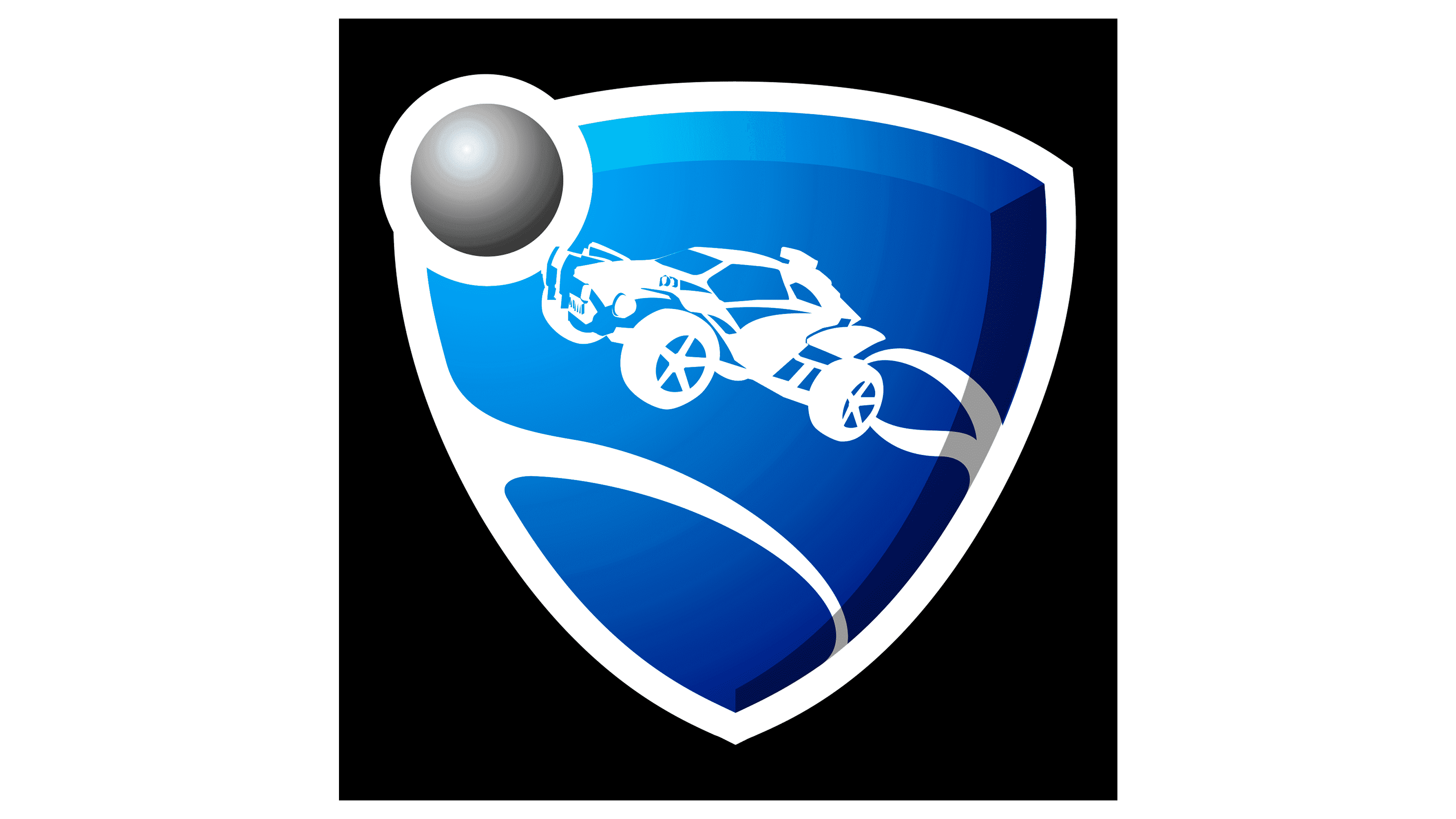
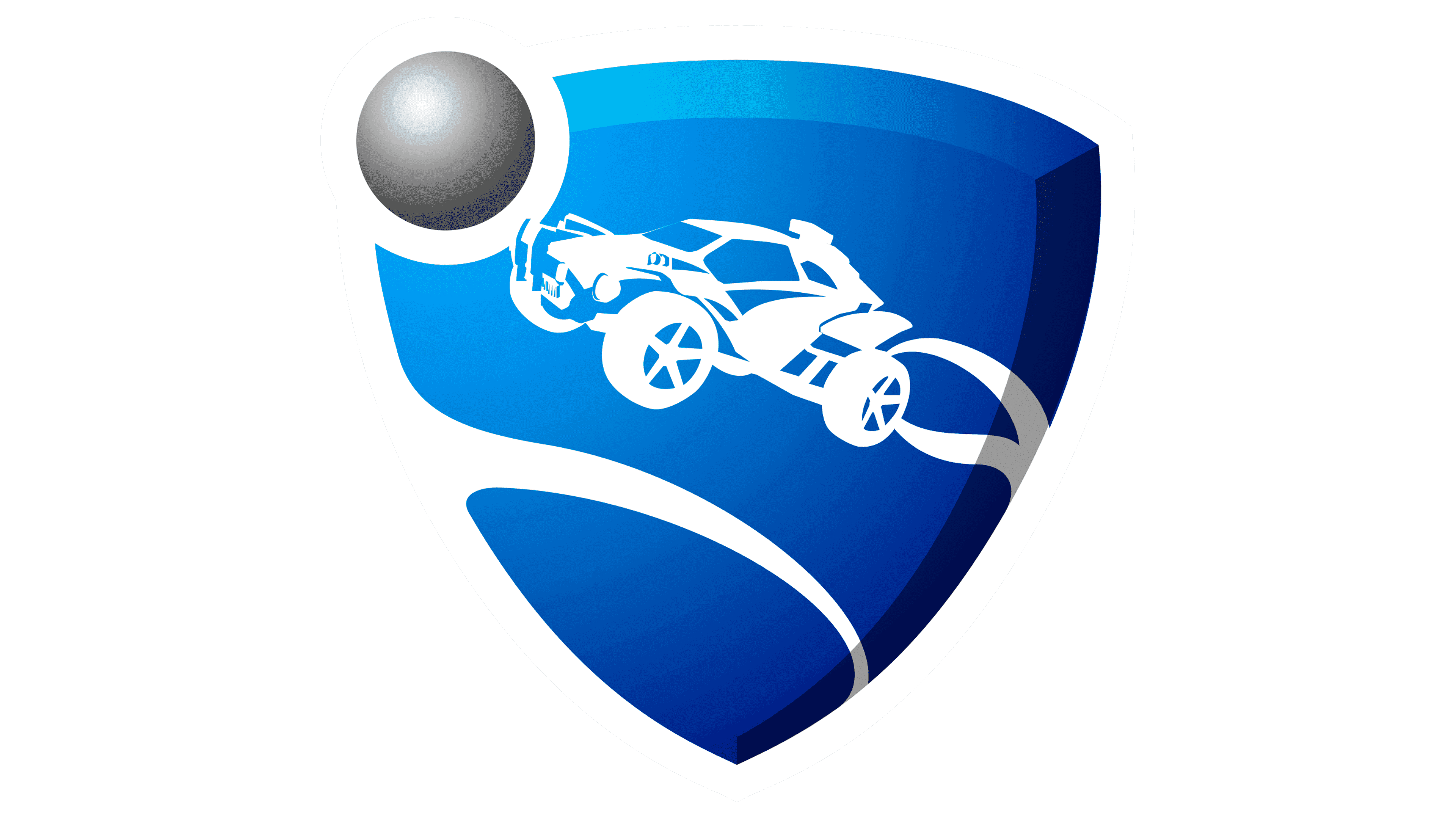
2015 – 2020
![]()
It combines graphics and text, emphasizing identity and distinction simultaneously. They align with the logo design, ensuring there is a version for every situation without contradicting the main sign. As a result, there are three design variants.
The general scheme is the arrangement of elements: the picture is on the left, and the text is on the right. The first image depicts a racing car with large wheels. It is detailed down to the smallest parts to create the impression that it is a real sports car. Behind it stretches a two-stripe trail that, by design, conveys movement, dynamism, and drive. In front of the car is a ball, abstracted from a specific sport, smooth and monochrome, with glints of light.
In the background is a triangular crest that strongly associates with the sports theme, as it appears on the emblems of most teams. A silver ball is in the upper left corner, and a thin, white, curved line crosses the lower edge. On the emblem’s right side is the computer game’s name, set in large, bold, brutalist letters. In all versions of the emblem, they are black.
2020 – today
![]()
After Epic Games acquired Psyonix, the logo changed. The transition to free-to-play also influenced this. In the modern version of the emblem, the Octane shield is no more. All attention is focused on the game’s name, so the redesign removed all graphic elements. The phrase “Rocket League” remained unchanged without the slightest adjustments. It is, as before, executed in uppercase letters, painted black, and composed of large, wide characters.
Font and Colors
The name is written in a geometric sans-serif font, similar to Futura ExtraBold. The only replacement is the letter “G.” All other characters are identical. Designer Paul Renner created this font in 1927. The icon’s color palette is quite diverse, featuring a blue shield with white elements and a gray ball.