


![]() DnD Logo PNG
DnD Logo PNG
The emblem shows that the game, like a dragon’s flame, is exciting and addictive. The emblem of Dungeons & Dragons conveys bright emotions, the energy of the struggle, and the desire to win. After spending time with dragons, players want to stay in this magical fairy tale world.
Dungeons & Dragons began with Gary Gygax in Lake Geneva, Wisconsin, and Dave Arneson in Minneapolis, both of whom were rooted in the wargaming scene. In 1971, Gygax and Jeff Perren created Chainmail, a medieval miniatures rule system with a fantasy supplement. Arneson used it for Blackmoor, where players controlled individual characters instead of armies. In February 1973, he showed it to Gygax, and the idea for a new kind of game took shape.
In October 1973, Gygax and Don Kaye founded Tactical Studies Rules (later TSR) with $2,400. Brian Blume joined in December with extra funding. In January 1974, 1,000 boxed sets of Dungeons & Dragons were printed in Gygax’s basement. Each set had three small booklets and sold for $10. About 1,000 copies sold in the first year, then 3,000 in 1975.
D&D effectively created the tabletop role-playing genre. Competitors such as Tunnels & Trolls, Empire of the Petal Throne, and Chivalry & Sorcery appeared quickly. TSR split the line in 1977 into a basic set for newcomers and Advanced Dungeons & Dragons for experienced players. Monster Manual, Player’s Handbook, and Dungeon Master’s Guide formed the core three-book model.
The 1980s brought growth, lawsuits, and public controversy. Arneson settled a royalty dispute in 1981, and Gygax left TSR in 1985. The “satanic panic” hurt the game’s image but gave it huge media exposure. After financial trouble in the 1990s, TSR was bought by Wizards of the Coast in 1997 and later owned by Hasbro. D&D 3rd Edition arrived in 2000, 5th Edition in 2014, and streaming shows such as Critical Role helped bring the game to tens of millions of players.
Meaning and History
![]()
The prototype of Dungeons & Dragons was a wargame miniature model of battlefields with detail. The original rules system was borrowed from the Chainmail variant of the game, released in 1971. Therefore, DnD is now recognized as the forerunner of modern role-playing games and the entire RPG industry.
During the action, instead of a military formation, participants can choose their hero. Characters embark on a fantasy adventure, with the Dungeon Master acting as the judge. Heroes form groups and interact with each other and with the population. Together, they solve problems, accumulate knowledge, collect treasures, explore the terrain, and participate in battles. Players earn special points by competing to see who earns the most. The points earned allow you to advance to the next level and become stronger.
The instant success was a powerful boost to the rapid spread of D&D. It is still the leader among role-playing games, having split into two parts in 1977: fantasy with easy rules and combat with a more complex rules system. In 2017, Dungeons & Dragons recorded the largest number of participants addicted to the game, with between 12 and 15 million people in North America alone. There are five editions, the latest of which was published in 2014. And the game has only two emblems.
The board game’s individual sign has spread to all kinds of products, as its popularity has led to the creation of animated series, comic book magazines, books of the same name, many role-playing video games, and other variations of the D&D game.
2000 – 2008
![]()
The original DnD (Dungeons & Dragons) logo was stylized to fit the game’s plot. For this purpose, the designers chose a harmonious combination of military weapons, such as swords, with the name. They divided the phrase into fragments and arranged them in two lines. The letters resembled ancient symbols: blood-red, shaped, graceful, with long strokes and black shadows. Due to a special combination of light and dark sides, the signs in the text were sharply angular. And the short stripes drawn on them were perceived as flames.
Between the first and second rows, there was a sharp sword. The blade of the cold weapon was wide and shiny, with a deep groove stretching from the hilt to the tip. The blade was covered with a noble patina. The hilt was complex, but the figural elements were arranged symmetrically. According to the designers’ idea, the hilt was adorned with a dark gold decoration made of black leather. The background was a gold plate framed with twelve screws. An ampersand in the form of a curved dragon was placed between the words “Dungeons” and “Dragons.” To the left of the mythical character was a red ruby.
2008 – 2014
![]()
The debut logo featured many decorative elements and had a Gothic design. The style of the inscription, its design, and the amazing golden ampersand, which resembled the silhouette of a fairy-tale dragon, contributed to this. The letters were capitalized, accented with the first “D,” so that they visually formed the abbreviation D&D. The ends of the letters “E,” “D,” “R,” and “A” had pointed serifs resembling spades. The letter “S” had a serif only at the bottom. The letter “O” had a vertical rhombus in the middle. The letters were painted in disturbing colors, with raging flames and yellow tongues of fire at the bottom. This brutal and massive logo brilliantly conveyed the energy of the game, its concept, and its story. Between the words was a narrow band that resembled a sharp blade.
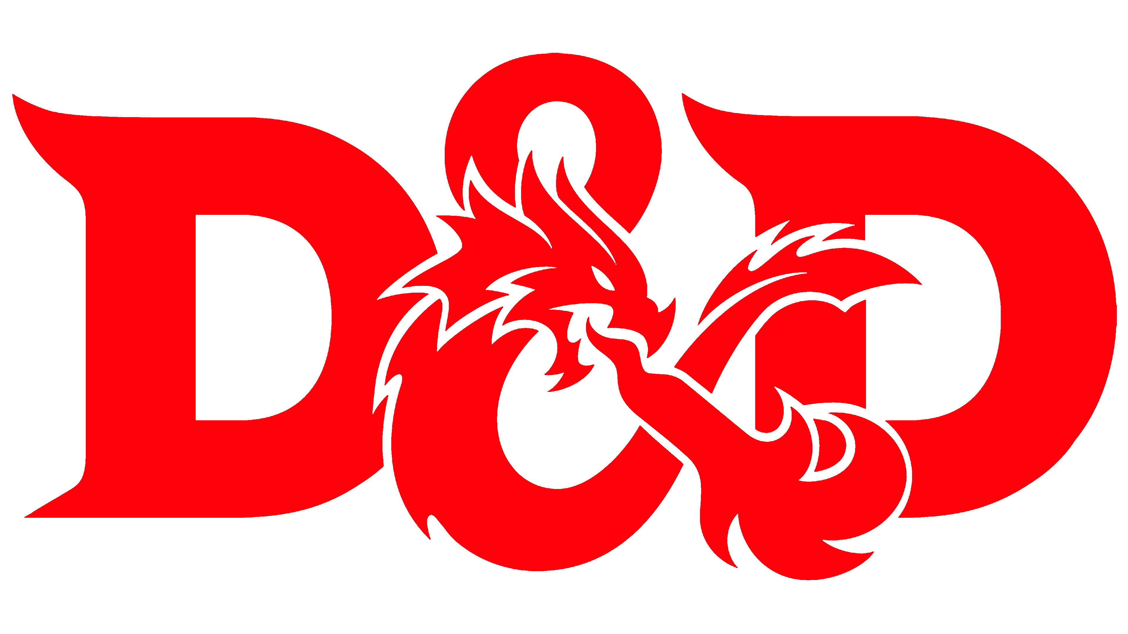
2014 – today
![]()
The emblem is still divided into two halves, one graphic and the other textual. The word combination occupies two lines. The letters are red and decorated with serifs. They are present in all symbols and look like needle-shaped protrusions. At the same time, the appearance of the letters has changed – they are now larger and clearer, with a wider interval. The exception is the combination “RA,” which is written as a single letter because the legs of “R” and “A” are connected. The original ampersand is between the top and bottom of the name: a silver-gray, cold, steel sign in vignette form. This is the dragon, a fantasy character from the game’s story.
Font and Colors

The Dungeons & Dragons emblem is recognizable for its unique typeface developed specifically for the company. The Zentron studio created it in an original style called DnDC, while designer Martin Wait suggested an alternative called Masquerade. Both versions feature precise, graceful lettering characterized by thin horizontal serifs that balance the characters’ robust forms. The letters “D” stand out with elegant upward curves, reminiscent of stylized blades.
The logo’s color palette is dominated by two main shades: a vibrant crimson and cool metallic silver. The red symbolizes excitement, adventure, and heroism, recalling fierce battles and legendary deeds. The silver shade used in the ampersand adds depth and dimension, evoking a sense of mystery and magic. Before the visual redesign, silver was replaced by gold, giving the emblem a more classic yet less contrasting appearance.
With the introduction of the silver gradient, the emblem became stricter and more restrained. Sharp outlines and refined lettering enhance the fantasy atmosphere, magic, and mysteries that invariably accompany this iconic brand.