The Minecraft logo symbolizes the ability to create a complex cubic world based on multiple logical schemes, visualizing the most popular computer game today. The pixel identity demonstrates the nonlinear nature of the gameplay and the graphic features, ensuring recognition.
Minecraft: Brand overview
Meaning and History
From May 10 to May 15, 2009, the video game was called Cave Game, as reflected in its logo. Then, the authors renamed their “brainchild,” deciding to change the brand name to something more appropriate.
Hayden Scott-Baron, nicknamed Dock, proposed the first option. The professional illustrator was then working as a game designer for Markus Persson. But his version was immediately rejected: the owner of Mojang AB did not like the four-color Minecraft sign with rounded, galloping letters. Therefore, Dock left the team, and Markus independently developed the prototype of the modern logo.
What is Minecraft?
Minecraft is a popular indie game with nonlinear gameplay developed by Mojang Studios. The first version of the game appeared in 2009; later, it was updated and adapted for different platforms.
2009 – 2011
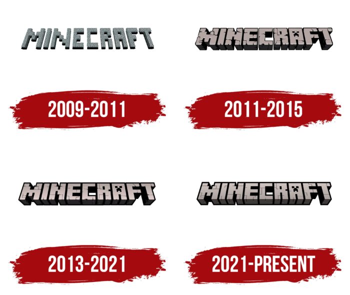
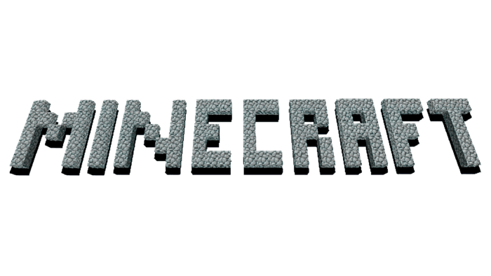
On May 15, 2009, a logo with characteristic graphics appeared. The word “Minecraft” is laid out in gray cobblestones and used as a building material in the game world. The letters consist of individual square segments and have an uneven texture. The inscription is placed at a slight angle in the horizontal plane. Due to the black shadows, it seems to be hanging in space.
2011 – 2015
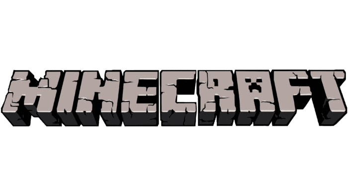
During the presentation of the game at MineCon, Mojang AB created a second trademark. It was presented in beta version 1.4. This version does not differ much from the previous one. Designers removed the shadows but kept the black color on the inner edges. They also enhanced the three-dimensional effect by making the letters shorter and thicker.
Another change concerned the texture. Now, the word is laid out not with square paving stones but cut from several cobblestones covered with cracks on all sides. The stylization of the letter “A” is noteworthy. Inside it is the face of Minecraft’s most famous monster, the Creeper. Markus Persson created this creature accidentally while trying to design a pig.
In addition, the current emblem had several additional versions. They were specially developed for the Java Edition and Bedrock Edition. All versions had minor details.
2013 – 2021
In 2013, designers modernized the artistic style and made the emblem more “pixelated.” To do this, they smoothed the edges, outlined all parts of the word with bold black contours, and blurred the cracks. Nothing else changed: the colors, shapes, and proportions remained the same. The famous Creeper, as before, is immortalized in the letter “A.”
Initially, this logo was used only for the Xbox 360 Edition as a side version of the original graphic sign. It became the main one only in 2015. This happened after Microsoft purchased Mojang AB along with Minecraft.
2021 – today
Based on the letter arrangement in the Minecraft logo, designers returned to the 2011-2015 version. At the same time, they removed most of the border shadows, leaving them only in the intra-letter space. Developers replaced the crack texture with straight lines to make the signs look like bricks. The metallic shade disappeared. Instead, a classic gray color appeared.
Minecraft: Interesting Facts
Minecraft is a game where you can build, explore, and survive in a world made of blocks. It was made by Markus Persson, or “Notch,” and came out in 2009.
- How It Started: Notch made Minecraft and shared it with the world in 2009. It was finished and fully released in 2011.
- Looks Like Blocks: Everything in Minecraft is made of blocks. This makes it easy to build stuff and is part of what makes the game look unique.
- Big Worlds to Explore: The game creates huge, different worlds, so you can always find new places.
- Learning with Minecraft: There’s a special Minecraft for schools that helps kids learn math and history by playing.
- Super Popular: More than 200 million copies of Minecraft have been sold, making it the top-selling game ever.
- Redstone: This game part lets you build things that move or work like electrical circuits.
- The Ender Dragon: This is the big boss at the end of the game. You see the end credits when you beat it, but you can still play after that.
- Everyone Helps Out: Minecraft players have made changes and additions, making the game even bigger and cooler.
- Play Together: You can play Minecraft with friends on different devices, not just computers.
- Microsoft Bought It: In 2014, Microsoft bought Minecraft for a lot of money, but they keep adding new things to the game.
- Minecraft Everywhere: Minecraft is more than a game. It’s on T-shirts and in books, and there are even other games and tools for learning that come from it.
Minecraft is popular because it’s a place where you can make almost anything you can think of. It’s not just about playing a game; it’s about being creative, working with others, and learning. That’s why people of all ages love it.
Font and Colors
The recognizable Minecraft emblem appears in the game and promotional materials. It is a stylized inscription consisting of many cubes – blocks used as building materials in the fictional universe. The voluminous letters “lie” on the plane at a slight angle. Their surface is covered with uneven cracks, creating the impression that they are carved from stone.
The creators of the Minecraft logo developed it from scratch. Standard fonts did not satisfy them: the word looked more like a picture than an inscription. The characteristic features of the letters are their large height (in three-dimensional space), straight angles, and the absence of serifs.
To mimic the texture of cobblestones, artists used shades of gray for the main surface and black for shadows, cracks, and contours. This combination corresponds to the color of the building blocks in the game.
Minecraft color codes
| Raisin Black | Hex color: | #252326 |
|---|---|---|
| RGB: | 37 35 38 | |
| CMYK: | 3 8 0 85 | |
| Pantone: | PMS Neutral Black C |
| Pale Silver | Hex color: | #c7b8b5 |
|---|---|---|
| RGB: | 199 184 181 | |
| CMYK: | 0 8 9 22 | |
| Pantone: | PMS 406 C |
| Black | Hex color: | #000000 |
|---|---|---|
| RGB: | 0 0 0 | |
| CMYK: | 0 0 0 100 | |
| Pantone: | PMS Process Black C |
FAQ
What was the first Minecraft logo?
The first Minecraft logo had the same structure as the modern one. It contained a drop-down inscription consisting of individual blocks. But, unlike the modern version, the name of the game was drawn with gray cobblestone. The letter A had a standard design without stylization under the face of a creature.
Why did Minecraft change its logo?
The logo used today was created for the Xbox 360 Edition. It became the primary graphic sign of Minecraft when Microsoft acquired the rights to the series of video games and its developer, Mojang AB. That is, the design update marked the transition to another owner.
