


![]() Grand Theft Auto V (GTA 5) Logo PNG
Grand Theft Auto V (GTA 5) Logo PNG
The game’s visual sign is large, voluminous, and memorable. The GTA 5 logo points to the huge number of game possibilities on the site, demonstrates the player’s freedom of choice, and promises something special, a highlight that will delight fans of the series.
Grand Theft Auto V grew out of a series that began in 1997, when DMA Design released the first Grand Theft Auto, featuring a top-down view and an open-world crime structure. DMA Design later became Rockstar North under Take-Two Interactive. GTA III moved the series into 3D in 2001, San Andreas expanded it in 2004, and GTA IV added a more cinematic tone in 2008. Development of GTA V began around the time of GTA IV’s release. About 360 people at Rockstar North worked with Rockstar teams in Leeds, Lincoln, London, San Diego, and Toronto.
The team studied California streets, sounds, and urban details to build Los Santos. Dan Houser and the writing team created a script of about 1,000 pages. The main change was the addition of three playable characters: Michael, Franklin, and Trevor, with real-time switching between them. Rockstar announced GTA V on October 25, 2011. The first trailer arrived on November 2 and quickly drew record attention.
The game was delayed from spring 2013 for extra polish. Analysts estimated development and marketing costs at over $265 million. GTA V launched on September 17, 2013, for PlayStation 3 and Xbox 360. It made over $800 million in 24 hours and $1 billion in three days. GTA Online launched on October 1, 2013, amid server failures, lost progress, and subsequent compensation. Updated versions followed for PS4 and Xbox One in 2014, PC in 2015, and PS5 and Xbox Series X/S in 2022. By early 2026, GTA V had sold over 220 million copies.
Meaning and History
![]()
The video game has a lot of fans, so everyone knows what its logo looks like: white lowercase lettering “Grand Theft Auto” with a green Roman numeral “V.” Considering that the publisher, Rockstar Games, spent a record amount on marketing, it couldn’t have been otherwise. To date, GTA 5 can be confidently called the most expensive project in the gaming industry: its budget exceeded 250 million dollars. This amount included the development of the fifth installment of the Grand Theft Auto series and the creation of corporate design.
In addition, the multiplatform action-adventure game became one of the best-selling games. In 2020, it surpassed all other video games in popularity, ranking behind only Minecraft and Tetris. Such success is partly due to GTA 5 not having to be promoted from scratch: its visual appearance from day one resembled that of previous Grand Theft Auto games. This unites them visually, as a common concept is important for marketing and its presentation.
What is GTA 5?
GTA 5 is the acronym for Grand Theft Auto V, a game in the massive Grand Theft Auto franchise. It is the fifteenth in the overall series. This game project is recognized as the most expensive and most popular in history, as it ranked second only to Minecraft in sales in 2021.
Successful branding helped attract users’ attention. The logo looked promising, especially for GTA fans, who knew what to expect from the new product and were already familiar with the past parts. The only distinctive element was the number 5, represented by the Roman letter “V” and the English word “five.”
The emblem, also a wordmark, reflects Grand Theft Auto V’s full name. All three words are written in lowercase letters and arranged in a column. There is no interval between the letters; the characters are separated only by thin black lines.
The number 5 in the capital letter “V” indicates the sequential number of the game in the GTA series. It is in the lower-right corner, highlighted in a green gradient and outlined with a black stripe along the outer edge. Around the “V” is wrapped a white ribbon with the decoder inscription “five.”
The logo has two variants: vertical, with all words arranged in a column, and horizontal, with the text on one line. They differ only in the space they occupy.
Font and Colors
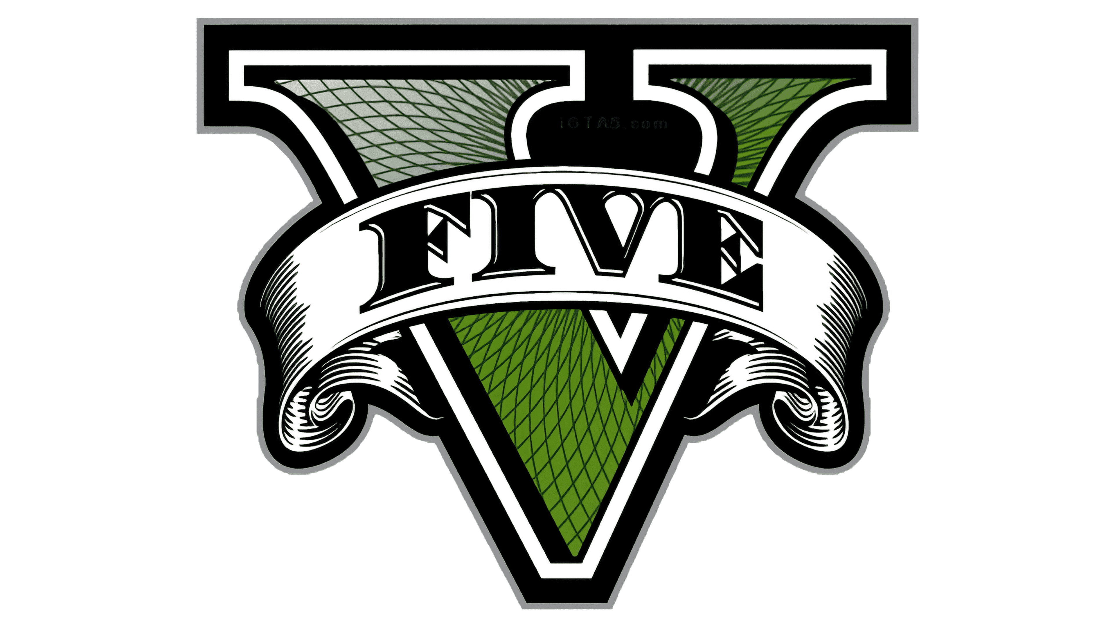
At first glance, the inscription on the GTA 5 logo appears to be unique. Such a font exists. It is called Pricedown Black and belongs to Ray Larabee. Therefore, the disproportionate shape of the letter “t” and an additional vertical line at the bottom of the letter “r” are not fantasies of the game developers but characteristic features of the original inscription.
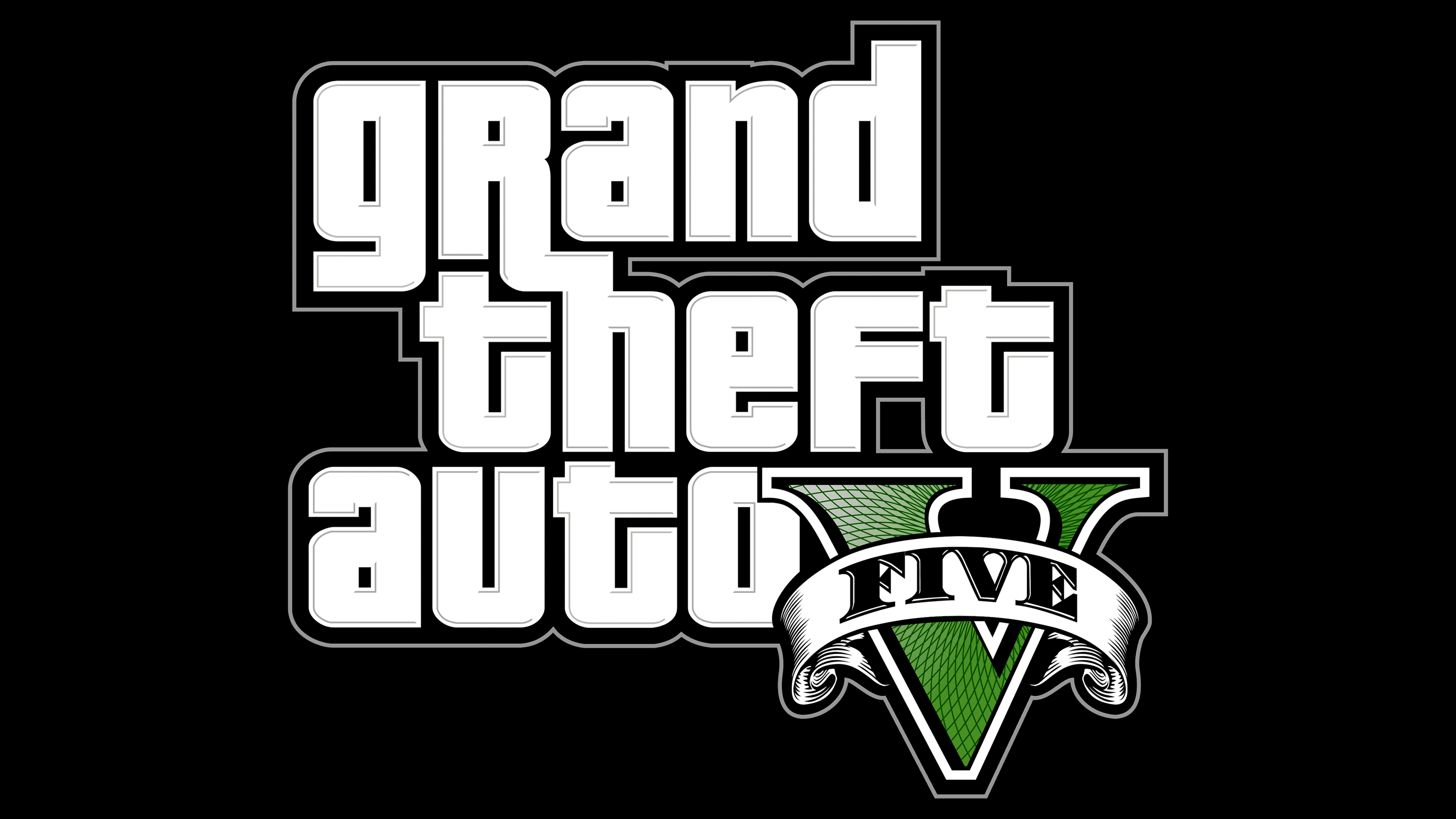
The color scheme is monochrome, with black and white. The only bright spot is the green Roman numeral. A shade similar to Sap Green (# 47761E) was used. However, it is not uniform but has a smooth gradient transition.
FAQ
What does the GTA 5 logo stand for?
The GTA 5 logo signifies the connection to Grand Theft Auto by sharing the design principles of the series’ main logo. Only the Roman numeral five has been added.
What is the GTA V symbol?
The main symbol of GTA V is a green Roman numeral 5 with a gradient, grid pattern, and black-and-white outline. It is wrapped in a white ribbon, and the word “FIVE” is written in black capital letters with serifs.
What font is used for the GTA 5 logo?
The font used for the Grand Theft Auto logo is Pricedown Black, designed by Ray Larabee. The word “FIVE” on the ribbon is in bold serif font.