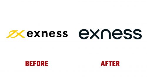
Exness, a leading global multi-asset broker, has introduced a new brand identity, including a revamped Exness logo, signaling a significant shift in its visual presentation and marketing approach. This change comes when the company is experiencing unprecedented growth, with trading volumes reaching new monthly records of $3 trillion in 2023, supported by an active client base exceeding 414,502 individuals worldwide. The rebranding effort represents Exness’s mission to reshape the online trading industry by offering superior market conditions across various assets.
The redesign addresses the complexities and visual clutter of the previous logo, which struggled to balance its monogram and wordmark effectively. The old design, characterized by its redundant “ex exness” appearance and overly aggressive styling, failed to convey the brand’s ethos of simplicity and efficiency. In contrast, the new logo embraces a minimalist approach, utilizing strict geometric sans serif typography that harmonizes round shapes with precise angles to create a distinctive and coherent visual identity.
Central to the rebranding is the introduction of “The Exo,” a dynamic 3D object designed to encapsulate the essence of Exness through its ability to morph into various forms, including an “e,” an “x,” an “o,” and a heart-like shape. This innovative design element is a metaphor for the broker’s versatility and commitment to fostering a positive client trading environment. The animation of The Exo is particularly notable for its smooth, hypnotic quality that enhances the brand’s futuristic and client-centric outlook.
Despite the elegance of The Exo and the wordmark, the broader identity system ventures into overly complex territory, diverging from the simplicity that defines the core brand elements. Aggressive iconography and seemingly arbitrary 3D dot compositions introduce inconsistency that may detract from the cohesive brand experience Exness aims to deliver.


