


Threads is establishing an identity distinct from Instagram with a new logo. Unveiled on May 11, 2026, nearly 3 years after the service launched, London’s Studio NARI developed the update in collaboration with Meta’s team. The designers reworked the wordmark and “@” symbol to better reflect Threads’ purpose as a public conversation space.
The platform launched in 2023 as a text-based alternative to Instagram and a competitor to X. Its connection to Instagram helped it attract 100 million users in its first 5 days. Over time, the apps’ resemblance made it harder to tell their posts apart. The designers needed to give Threads a separate identity centered on human interaction. The service’s name refers to chains of messages. Replies extend the original conversation and appear on participants’ profiles, opening up opportunities for further discussion.
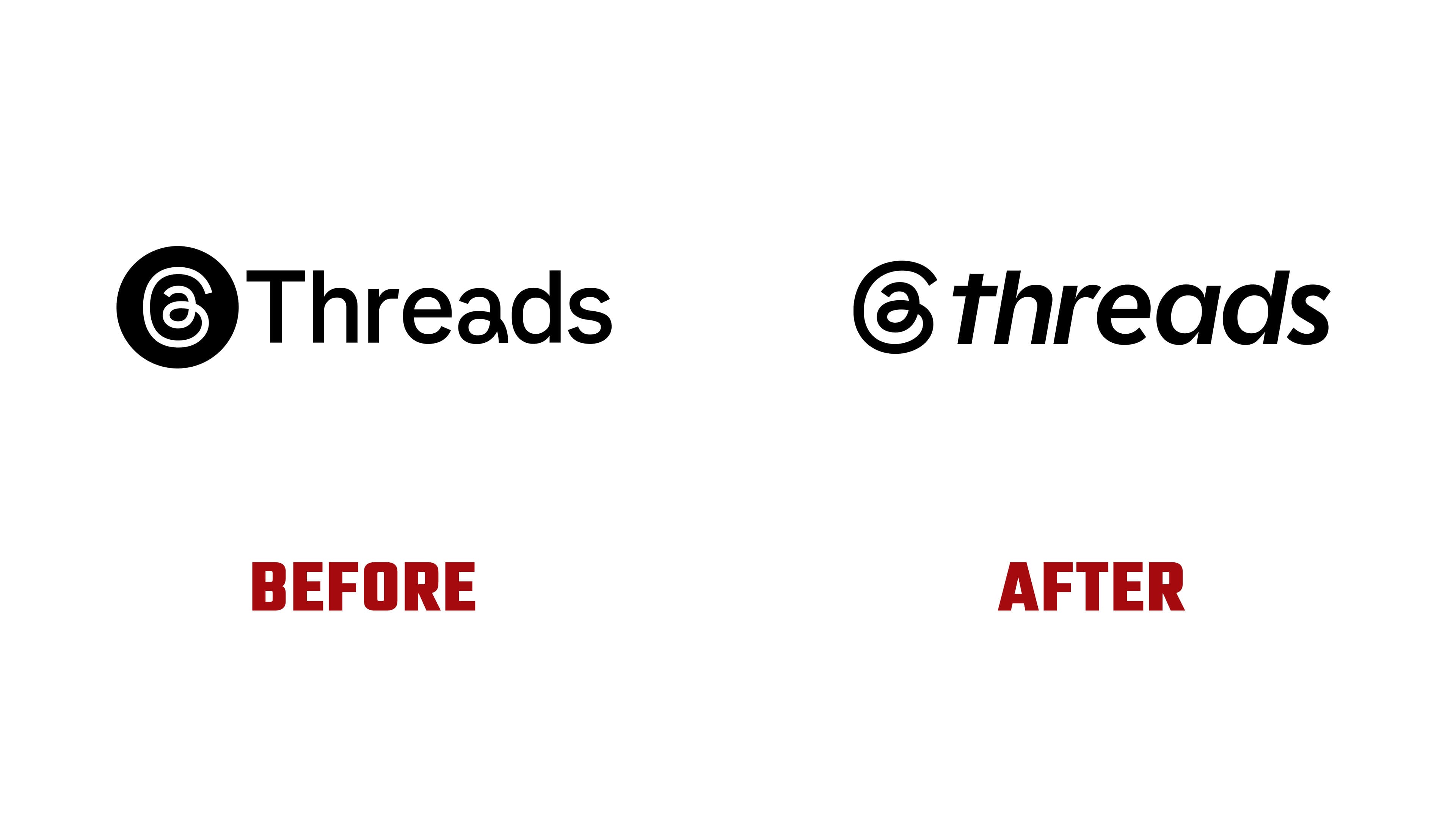
The new lettering draws on the strokes of a chisel-tip marker. The “Trending Chisel” concept references the habit of highlighting passages of text to call out timely topics and comments. The designers translated this into variations in stroke thickness, angled terminals, and thin connections between strokes. These details were intended to convey the emphasis and reactions of a live conversation. An editorial approach to the identity reinforces the platform’s connection to discussions as events unfold.
The previous “Threads,” with its capital “T,” has become the lowercase “threads.” The letters lean to the right and have a taller x-height, with ascenders extending only slightly above it. The “t” has a long crossbar, the “r” a short shoulder, and the “a” a single-story form. Strokes narrow where verticals meet curves. Heavy sections taper into thin ones, and soft curves meet angled terminals.
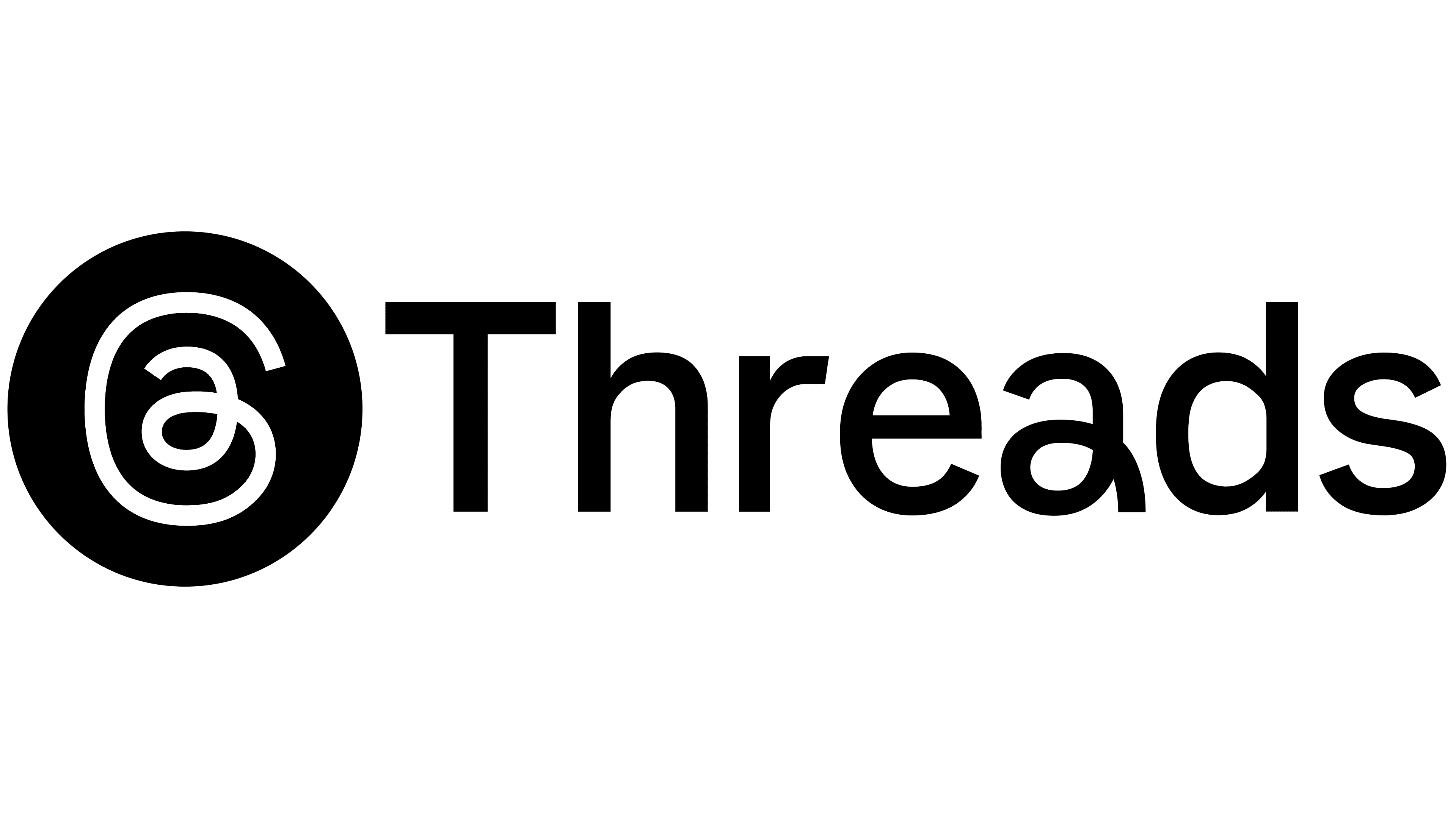
The previous wordmark used Instagram Sans with an “a” from Instagram Sans Headline. The update introduces custom lettering. Loops are now concentrated primarily in the “@” emblem, with fewer repeated in the name. The slant, flowing transitions, and angled cuts connect the two parts of the logo.
The “@” symbol retains its underlying structure, derived from the 2022 Instagram Sans version. Previously, its outer contour resembled a rounded square, referencing the Instagram icon. The new emblem is wider and rounder, with a thicker line, and the entire form leans to the right to match the wordmark. The angled cuts at its endpoints are more pronounced. A continuous line conveys an ongoing conversation. The design was adapted for the app icon, notifications, and other small formats.
Studio NARI’s team included Executive Creative Director Caterina Bianchini, Creative Director Julien Kieran, and Lead Designer Lauren Davidson. Chi-Long Trieu oversaw type direction, with Alexis Gargaloni handling typography. Designers Charley Ray and Dom Vine also contributed. On the Threads side, Head of Design Christopher Clare explained the project’s goals, connecting the changes to the development of a distinct brand within Meta’s ecosystem.
The chisel-tip marker treatment extends to text highlights and animation. The app uses a restrained version of the identity. Campaigns focused on sports, music, and entertainment feature bold accents and animated elements built from the new logo’s shapes and angled cuts.