


![]()
British menswear brand Kent & Curwen, founded in 1926, unveiled an updated identity created by the studio Yorgo & Co. Throughout its history, the brand has undergone various stages of development, including a partnership with David Beckham. Now, under the direction of Daniel Kearns, the brand is updating its visual identity while maintaining a connection with English tradition.
![]()
- The key symbol of this update is the famous crest featuring three lions, refined by artist Chris Wormell. The new design provides three versions of the crest for different applications:
- The first version includes detailed features like fur and the lions’ facial expressions, making it suitable for large-scale images.
- The second version is less detailed but maintains dimension.
- The third version is limited to lion silhouettes, making it suitable for small embroidery or metal elements.
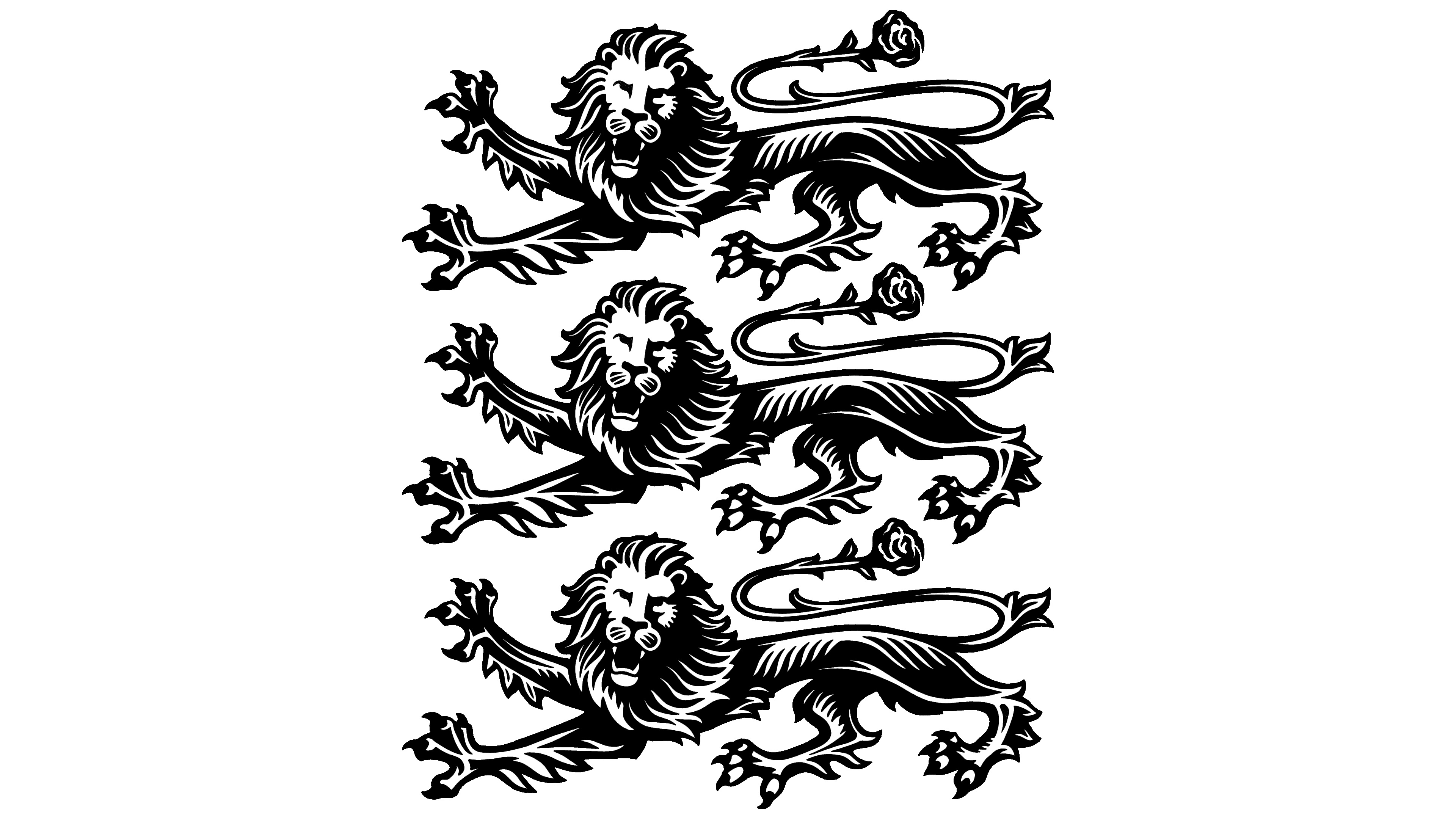
A rose, the symbol of England, was added to the lion’s tail. The lions remain in the classic heraldic pose of Passant Guardant, ensuring historical continuity.
The typeface for the brand name has become neat, with even serifs and clear lines. The ampersand symbol was enlarged, strengthening the connection between Kent and Curwen.
Below the name remains the word “ENGLAND,” now lighter and more elegant. The founding year “1926” is added beside the crest, serving as a reminder of the brand’s history.
![]()
An additional sans-serif typeface is used for supporting text, such as “ENGLAND” and “1926.” This contrast helps the brand appear contemporary while retaining a traditional style.
Besides the primary logo, a separate emblem in the form of a rose has been introduced as an alternative symbol.
With this update, Kent & Curwen reaffirmed its position as a classic menswear brand, blending tradition with contemporary fashion trends.