Founded in 2018 by Scott Budnick, 1Community (1C) has introduced a new logo and brand identity that vividly represents its commitment to driving social change through impactful media projects. The organization produces content that addresses critical issues like climate justice, racial equity, and mental healthcare, with each project linked to a specific advocacy campaign. This strategic approach is designed to motivate viewers to actively participate in addressing the social issues highlighted in the media they consume.
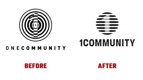
The redesign marks a significant evolution from the original logo, which cleverly hinted at the organization’s focus on targeted social causes with subtle imagery resembling a target. The old design, although memorable, featured a wordmark with overly spaced letters that diluted its visual impact.
The new logo adopts a style reminiscent of 1960s broadcaster icons, blending a modern look with nostalgic elements typical of vintage designs from companies like AT&T. This emblem cleverly integrates the numeral “1” within its structure, playing with visibility to create a compelling visual effect. However, the intricate details like ink traps in the wordmark might distract slightly from the overall design’s clarity.
A distinctive feature of the new logo is the application of a grainy, textured effect in some versions, which enhances the retro feel while fitting modern design trends. This textural detail adds depth, helping the logo stand out and reinforcing the brand’s historical continuity with a fresh twist.
The overall brand identity incorporates unique visual distortion effects that, while visually striking, may initially confuse viewers about their purpose. More effective integration of these effects, possibly by echoing the logo’s design, could improve their coherence with the brand’s message.
The animated version of the logo, likely featured at the beginning of 1C’s film productions, presents an engaging, slightly dystopian look. It depicts a silhouette of a family watching a sunset, a powerful visual that aligns with the serious and urgent themes explored in 1C’s projects. This animation enhances the logo’s narrative depth and underscores the organization’s transformative aims.
1Community’s revamped identity, which includes a strong online presence, effectively communicates its dynamic method of creating media that inspires action. The thoughtful design elements, from the innovative logo to the meticulous applications, establish 1C as a pioneering entity at the nexus of media production and social activism.


