


![]()
Working animals rarely figure prominently in the main charitable agenda, even though the lives of millions of families depend on them. Donkeys, horses, mules, camels, oxen, and other animals help transport water, food, and goods, reach markets, and preserve income. According to the organization’s estimates, their labor supports about 600 million people across Africa, Asia, the Middle East, and Latin America.
For more than 100 years, the charity operated under the name “SPANA,” and in 2026, it became “Working Animals International.” The new name removes the closed nature of the old acronym and speaks to the mission without explanation, helping working animals and the people whose lives depend on them. “The Clearing” developed the organization’s name, strategy, and identity, building the system around the formula “Impossible to Overlook.”
![]()
The new position is built around a problem that was long treated as a normal part of daily life. “Working Animals International” addresses animal suffering, lack of veterinary care, and low welfare standards as issues requiring action. The charity works with partners around the world, expands access to treatment, trains owners, and promotes more caring treatment of animals.
The main logo is a globe. Inside the circle, the profiles of a horse, a camel, and a donkey are connected through negative space. The structure explains the charity’s area of work and the international scale of the problem. The symbol combines animals, geography, and the shared mission in a single image.
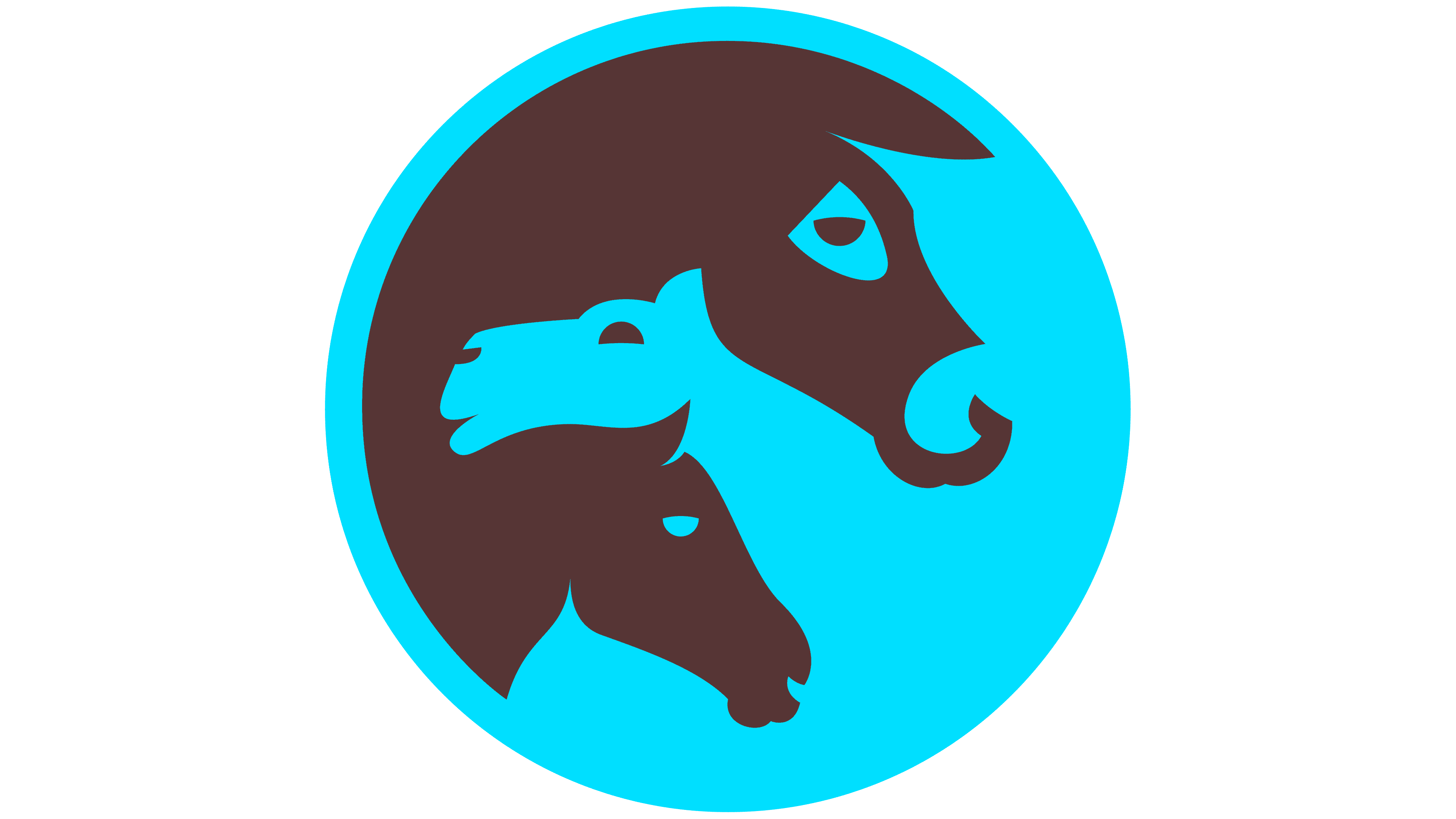
The new logo replaced the old fragmented presentation with a set of animals and a heavy color combination. Now the mark looks more cohesive and works more easily across digital channels, reports, campaigns, partner materials, and field communications. The long name received a clear role next to the round symbol, and the entire system moved closer to the language of an international humanitarian organization.
The colors are taken from the natural environments where working animals and the communities that depend on them live, including earth, dust, vegetation, heat, and open space. The typography uses “Right Grotesk Casual” and “DM Sans.” One typeface works for large brand moments, while the other is suitable for digital media and long-form reading.
![]()
The organization’s identity includes a pattern based on a hoofprint. It recalls the well-traveled routes of animals and people across difficult terrain. For “Working Animals International,” the mark serves as a metaphor for daily labor, the repetitive roads, and the burden without which entire communities lose their support.