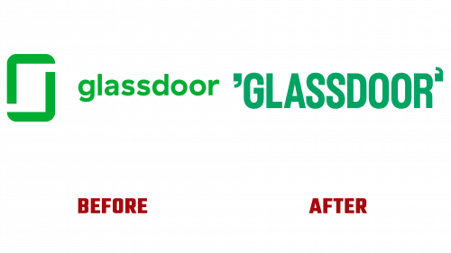
As Glassdoor celebrates its 15th anniversary of revolutionizing workplace transparency through an array of reviews, ratings, and insights, it proudly unveils an imaginative rebranding featuring a captivating logo that offers more than meets the eye.
The innovatively reimagined logo presents a minimalist, typography-centric design, enclosing the company’s name within quotation marks – a nod to its integral role as a platform for unfiltered employer evaluations. What catches the eye, however, is the seemingly misplaced opening quotation mark, a detail that may initially appear as an error but is, in fact, a cleverly concealed message.
This design oddity unfolds its purpose in the animated version of the logo and in the compressed form serving as the brand’s refreshed app icon. Viewed in conjunction, the inverted quotation marks seamlessly transform into a lowercase ‘g’ and ‘d’, representing the brand’s initials.
Koto, the creative powerhouse behind this redesign, is renowned for its imaginative work, including a recent logo revamp for e-commerce firm Bolt. The ‘g/d’ quotation marks add an element of versatility to the branding toolkit, potentially framing text beyond the brand’s name. The brand has introduced a custom sans serif typeface named Glassdoor Sans, crafted by Giulia Boggio. With its distinct characteristics inspired by office jargon, the typeface further augments the brand’s unique charm.
The logo’s animated iteration features a captivating sliding action, metaphorically reflecting Glassdoor’s commitment to transparency. Complementing the new Glassdoor logo, the brand has introduced an array of lively icons designed by Josep Puy. Designed for product and marketing use, these icons embody the brand’s core values – openness, diversity, collaboration, and candid conversation. Interestingly, the icons feature intentionally omitted pixels, a design detail that encapsulates Glassdoor’s reputation for fostering transparency.


