Building a company’s staff, as the logo symbols show, is a two-way job that requires the efforts of the job seeker and the employer. The Glassdoor logo stands for honesty and transparency at the dating stage; then, cooperation will lead to mutual growth and development.
Glassdoor: Brand overview
| Founded: | June 2007 |
| Founder: | Robert Hohman, Rich Barton, Tim Besse |
| Headquarters: | San Francisco, California, U.S. |
| Website: | glassdoor.com |
Meaning and History
Surprisingly, the job search site Glassdoor is historically associated with a travel company. All three of its creators – Robert Hohman, Rich Barton, and Tim Besse – once worked together at Expedia Group, Inc. One day, Robert described how he forgot the printed results of a survey of Expedia employees next to the printer. Fantasizing about what might have happened if these papers were in the public domain, former colleagues decided to launch a service with feedback from people about working conditions in large organizations.
The joint project of the three enthusiasts proved to be successful. They removed the veil of secrecy that hid real business information and made it easier to find vacancies. As for the Glassdoor logo, it echoes the design of the site. The global redesign was carried out only once.
What is Glassdoor?
Glassdoor is an American company that has been owned by Recruit Holdings since 2018. It was founded in 2007 and, a year later, launched a website featuring ratings of various employers. The site displayed employee reviews and salary data. Later, the online platform transformed into a job search engine where job seekers could find all the relevant information and submit their resumes.
2007 – 2017
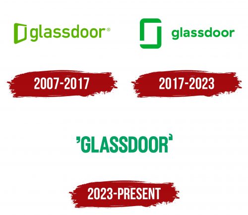
In 2007, Hohman, Besse, and Barton founded Glassdoor, using the former guitar warehouse as headquarters. The first graphic logo of the company was simple and concise. It was shaped like a trapezoid and looked like a three-dimensional frame that symbolized an open door. The brand’s name was written on the right, for which the designers used a sans serif lowercase font. Light green became the main and only color.
2017 – 2023
The Glassdoor team has been working on a new corporate identity for almost a year, enlisting the support of the creative agency Nelson Cash. The largest redesign in the company’s history touched both the interface and the logo. It took a rethinking of the brand to make its objectives more concrete. Because users interpreted the symbol differently in the form of a green frame, specialists had to make the geometric shape two-dimensional and give it a rectangle shape. These are now two right angles that form the door frame. At the same time, the font became round, and the green color took on a darker shade.
2023 – today
It received a unique logo after a rebranding associated with improving the online job search platform. At first glance, there is nothing unusual in it: a simple inscription with a straightforward site name. But hidden in this simplicity is a mystery you won’t notice immediately. Perhaps only a perfectionist would point to the incorrect formatting of the closing quotation mark. But! In reality, it is correct. It was invented by designers from the creative agency Koto, who were responsible for refreshing the brand identity.
The two symbols, located before and after the resource’s name, can only be considered quotation marks with a stretch: they are not. An observant person will instantly note their resemblance to the lowercase “g” and “d.” And that’s true: these are the letters in the word “Glassdoor.” They represent the initials of the brand name formed from “Glass” and “Door.” The font is translated into uppercase. The custom typeface has no serifs – it is smooth, even, and tall. Its author is Giulia Boggio, who was inspired by an office style. As the developer studio representatives noted, the special font humanizes the wordmark.
Glassdoor: Interesting Facts
Glassdoor is a trailblazing platform, reshaping how individuals worldwide approach job searching and company evaluation since its inception in 2008. It grants a unique glimpse into the workings of companies through employee reviews, salary disclosures, and more.
- Origins and Mission: Created by Robert Hohman, Rich Barton, and Tim Besse in 2007 and launched publicly in 2008, Glassdoor aims to enhance transparency in workplace cultures and the job search experience. It offers employees a platform to share their views and provides job seekers with previously elusive insights into companies.
- Content Driven by Users: Glassdoor’s strength lies in its extensive collection of user-generated content, including reviews, salary details, interview experiences, and photos of workplaces, all shared anonymously by past and current employees. This wealth of candid feedback offers valuable perspectives on company cultures, management styles, and remuneration.
- Expansion Worldwide: Originally from the United States, Glassdoor has broadened its reach internationally. It now provides resources in various countries and is an indispensable tool for job seekers and employers worldwide.
- Advocating for Salary Clarity: Glassdoor has been instrumental in advocating for open discussions about salaries. It allows for the sharing and comparing of compensation details for specific roles, aiding in the push for equitable pay across sectors.
- Evaluations and Company Scores: The platform enables employees to assess their workplaces on several criteria, such as work-life balance and career growth opportunities, culminating in an overall company rating. These evaluations significantly influence a company’s reputation as a place to work.
- Recognition and Awards: Glassdoor annually honors businesses with its “Best Places to Work” award based on employee input. This distinction is highly sought after and helps attract exceptional talent.
- Joining Forces with Recruit Holdings: In 2018, Recruit Holdings Co., Ltd., known for owning Indeed.com, acquired Glassdoor for $1.2 billion, facilitating further growth and expanding its capabilities.
- Redefining Job Searching and Hiring: Glassdoor has left a lasting mark on the recruitment landscape, enabling job applicants to make well-informed decisions and motivating employers to foster positive workplace environments.
- Insightful Interview Preparations: Besides offering insights into companies, Glassdoor offers a look into their interview processes. Job applicants share detailed accounts of their interview experiences, thus aiding others in their preparation.
- Leadership Ratings: The platform allows employees to evaluate CEOs, adding a layer of transparency regarding leadership quality and management approaches.
By championing transparency, Glassdoor has transformed the employment landscape, empowering employees and job seekers while encouraging businesses to adopt greater openness and act on employee feedback.
Font and Colors
The updated Glassdoor symbol creates a sense of symmetry and limitless possibilities. This is a modern interpretation of the original door frame, which, as before, stands for openness, honesty, and free access to information of interest. The open door invites you to look inside the company and find out what is going on.
The font of the first Glassdoor logo was almost identical to Alte DIN 1451 Mittelschrift Regular. But it is worth noting that this typeface appeared much later than the word mark – in 2009, Peter Wiegel developed it. Then the designers chose another version of the grotesque – with round and bold letters. The decision was made jointly with the specialists of the creative studio Nelson Cash.
The color also changed: a transition from light green to Glassdoor Green (# 0CAA41). This modern shade is used for both the logo design and the interface of the online platform.
Glassdoor color codes
| Pigment Green | Hex color: | #0caa41 |
|---|---|---|
| RGB: | 12 170 65 | |
| CMYK: | 93 0 62 33 | |
| Pantone: | PMS 354 C |
