Since 1984, it has been surprising, entertaining, and announced every day by La Cuarta, which means “fourth” in Spanish. The newspaper is widely known for its special tone of presentation, “plebeian” style of news headlines. Interestingly, photographers provide the paper with a weekly batch of nude photos, adding spice to the news reports.
The main target audience of the publication is the middle and lower economic class. It so happened that bright, expressive expressions adopted in the community became the main language of the newspaper. This makes it possible to succinctly and succinctly briefly talk about what happened and present the facts in an extremely interesting manner. The abundance of news related to crime, sexual relations, and other “peppery” topics for a long time riveted the public’s eyes to the newspaper. That is why it is so popular and does not lose its audience to this day.
In general, we can say that the newspaper is designed for the public, which is interested in gossip, terrible news, presented easily so that you can “gasp” and immediately turn over the page with a photograph of a beautiful woman, and forget about the incident.
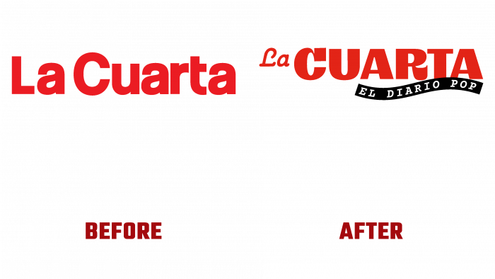
As for the logo, initially, the red letters of an even font without much zest were the hallmark of the newspaper. Nowadays, against a red background, white letters of various sizes and styles, as well as a Spanish postscript “Popular Diary” flaunt on the front page of the newspaper. We can say that such a logo reflects the tone of voice of the newspaper, reflects the presentation of facts interestingly and entertainingly. Here comedy, tragedy, and seriousness are conveyed; in general, everything is mixed together but does not burden the visual perception.
The public will readily read the edition, whatever the logo may be because the most important thing is the filling of the newspaper. And recognition will be in any case. Therefore, La Cuarta does not need to worry about how its beloved readers will perceive the new changes in the identity.


