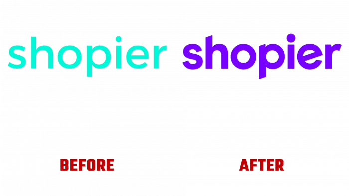
In the context of the development of modern technologies and quarantine, the Internet more and more covers the process of buying and selling, providing an opportunity to reduce direct contact between the seller and the buyer. To simplify and make online transactions easier and more comfortable, modern developers offer a variety of systems and applications. Among them, the Shopier platform is distinguished by its convenience and ease of use. It provides the ability to automate transactions in social networks, on trading platforms of any kind, located on the Internet. The program stands out for its greater security and availability, quick installation, and intuitive interface. Those who want to start trading on social networks can use the platform to start selling in just a few minutes. After making some improvements, today’s platform underwent a rebranding, which presented it to the consumer in a new way, making its visual identity more attractive and demonstrative. Its identity was handled by the multi-disciplinary independent design studio Fol, located in Istanbul in 2014.
The brand demanded radical changes in its identity, including strategy, style, mobile applications, digital and corporate print materials. Fol studio tried to strengthen the brand’s leading position through visual technologies and, first of all, by creating an understandable, accessible, and modern design of the new logo, which has acquired sharp edges of universal execution. Thanks to its features, the sign has proven to be very well compatible with all sub-brands and platforms. The new identity was supposed to distinguish him from competitors, make him recognizable and well remembered. This was achieved thanks to the colorful design, the creation of a spirit of sincerity and trust, which is especially important for users, with the help of three-dimensional elements.
The logo is made in compliance with the modern requirements of current trends. Simplicity and conciseness are the basis for the formation of the graphics of the logo. It is a textual reflection of the brand name. For this, a slightly transformed uppercase font of the type Gilroy Bold by Radomir Tinkov was used, from which some letters acquired beveled vertices, the letter “e” a middle line at an angle of 30˚ to the horizontal, and “r” – it’s more curved upper part. The graphics of the font evoke positive emotions and trust, which is especially important for this type of brand. The slopes of the vertices “h” and “p” – in the latter, this is done in the upper and lower parts, provided the creation of a visual graphic composition that can be easily combined with various images on the web and in print.
The used shade – Persian blue, characterized by saturation and positive impact, enhances the psychological effect of the required impact on the consumer.


