When you think about the ever-evolving world of e-commerce, Shop’s journey is a prime example of adaptability and growth. From its origins intertwined with Shopify to its current standalone brand, Shop’s journey is nothing short of a masterclass in brand evolution.
Emerging from Tobias Lütke and Scott Lake in Ottawa in 2006, Shopify has thrived under the umbrella of its parent platform. For years, Shopify relied on third-party payment processors. That changed in 2013 when a partnership with Stripe resulted in the launch of the Shopify Payments platform, marking the brand’s entry into its own level of payment processing. The years that followed were marked by constant innovation. 2017 was particularly notable for the launch of Shopify Pay, which emphasized fast checkout through data storage, and the introduction of Arrive, a mobile app aimed at enhancing the customer experience after a purchase.
The dawn of 2020 saw another major brand change. Shopify Pay became Shop Pay, and Arrive was rebranded to Shop. These changes weren’t just nominal: they combined payment and order tracking services into one integrated app. In September 2023, Brooklyn-based studio Porto Rocha breathed new life into the Shop brand identity, ensuring its relevance in today’s market.
When you think back to the Shop brand identity created in 2020, it was a product of its time. Grainy gradients, monospaced lines, and abstract patterns all echoed the prevailing branding aesthetic. However, the inclusion of doodle-style illustrations seemed somewhat inappropriate and too intrusive.
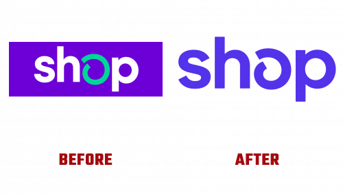
The updated Shop logo demonstrates its evolution. The swirling icon forming the letter “O” now has a more pronounced line weight. While there is a fine line between the words “Shop” and “Shap,” the context usually avoids confusion. With its streamlined look, the logo blends well across platforms and sizes, especially when presented in monochrome or as tiny buttons. In addition, the cooler shade of purple color gives the new design a touch of elegance.
The typography uses Good Sans by Good Type Foundry, a neutral yet vibrant font often found in creative fields such as art galleries. Given the Shop’s diverse range of products, the neutral font provides a harmonious blend with the vast amount of online content.
While retaining the underlying earthy tones, the palette now features flecks of bright colors that perfectly complement the dominant purple. This nuanced palette provides versatility, complementing many photographic backgrounds without looking overwhelming.


