


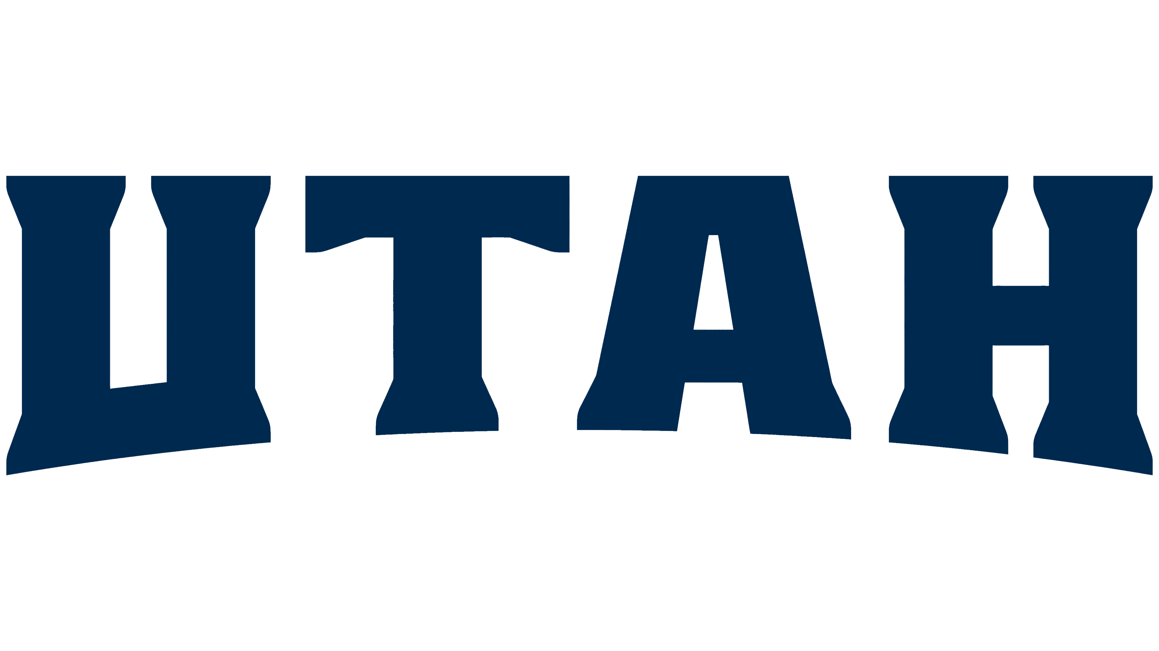
Utah has updated its tourism logo to mark the 20th anniversary of the Utah Life Elevated brand. Salt Lake City studio Afton Klein Group reworked the UTAH lettering while retaining the “Life Elevated” tagline. The letters reference rock formations and the Old West. The tourism office notified partners that the new identity was ready on July 7, 2026.
The Life Elevated campaign debuted in spring 2006. The tourism office and agency W Communications spent seven and a half months developing its name, tagline, logo, and advertising materials. The phrase connected mountain elevations with the emotional lift of travel and an escape from everyday routines. The current update retains the tagline and focuses on the wordmark’s shape and proportions.
Utah’s natural features inspire the logo. The identity guidelines connect the letters to mesas, natural arches, granite peaks, and erosion-shaped sandstone. Heavy strokes recall the rock formations and their enduring presence, while vertically elongated proportions extend the theme of height. Wedge serifs reference Old West lettering. These influences appear in four letters.
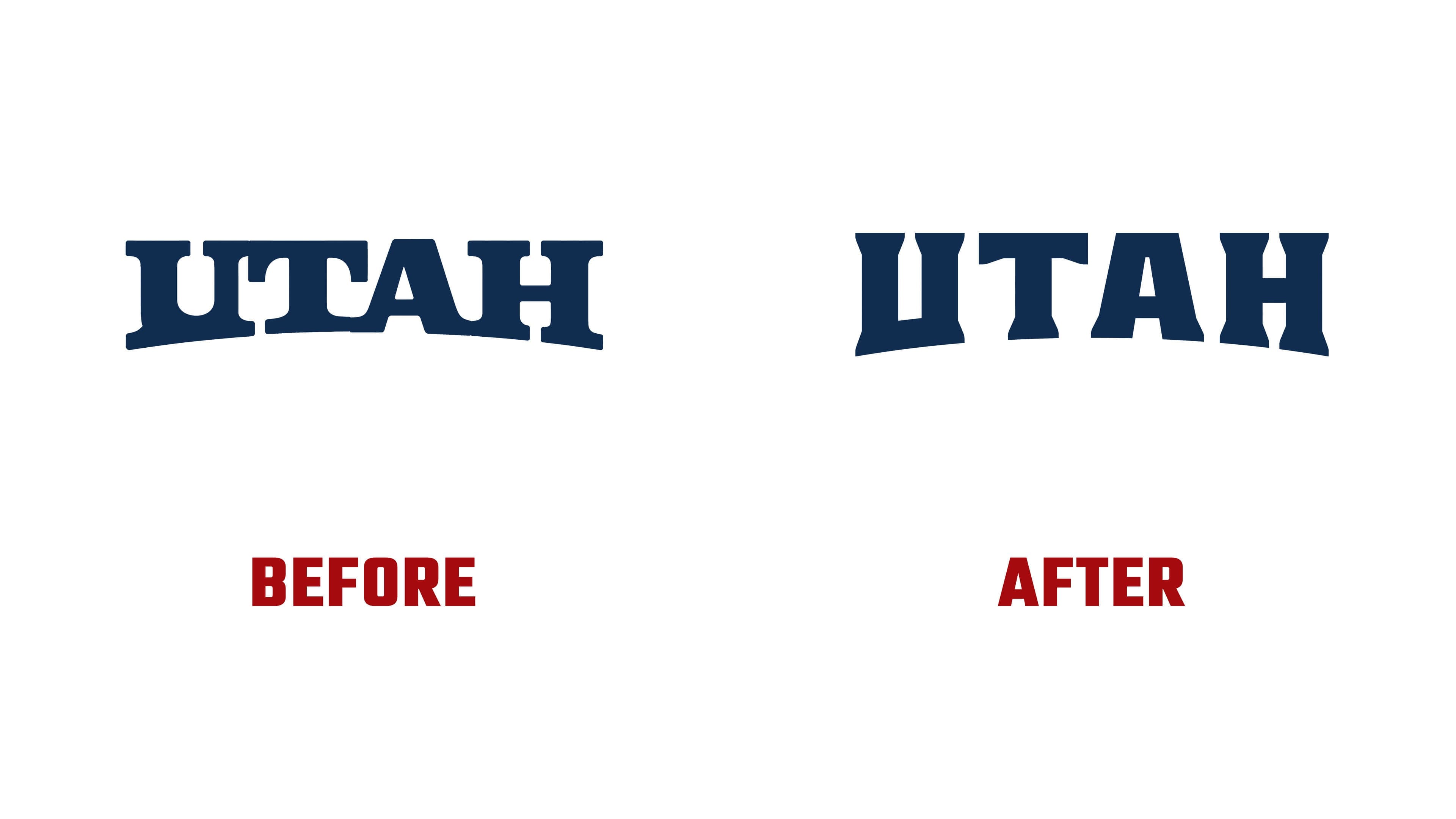
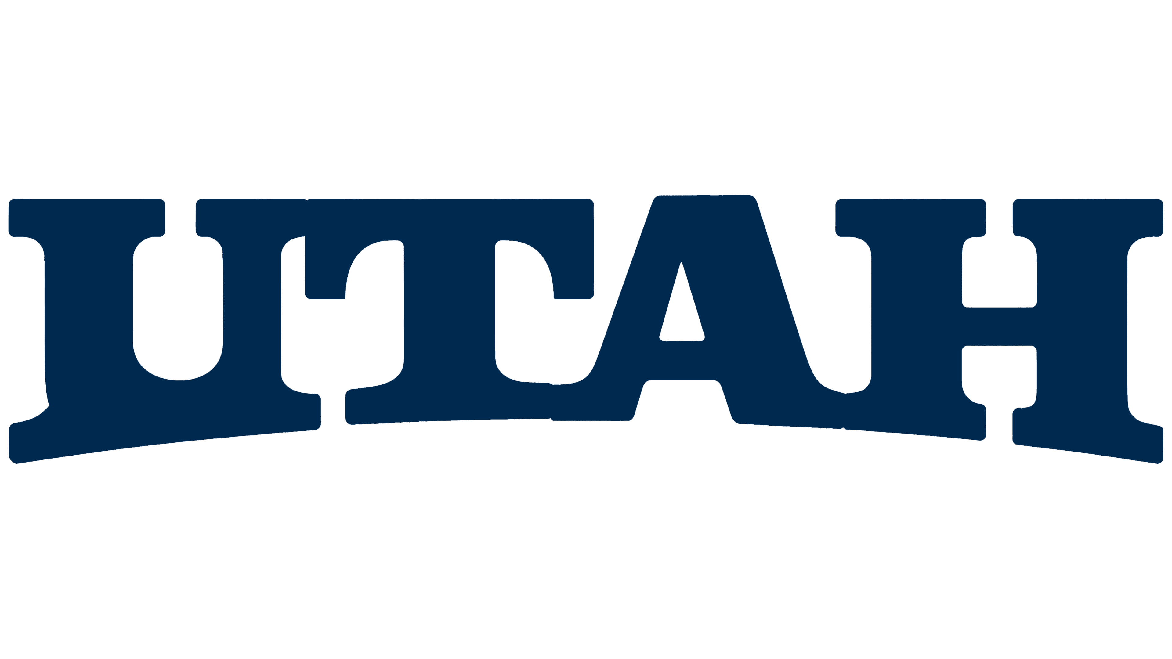
The differences between the two versions are evident in the word’s width and letter spacing. The previous wordmark was wider and more tightly spaced, with large rectangular serifs joined to the main strokes by rounded transitions. The new wordmark is more compact, with greater space between the letters and wedge-shaped terminals with angular cuts. Its lower edge still forms an arch that rises toward the center, while the top remains nearly level.
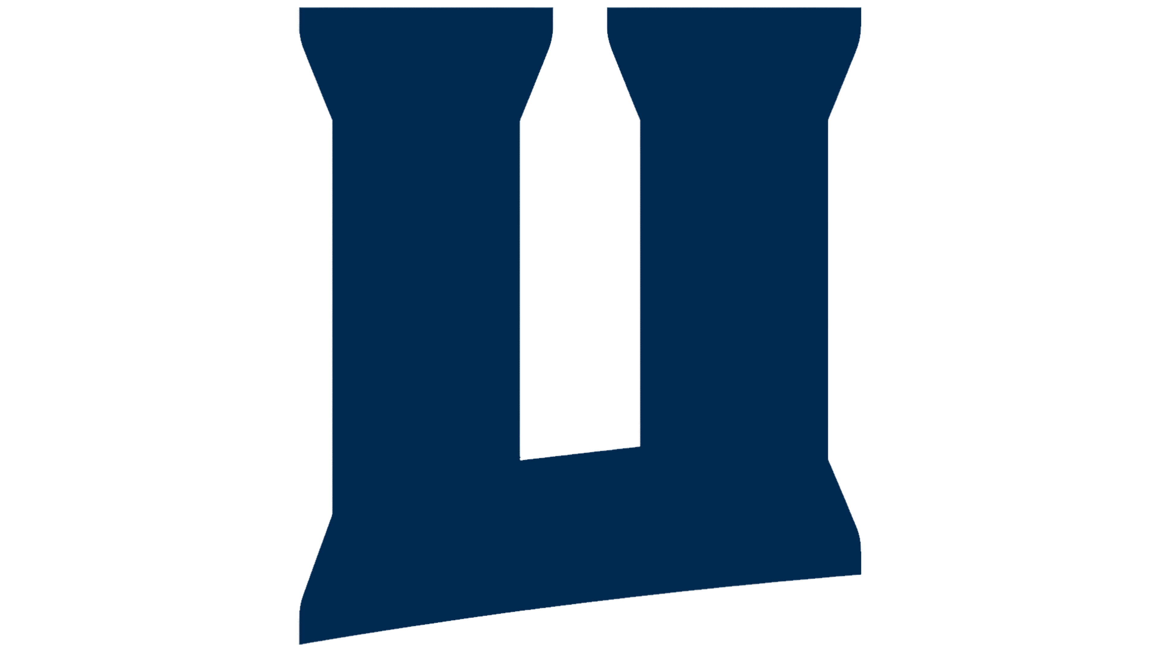
The designers gave particular attention to the “U.” Its counter is more rectangular, and its base is more angular. The “A” retains its flat top, while the “H” has revised connections between its vertical stems and serifs. Uniform stroke widths give the letters their substantial weight, and the familiar curve along the lower edge connects the update to the original logo.
“Life Elevated” appears beneath the name in a bold sans-serif typeface. Its letterforms and lack of wedge-shaped terminals distinguish it from UTAH. The system includes several layouts, a standalone UTAH wordmark, and a secondary emblem. All versions can be reproduced in a single color. The guidelines require the original proportions, placement, solid fill, and custom letterforms to remain intact.
Other materials explore Utah through contrasts between mountains and desert, north and south, and winter and summer. Oversized portions of letters extend beyond the edges of layouts. According to the studio, this treatment reflects the experience of discovering the state through individual views and changing perspectives. The primary colors are Desert Orange #FF6F00, Alpine Blue #0A44E2, and Powder white #FFFFFF. Additional color names reference local natural features and geography, including Golden Aspen, Uinta Sky, Deep Desert, Wasatch Blue, Salt, and Granite.
The guidelines recommend a white logo over color photographs and permit black on light images. In its July newsletter, the tourism office invited partners to adopt the new identity across websites, presentations, templates, and social media.