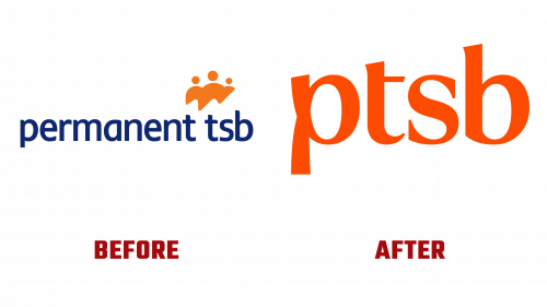
Irish bank, Permanent TSB – now called by the simpler acronym PTSB. As part of its plans to modernize its 200-year-old brand, it has unveiled a new logo that has drawn both approval and skepticism from experts and consumers. Designed to harmonize technological innovation with a “human touch,” the PTSB logo signals the evolution of the bank’s approach to customer service in the digital age.
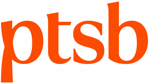
The updated logo is an interesting stylistic collage in which each of the bank’s initials – “p,” “t,” “s,” and “b” – has a unique design. The “p” initials are in a high-contrast sans serif style, the “t” and “b” have flared ascenders, and the “s” is in a different direction altogether, with serifs. Critics argue that these various elements look disjointed.
However, the logo is not without merit. It features an upward slant at the top of the letters “p,” “t,” and “b,” which adds personality to the entire design. However, the 3D drawing of PTSB’s logo has more mixed reviews, as critics believe it lacks clarity and is dissonant with the bank’s new slogan – “Completely Human.” This conflict between the desire to create a more approachable, human brand and a logo that looks corporate emphasizes the challenges facing the redesign.
On the other hand, the color scheme received positive reviews. Carefully selected shades allow us to find a balance between tradition and modernity, which reflects the bank’s long history and its desire for further development. In addition, the customized font, although not featured in the logo, received positive feedback when placed on the corporate website.
One strategic change that is hard to miss is the bank’s transition from the cumbersome “Permanent TSB” to the more concise “PTSB.” This change seems almost inevitable, given the global trend of financial institutions such as HSBC and BBVA using acronyms to make it easier to remember.
The new corporate identity symbolizes PTSB’s attempts to keep up with new trends in financial services, but it also sparks discussions about what works and what could be refined. Ultimately, the focus is on how the bank will use the brand to maintain its dual focus on technological innovation and human connection. It remains to be seen whether future updates will address the criticisms and build on the strengths of the initial design. As this complex financial rebranding process unfolds, the PTSB logo is likely to serve as an interesting case study for years to come.


