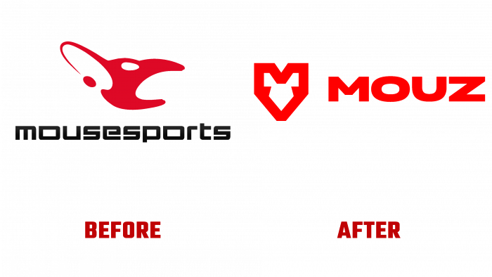
The German esports company Mousesports has carried out a large-scale rebranding and is now called and briefly – Mouz.
This decision was accompanied by the development of a new logo, which replaced the iconic old symbol.
The main reason for this change is that since 2002, when this organization was founded, the logo has always remained the same, but this did not affect the brand’s recognition by fans in any way. The fact is that too many esports companies appeared on the market, the company was lost among others, and the association of a logo with a brand, according to marketing research, was extremely weak. Even though the company was recognizable globally, fans couldn’t quickly identify the logo of their favorite.
The old logo imitated a mouse’s head and denoted the player’s palm, which was located on the gaming mouse. On the other hand, the new identification is much easier; however, the mouse-head idea remains.
A sharp, trendy and powerful logo automatically becomes part of the brand’s new identity, further attracting esports fans to the company.
Both the new name and the updated logo promise great success in the future because game fans are very fond of transformations and novelties based on visual creativity.
Soon it was announced that a line of merchandise would be created with new identity elements, so fans would be able to identify themselves among others by buying clothes or accessories with a new logo.


