


The Florian presents a residential project in Gramercy with a soft, warm image. The 54-unit building is designed for people starting life in New York. The presentation connects to the neighborhood’s green streets, historic architecture, and intimate residential scale.
The brand was developed from scratch by the agency Watson. The name The Florian is connected with flowers, soft light, and the feeling of a private city home. Through the name, the project gains a more personal image tied to Gramercy, the park, the streets, and the neighborhood’s residential culture.
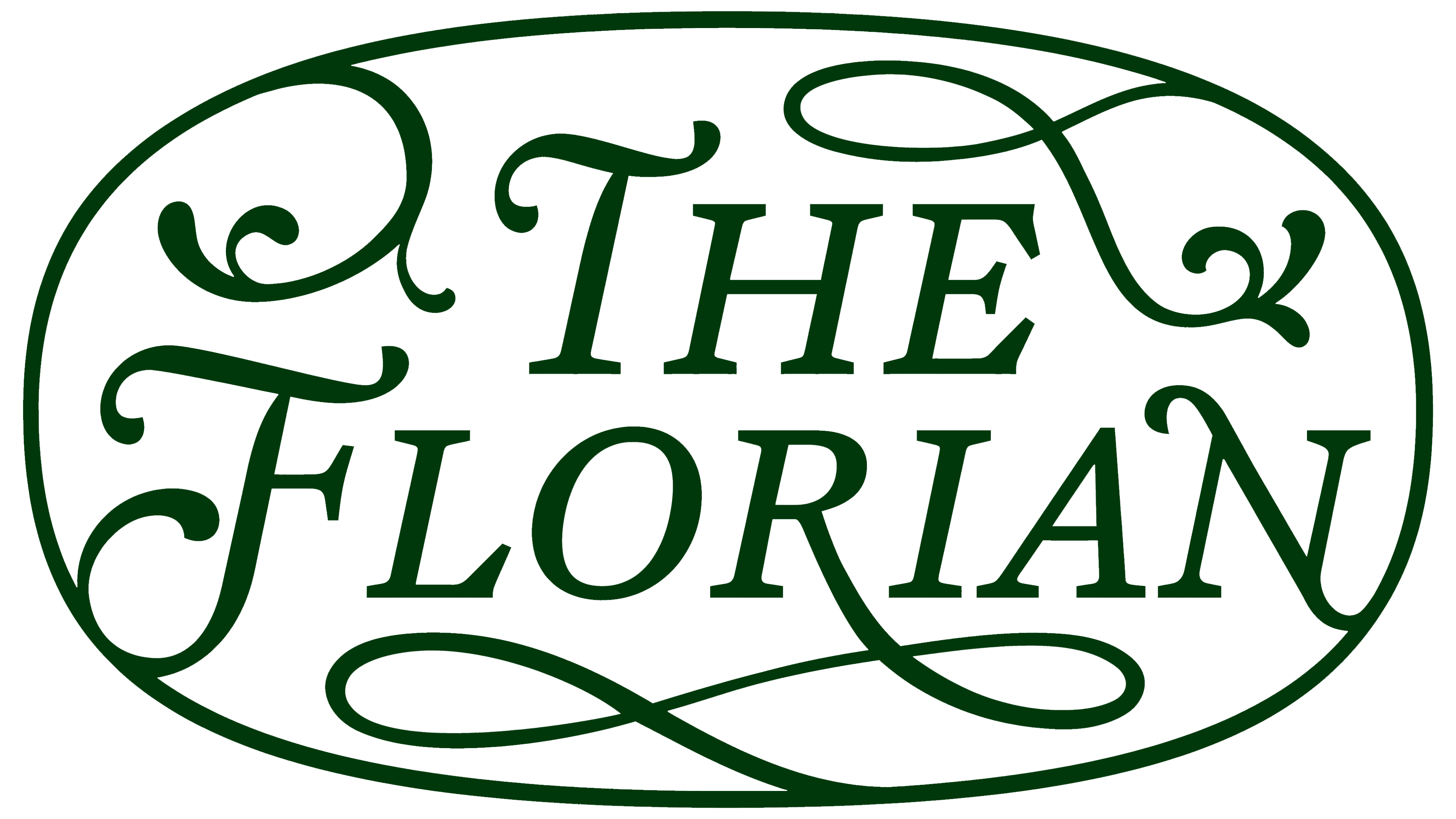
The logo became the main part of the identity. Instead of the cold sans-serif often seen in high-end real estate, Watson used classical serif typography, italics, lowercase letters, and a decorative fleur-de-lis. The wordmark resembles a bookplate or a mark in a private library. It feels warmer than a standard sign for a new residential building.
The logo is built on careful typography. The name is centered, the letters are set in an old-style typeface, the italics add softness, and the fleuron supports the floral theme. In the extended version, the mark is placed inside an elongated oval with rounded edges. Leafy lines move from the details of the letters into the frame, while the long flourish from the “R” fills the lower part of the emblem.

For The Florian, the logo evokes a historic residential address. Gramercy is associated with 19th-century architecture, a literary environment, and a private garden. The mark conveys these associations in a calm form. Beige and green colors support the themes of light, greenery, and home comfort without showy luxury.
The Florian identity is built on calm classicism, floral details, and soft typography. It is a modern residence in a historic New York neighborhood, where luxury is conveyed through form, scale, and the home’s atmosphere.