This is how the company demonstrates its vision of the world’s best burger.
SMASHBURGER used a bold color for a special grinder and placed the brand name in black in bold under the image. The kitchen appliance is part of the special preparation of each burger. It is used to press the bun against the preheated grill. It is fried in spiced butter for 10 seconds to create a caramelized burger base.
The aromatic crust is complemented by the juice of the other ingredients and together create an incredible flavor. A unique technique is reflected in the brand logo and, in the future, may become a distinctive feature of the brand.
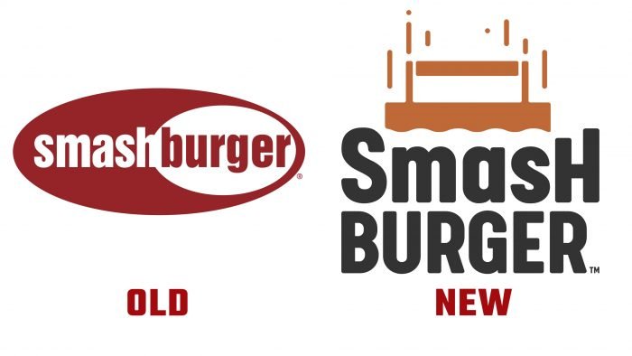
Last year, SMASHBURGER introduced several updates, such as an open kitchen and heated seating to keep takeout warm. It is also planned to open more than 20 new establishments using the already new logo. The brand is already using the logo in digital channels and has also begun changing the branded packaging.
According to Carl Bachmann, President of the company, the company has always been sensitive to selecting products, which is an important element of its activities. By the way, the creative agency Partners + Napier was engaged in the rebranding, which combined the institution’s principal elements and symbols. Add more culinary innovations, and you can safely surprise loyal customers and attract new consumers.


