The Meta logo represents infinity, which in turn symbolizes limitless possibilities. This correlates with the huge number of applications owned by the company and designed for different ways of interacting with users.
Meta: Brand overview
| Founded: | January 4, 2004 |
| Founder: | Mark Zuckerberg, Eduardo Saverin, Andrew McCollum, Dustin Moskovitz, Chris Hughes |
| Headquarters: | Menlo Park, California, U.S. |
| Website: | about.facebook.com |
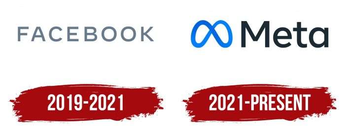
Meta is an American corporation that replaced Facebook, which was founded in 2004. It received a new name, retaining the old versions of all its services: social network, WhatsApp, Instagram, Oculus, Messenger.

The newly created parent structure also changed the logo, concept, and strategy of work, so the icons of these subsidiary applications are now transformed into a single logo. As noted by Mark Zuckerberg, the founder of the company, it will continue to develop: for example, soon, users will be able to manage other branded services and products without a social network. Meta was launched in 2021. Its headquarters are located in Menlo Park, California.
Meaning and History
The new corporation is a legal continuation of the previous organization. She will continue to deal with the socialization of users in the Internet space, but only from a more advanced perspective. Its priority will be the support of virtual and augmented realities, creating ideas for the Metaverse – a world whose name is derived from the combination of Meta + Universe. In July 2021, Facebook announced a set of developers for a service designed to integrate into the Facebook Reality Labs structure, focused on VR and AR projects. It was on them that the management staked.
In connecting digital worlds, immersiveness will be key. Users will feel as if the person in the digital space is next to them, although they will remain on the other end of the feed. With the help of a special Oculus headset and a device for video calls, the company has already learned how to “move” a real person into a room where another Internet user is present. And all this – regardless of the distance between them. It will also be possible to visit new virtual spaces, communicate within common platforms, advertise their products, make calls, play games, order goods, etc.
This means that Meta is promoting its services, translating them into virtual reality. The founder carried out a complete rebranding, aligning the name and logo with the company’s new goals. She is currently testing an app that will allow users to enter the digital world as avatars. They need virtual reality glasses, gesture control systems, voice interfaces, and smart gadget control techniques to join Metaverse. As a result, people will begin to move in a “parallel” universe as clones of themselves, participating in clones of any events and actions.
For a high-quality implementation of the idea, the activities of the newly created structure are now divided into two parts – the first deals with existing sites and services of the old type. The second oversees the development and implementation of advanced technologies with more advanced capabilities.
What is Meta?
Meta is the abbreviated name for Meta Platforms, Inc., which succeeds Facebook, Inc. It is a US multinational holding company – the parent company of Facebook, Oculus, WhatsApp, Instagram. The time of its foundation is 2021.
New Name and Logo
As noted by Mark Zuckerberg, founder of Facebook, the new service’s name is associated with the Greek language: it translates into English as “after.” According to the concept, the corporation received enough space for further development: it moves through parallel spaces, combining them with modern technologies. For example, users will be able to participate in a concert held simultaneously in real life and in virtual.
That is, Meta denotes a futuristic direction focused on innovative development and implementation of Metaverse technologies. It reflects the chosen concept, which unites the entire range of service programs and augmented reality devices to transfer what is happening in the virtual space.
After the rebranding, Meta received a radically different logo, so there is no talk of evolution here. This is a completely different product – a symbol of infinity. It includes the concept of endless possibilities, endless space, endless universes.
But the stylized sign looks more than just an inverted figure eight. It is also a double Möbius loop – an important topological object named after the inventor. It demonstrates the originality of our world and the ability to imagine existing life as a curved ribbon in three-dimensional Euclidean space. This look also fits into the new concept of Mark Zuckerberg.
Meta: Interesting Facts
Meta, evolving from Facebook Inc., is pivotal in social media and the broader technological sphere. Its rebranding in October 2021 marks a determined stride towards crafting the “metaverse,” envisaging a unified virtual space.
- Roots in Facebook: The inception of what is now Meta dates back to 2004, when Mark Zuckerberg and his Harvard peers launched Facebook, a platform that quickly grew from a college network to a global social medium.
- Broadening Horizons: Initially a social networking site, Meta has widened its scope to encompass other technologies and platforms, integrating Instagram, WhatsApp, and Oculus VR into its portfolio, thus establishing itself as a tech conglomerate.
- Metaverse Vision: The shift to Meta underscores the company’s commitment to spearheading the metaverse concept, aiming to merge VR and AR into interactive digital realms, transcending the confines of conventional social media.
- Connectivity Endeavors: Meta’s ambition extends to enhancing internet accessibility, with projects aimed at connecting remote regions, reflecting its innovative spirit in bridging digital divides.
- AI Exploration: Meta’s investment in AI research is profound. It advances algorithms that refine user experiences across its platforms while contributing to broader AI advancements.
- Economic Influence: Through targeted advertising and business tools, Meta has opened avenues for global economic engagement, facilitating business growth and customer interaction worldwide.
- Regulatory Hurdles: Despite its successes, Meta navigates complex challenges related to privacy, data management, and its societal impact, engaging in ongoing dialogues and adjustments in response to scrutiny.
- Innovative Work Environment: Known for its dynamic workplace culture, Meta encourages creativity and innovation among its team, supported by its collaborative space in its Menlo Park headquarters.
- Forward Momentum: Facing adversities head-on, Meta persists in exploring new technological frontiers, with the metaverse project emblematic of its forward-thinking approach to digital interactivity and connectivity.
Meta’s transformation from a college networking site to a technology leader illustrates its significant role in digital evolution and its ambitious vision for an interconnected, immersive future.
Font and Colors
Many users ask themselves the question: why exactly now there was a renaming of Facebook with a radical change of identity? There are several reasons for this, the main one being the desire to eliminate the many negative aspects associated with the old name of the social network and its logo. It’s just that there have been frequent attacks on her lately, both emotional and technical. The result was verbal battles, irritation, discontent, periodic disruptions.
The second factor in the profitability of rebranding at the moment is associated with the coronavirus pandemic: due to lockdowns, the population has gone deep into the Internet in search of communication. The number of users has grown rapidly, and they are looking for a replacement for living relationships. And Meta intends to give them that opportunity. In the created space, it will be possible to communicate and trade, promote products, advertise oneself, improve oneself, make purchases, and so on.
The lettering in the logo is made in full-size sans serif – smooth, even, expressive, and easy to read. The typeface resembles the Nexa Text Bold and Carmen Sans Semi Bold fonts as much as possible.
The corporate palette has been preserved – it has remained blue. However, its spectrum has shifted slightly towards the saturated side – closer to neon than classically bright. Moreover, a subtle gradient is visible in the tape, almost imperceptible – with a smooth transition from dark to light colors. The company name is colored black.
Meta color codes
| Celtic Blue | Hex color: | #0668e1 |
|---|---|---|
| RGB: | 6 104 225 | |
| CMYK: | 97 54 0 12 | |
| Pantone: | PMS 2728 C |
| Azure | Hex color: | #0080fb |
|---|---|---|
| RGB: | 0 128 251 | |
| CMYK: | 100 49 0 2 | |
| Pantone: | PMS 2727 C |
| Gunmetal | Hex color: | #1c2b33 |
|---|---|---|
| RGB: | 28 43 51 | |
| CMYK: | 45 16 0 80 | |
| Pantone: | PMS 5463 C |
