The Instagram logo, with its succinct and comprehensible design, serves as an accurate and vivid reflection of the brand’s essence. The LAN feature, which enables photo/video sharing and interaction, is symbolized by a futuristic camera sign image combined with an appealing calligraphic font.
Instagram: Brand overview
| Founded: | October 6, 2010 |
| Founder: | Kevin Systrom, Mike Krieger |
| Headquarters: | San Francisco |
| Website: | instagram.com |
Meaning and History
The main activity of the eponymous company and social platform is image publishing, as reflected in the company’s logo. The ability to post video files came much later, necessitating a redesign. However, the idea has always remained the same: communication through personal photo and video content. Therefore, the initial version of the emblem sometimes changed but remained within the concept.
What is Instagram?
Instagram is a global social network where users can post and edit photos. It offers the option to add geotags and hashtags for easy searching and viewing. The platform was launched in 2010 for iOS and is now compatible with the most popular systems. Its creators are Mike Krieger and Kevin Systrom, and its current owner is Meta Platforms.
2010
This period includes two icons: one debut and the other revised. The first logo featured a camera depicted head-on. It’s a Polaroid, where photos print immediately after pressing the button. Alternatively, the logo shows a retro camera from the tripod category, used for photography in the early last century. Regardless, the service attracted most users’ attention and was in demand.
2010 – 2011
The second emblem was developed after a massive influx of visitors interested in photo publications and posting videos. Adhering to modern principles and the relevance of requests, the designers adjusted the icon, emphasizing the camera lens. It’s enlarged and placed in the center. The viewfinder window is appropriately on the top right. On the left are vertical rainbow stripes, emerging from the platform’s shortened name – “Inst,” written in the Billabong font.
2011 – 2016
In 2011, the branding underwent minor changes. The owners highlighted some elements and introduced new ones. For example, the bright stripes now look distinct due to sufficient width. The camera lens became detailed, looking real with added highlights, lighting, and 3D volume. The inscription was also redesigned: it included the letter “a” and an original custom-designed font.
2016 – 2022
In this version, the designers decided to depart from the classic camera image, retaining only schematic outlines. As a result, the brand logo looks futuristic, capturing visitors’ attention. The modern logo contains four elements: the lens (in the center), two “body” parts (around), and a dividing line. The color scheme became brighter – in a gradient from light pink to deep purple with white lines.
2022 – today
The current Instagram logo is almost identical to the previous version. There are no differences in the placement of elements and design, but the application of the color scheme is noticeable. The modern emblem is much brighter and more colorful than its predecessor. Moreover, it leans towards the neon spectrum, so the sign has more golden and pink-fuchsia shades. The transition between them is very harmonious, as the developers used a gradient. Yellow, for instance, starts from the middle and occupies the lower part of the logo. Pink goes from top to bottom and smoothly flows to the right. Blue is also present but in a limited amount. It can only be seen in the top left corner. The improvised camera remained the same, looking like a square with rounded corners, a circle in the center, and a white dot on the right.
Instagram Logo Wordmark
Instagram uses a logo based on the legendary Polaroid camera. Over time, its image has evolved from realistic to schematic. The image is executed head-on with the main technical elements: buttons and the lens. The emblem’s color changed likewise – from real to abstract. It now includes a yellow-pink-purple gradient.
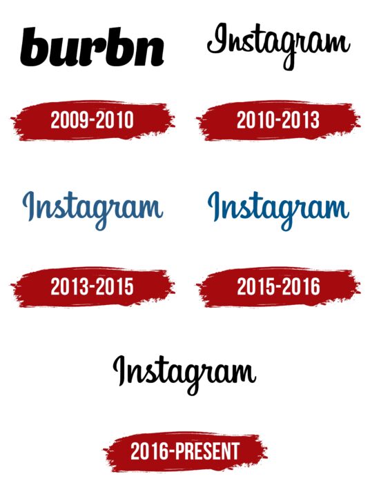
2009 – 2010
The inscription became bold and lowercase. Massive black letters were distinct against a white background. They were smooth and rounded, without internal angles or serifs. Both “b” letters had diagonal cuts at the top. The letters “r,” “n,” and “u” at the bottom had miniature bends of the same shape.
2010 – 2013
By the time the corporate inscription appeared, it closely resembled handwritten text. Especially notable were the initial “I” with an upper oval and elongated leg, and “m” with elements of different heights, and “s,” close to the print version.
2013 – 2015
In May 2013, a new wordmark was approved, custom-designed by the agency Mackey Saturday. This version is much smoother than the previous one, resembling a neat calligraphic handwritten text.
2015 – 2016
The designers changed the color of the word “Instagram,” making it a more saturated blue.
2016 – today
On May 11, 2016, the interface color changed to black, while all other elements remained the same.
Instagram: Interesting Facts
Instagram is a popular app that allows people to share photos and videos. It has changed how we use social media a lot.
- Starting Out: Instagram was created by Kevin Systrom and Mike Krieger on October 6, 2010. It became popular quickly, reaching one million users in just two months. When it was made available for Android phones in April 2012, it jumped to 30 million users.
- Facebook Buys Instagram: In April 2012, Facebook bought Instagram for about $1 billion. This was a big deal because it showed how important Instagram was for sharing phone photos.
- Stories Feature: In August 2016, Instagram added Stories, letting people post photos and videos that disappear after 24 hours. This was similar to what Snapchat does and made even more people use Instagram.
- IGTV and Reels: To keep up with YouTube and TikTok, Instagram added IGTV in 2018 for longer videos and Reels in 2020 for short, fun videos. This helped Instagram stay popular with people who like watching videos.
- A Billion Users: By June 2018, Instagram had a billion people using it every month, making it one of the biggest social networks in the world.
- The First Photo: In July 2010, Kevin Systrom posted the first photo on Instagram, showing a dog in Mexico.
- Changing How Posts Are Shown: In 2016, Instagram changed from showing posts in the order they were posted to using an algorithm that shows posts you think you’ll like more. Not everyone liked this change.
- Helping With Mental Health: Instagram has added features to help make the app a nicer place, like letting you hide how many likes a post gets and making it easier to block mean comments.
- Good for Business: Instagram is important for businesses and people who want to sell things or become famous online. It lets them show their products and connect with lots of people.
- Changing Culture: Instagram has greatly impacted what’s popular in fashion, travel, and lifestyle. It’s also where many people get their news and learn about new trends.
Instagram keeps adding new features to ensure it’s a fun and useful app for everyone. It plays a big part in our digital lives.
Font and Colors

Instagram logo black and white
Initially, the graphic palette included the original colors of the Polaroid camera: gray, beige, brown, black, white, greenish with reflections, and a rainbow marker. Later, a bright version appeared, predominated by purple, pink, red, and white shades. The textual part’s palette is more modest, consisting of black, blue, and navy. The logo’s font is handwritten, calligraphic, strictly vertical, without any tilt.
Instagram color codes
| Byzantine Blue | Hex color: | #405de6 |
|---|---|---|
| RGB: | 64 93 230 | |
| CMYK: | 72 60 0 10 | |
| Pantone: | PMS 2728 C |
| Majorelle Blue | Hex color: | #5b51d8 |
|---|---|---|
| RGB: | 91 81 216 | |
| CMYK: | 58 63 0 15 | |
| Pantone: | PMS 266 C |
| Medium Violet | Hex color: | #833ab4 |
|---|---|---|
| RGB: | 131 58 180 | |
| CMYK: | 27 68 0 29 | |
| Pantone: | PMS 7442 C |
| Medium Red Violet | Hex color: | #c13584 |
|---|---|---|
| RGB: | 193 53 132 | |
| CMYK: | 0 73 32 24 | |
| Pantone: | PMS 219 C |
| Cherry | Hex color: | #e1306c |
|---|---|---|
| RGB: | 225 48 108 | |
| CMYK: | 0 79 52 12 | |
| Pantone: | PMS 191 C |
| Neon Red | Hex color: | #fd1d1d |
|---|---|---|
| RGB: | 253 29 29 | |
| CMYK: | 0 89 89 1 | |
| Pantone: | PMS Bright Red C |
| Portland Orange | Hex color: | #f56040 |
|---|---|---|
| RGB: | 245 96 64 | |
| CMYK: | 0 61 74 4 | |
| Pantone: | PMS 171 C |
| Burnt Orange | Hex color: | #f77737 |
|---|---|---|
| RGB: | 247 119 55 | |
| CMYK: | 0 52 78 3 | |
| Pantone: | PMS 165 C |
| Yellow Orange | Hex color: | #fcaf45 |
|---|---|---|
| RGB: | 252 175 69 | |
| CMYK: | 0 31 73 1 | |
| Pantone: | PMS 1375 C |
| Jasmine | Hex color: | #ffdc80 |
|---|---|---|
| RGB: | 252 179 69 | |
| CMYK: | 0 31 73 1 | |
| Pantone: | PMS 134 C |
| Black | Hex color: | #000000 |
|---|---|---|
| RGB: | 0 0 0 | |
| CMYK: | 0 0 0 100 | |
| Pantone: | PMS Process Black C |
