The Oculus logo is a window into the world of virtual reality. No one knows what awaits the user inside. The emblem indicates autonomy and mystery. The sign clearly outlines the boundaries of the unusual world and beckons to look inside.
Oculus: Brand overview
Meaning and History
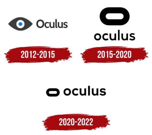
The manufacturer of software and hardware products released its first headset in 2012. Since then, a lot has changed: the company has evolved with VR technology, creating advanced devices and next-generation games. Her logo has also evolved, moving from the frightening eye many associate with the Illuminati to a stylish black-and-white oval.
What is Oculus?
It is a US-based virtual reality immersion software and hardware company. It appeared in 2012 and is a subsidiary of Meta.
2012 – 2015
When Oculus was a green startup raising money for the Rift prototype, it got the eye logo. This sign symbolized virtual reality, but the blue pupil, white iris, and dark gray sclera looked unnatural and eerie. The primitive drawing consisted of simple geometric shapes: a circle, a ring, and an ellipse with sharp corners. However, it had no artistic value, which did not stop the company from making its logo and becoming famous worldwide.
To the right of the image was the gray Oculus inscription. This Latin word became the project’s name because it translates as “eye.” There is a double connection here: with the eye emblem and the visual perception of VR games when using a special headset.
2015 – 2020
In 2014, Facebook took over the company. The new owner decided to “mark” it as his property, so he made a small rebranding. The new design presentation occurred on June 11, 2015, at a press event coinciding with the Electronic Entertainment Expo.
However, fans could see the transformed logo even before the briefing. It appeared on the official Oculus website, then spread throughout the rest of the brand, eventually replacing the eye with geometric shapes.
Although users did not see something completely new, the designers retained the emblem’s horizontally elongated shape and geometry. It is the same eye but without the blue pupil and sharp corners. The lettering also remained the same, except for a slight modification of the font and the translation of the first letter “O” into lowercase.
This logo collaborates with the talented graphic artists Jon Malkemus, Nicolaus Taylor, Mackey Saturday, and Cory Schmitz. By joining the Oculus team’s creative efforts, they created a bold design now associated with a virtual reality headset.
The current icon is an elongated “O” that looks like the front of VR glasses. By the way, the slider on the underside of the devices also simulates this symbol’s shape. The word “stadium” was used to designate the emblem in the press kit, but it did not become common due to the lack of obvious logical connections. However, the extended “O” resembles a stadium from a bird’ s-eye view.
The developers have tried to create a visual identity that would suit future Oculus products. Given the constant development of virtual reality technologies, they needed to make a logo “for growth.” So, an abstract and minimalistic sign is quite justified. It has limitless potential, allows for sub-brands, and looks good in any size.
By abandoning the old design, the company solved several problems at once. First, the eye was associated with an undercover observer and reminded users of a Facebook data breach. Secondly, the new geometric symbol is similar to the head-up display and does not raise doubts about what Oculus is doing.
The only drawback of the elongated letter “O” is excessive simplicity. Drawing a rectangle with rounded sides doesn’t take long, so the American software maker Oracle and the German clothing label Vonrosen have the same logo.
The first logo was written in Oculus’ signature Cabin Bold. It can still be found on the company’s websites today. The closest related variants are DIN Mittel Medium and Source Sans Pro, but they are not identical. In 2015, the design team changed the shape of the letters a bit, removing the bottom bar from the “l,” expanding the horizontal strokes of the “u,” and increasing the angle of the cut at the ends of the “c.” Also, they expanded the letter spacing and made all characters lowercase, which was not the case in the previous version.
The caption can be located either below or to the right of the stylized “O.” Both elements are black on a blank white background. Monochrome is another expression of Oculus’s minimalism, designed for the logo’s versatility.
2020 – 2022
The logo received a different configuration after a small modernization by the design studio Moniker and in-house. The elements are now arranged in one row instead of being ungrouped in two as before. To do this, the authors reduced the size of the horizontal oval, which symbolizes the eye, and placed the letters a little further from one another.
Oculus: Interesting Facts
Oculus, known for its virtual reality (VR) tech, has made VR mainstream since Palmer Luckey founded it in 2012. Starting with a Kickstarter campaign, Oculus quickly became a leader in VR.
- Kickstarter Launch: Oculus began with a 2012 Kickstarter, aiming to fund its first VR headset, the Oculus Rift. The campaign was a hit, raising over $2.4 million beyond the $250,000 goal.
- Bought by Facebook: In 2014, Facebook (now Meta Platforms, Inc.) bought Oculus for about $2 billion, giving it more development resources and showing big tech’s interest in VR.
- First VR Headset: The Oculus Rift, released in 2016, was praised for its display quality, head tracking, and immersion. Oculus later released the Oculus Quest and Quest 2, standalone headsets that don’t need a PC.
- Touch Controllers: Oculus also created the Oculus Touch controllers, which make virtual interactions more natural by tracking hand movements. This improves the VR experience.
- Quest 2 Success: The Oculus Quest 2, released in 2020, was very successful due to its higher resolution, better performance, and lower price, making top-notch VR more widely available.
- Social VR: With Facebook (Meta) behind it, Oculus has focused on social VR. Platforms like Oculus Rooms and Facebook Horizon let users meet and interact in virtual spaces, fitting into Meta’s vision for the metaverse.
- VR Content Ecosystem: Oculus supports a broad range of VR content, from games to educational apps, and helps independent developers through programs like Oculus Start and LaunchPad, encouraging content variety.
- Business Solutions: Oculus offers VR solutions for businesses, such as training simulations and collaborative workspaces, which shows VR’s potential outside entertainment.
- VR Experience Tech: Oculus created Asynchronous TimeWarp and SpaceWarp to smooth VR experiences, even on slower hardware, reducing motion sickness and enhancing comfort.
- Community and Developer Support: Oculus has a strong community of VR enthusiasts and developers, offering forums, conferences like Oculus Connect (now Facebook Connect), and resources to advance VR.
Oculus’s rise from a Kickstarter project to a key player in the metaverse shows VR’s fast growth and expanding role in gaming, work, and social interactions.
Font and Colors
The modern version still uses the Custom typeface, but the letter spacing in the word “Oculus” has become a little wider, adding lightness and readability.
FAQ
When did Oculus change its logo?
On October 29, 2021, Meta, formerly known as Facebook, announced that the brand, including the Oculus Quest series, would be renamed Meta Quest. The logo changed to reflect Meta’s new style. This change brought virtual reality products under the Meta umbrella, showing the company’s focus on creating a metaverse.
The new Meta Quest name and logo appeared in 2022. The logo has a modern design that aligns with Meta’s branding strategy. This rebrand shows Meta’s commitment to growing in virtual reality and integrating its products into the broader vision of connected digital experiences.
What does an Oculus do?
The device is mainly used for virtual reality (VR) games. The headset creates a 3D environment that reacts to your movements, making it feel like you’re inside the game.
It’s well suited for virtual meetings, allowing you to collaborate with others in a shared virtual space. This is useful for remote work and makes meetings more interactive than regular video calls. For studying, the headset offers educational capabilities in virtual reality. These include virtual tours of historical sites and interactive science lessons, making learning more engaging through immersion.
The brand supports various simulations that are useful for learning. Pilots can use it for flight simulation, and healthcare professionals can use it for medical simulation. These realistic simulations provide a safe way to practice skills.
What does the Oculus logo mean?
The logo represents an eye, corresponding to the name “Oculus,” which comes from the Latin word for “eye.” The logo is a horizontal oval with a wide black outline and a white center, resembling an eye.
This design shows the brand’s desire to create immersive visual experiences in virtual reality. The eye refers to vision and perception, which are key in virtual reality. The simple and clear logo design facilitates recognition and strengthens brand identity in the technology and virtual reality industry.
What does the Oculus logo look like?
The logo resembles an eye or a virtual reality device. It features an ellipse with a bold black outline and a white center. Next to the icon is the word “Oculus,” which means “eye” in Latin.
The design is simple and modern, reflecting the brand’s focus on visual technology and immersive experiences. The bold black outline makes the logo stand out, while the white center highlights the shape of the eye. The word “Oculus” emphasizes the connection between vision and perception, which is crucial in virtual reality.
Does Facebook own Oculus?
Yes, the brand is owned by Meta, formerly known as Facebook. Facebook bought the brand for $2 billion to combine a social network with virtual reality technologies.
The goal was to create a new social experience through virtual reality. Meta began actively using these technologies, achieving success in the VR industry. The brand now plays an important role in Meta’s vision of the metaverse, a virtual space where people can interact, work, and play.
Is the Oculus logo copyrighted?
The logo is not officially copyrighted because it uses simple geometric shapes and a generic word. Copyright law requires originality and creativity, which are not included in logo design. However, trademark law protects the logo.
Trademarks cover symbols, names, and logos used in trade to identify products or services. This protection prevents consumer confusion and preserves brand identity. The logo benefits from this protection, ensuring that others cannot use a similar logo to mislead or confuse customers.

