


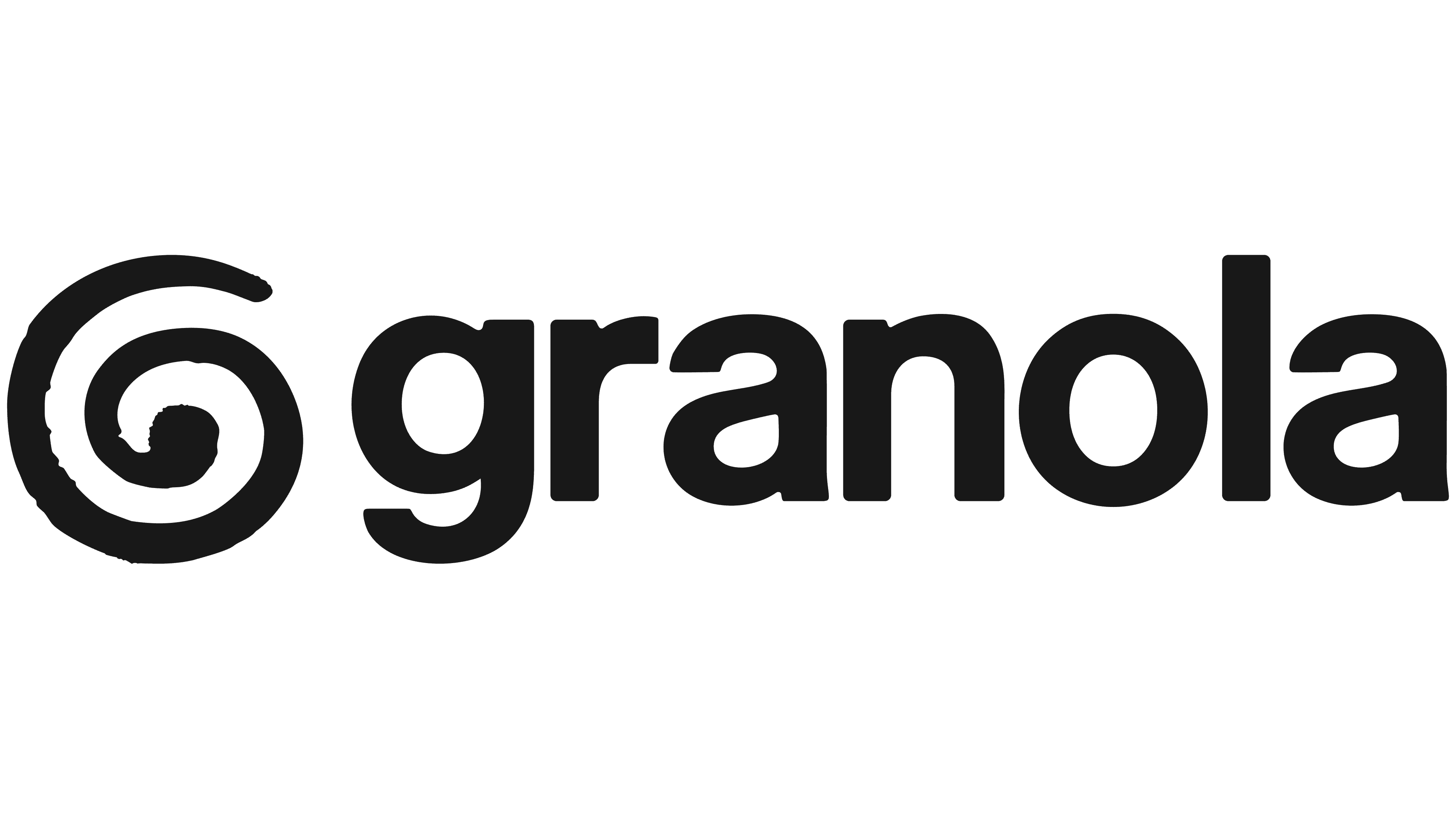
London studio Ragged Edge has given Granola a new identity as a calm companion for everyday work. Unveiled on February 2, 2026, the update replaces the logo’s text cursor with a hand-drawn spiral resembling the letter “G.”
Granola uses AI to take notes during video calls, phone conversations, and in-person meetings. Available on desktop and mobile devices, the service captures conversations and creates follow-up tasks. The London company grew from a team of 4 to nearly 100 employees. The original identity formed over a few intense days, and as the product matured, it needed a new look. Co-founder and designer Sam Stephenson wanted to give Granola a distinct personality and present it as an assistant that frees up time amid work demands and packed calendars.
Ragged Edge developed the idea of room to think. With the app handling notes, users can focus on the conversation and explore ideas. The messaging emphasizes what people accomplish and how they feel as they work. The new emblem connects the first letter of the name with a process of experimentation, intermediate steps, and gradual growth.
The spiral sits to the left of the Granola wordmark. A thick line with uneven edges forms irregular loops that end in a rounded tip at the center. Varying gaps between the curves give it a hand-drawn appearance. According to Ragged Edge, these imperfections convey the human side of an AI-powered product.

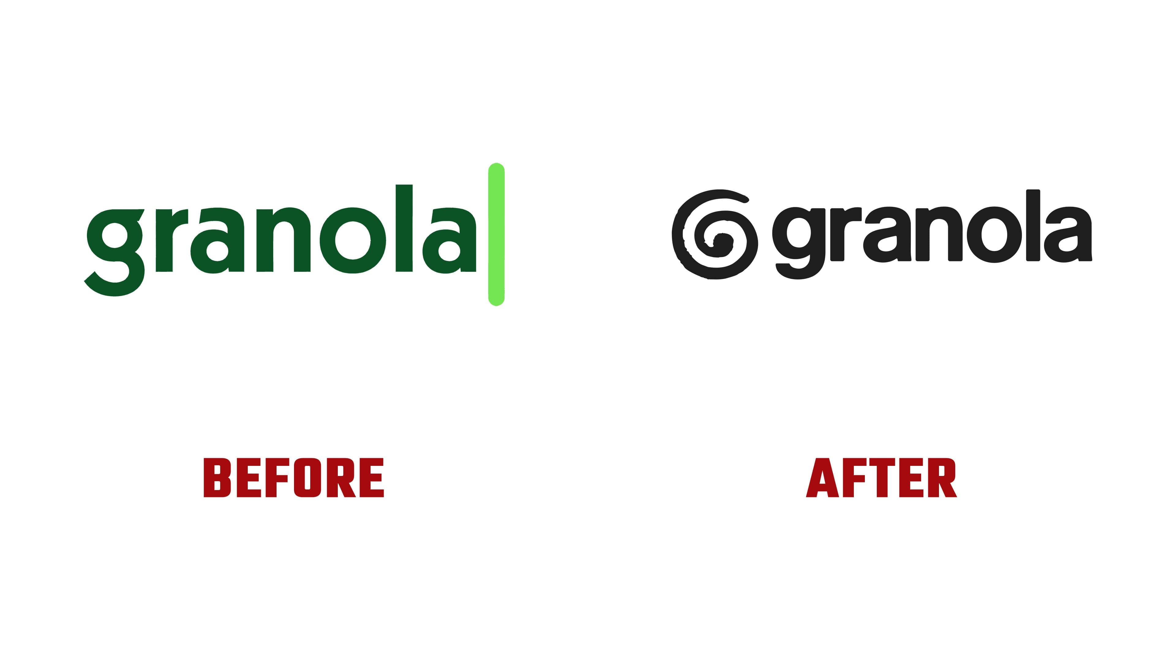
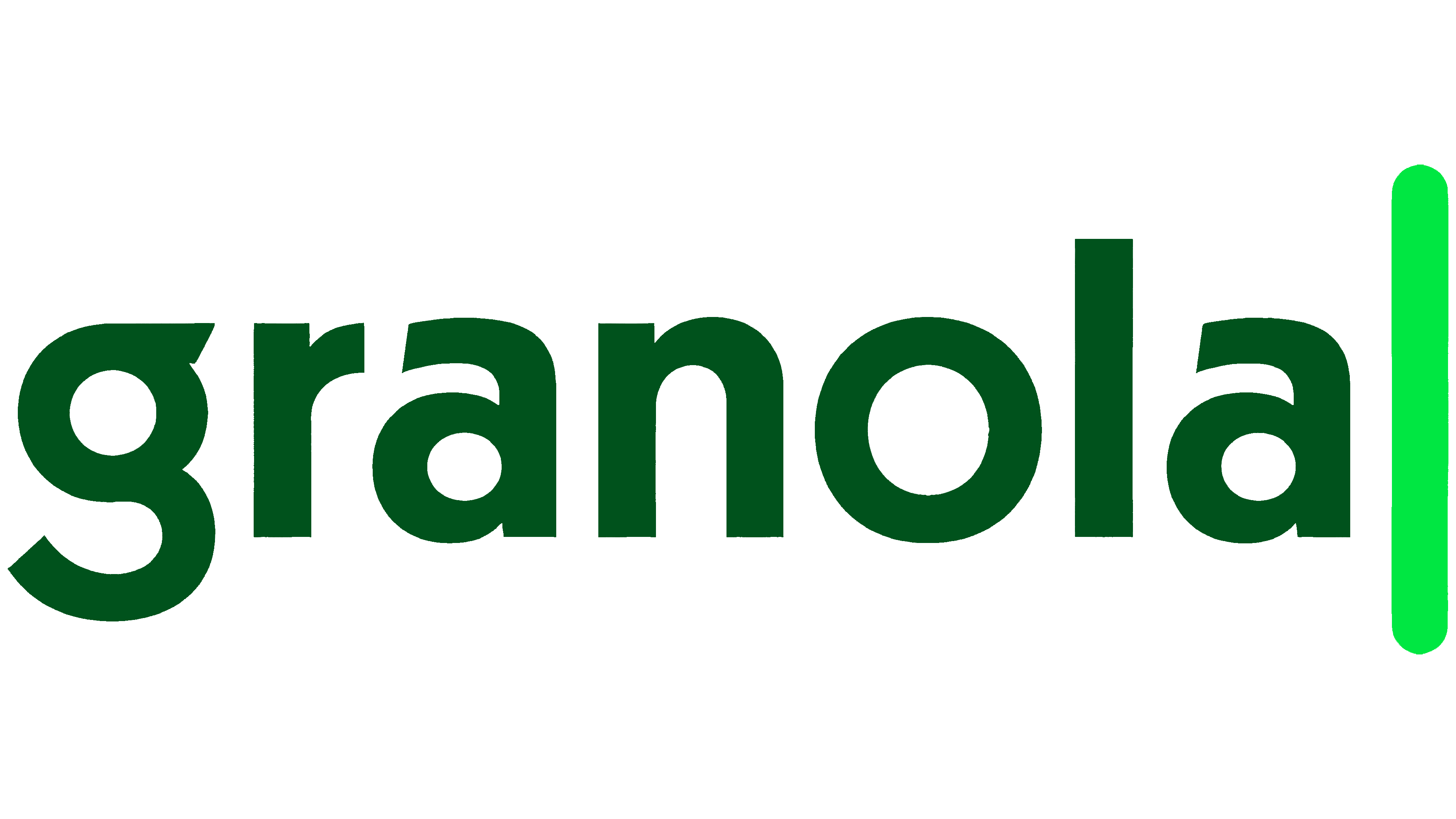
The previous logo used a text cursor to suggest note-taking. A vertical bar with rounded ends and a bright green gradient stood to the right of the dark green name. The lettering was uniform and tightly spaced. The new version retains the lowercase, bold sans-serif lettering but introduces softer corners and slightly irregular stroke joins. Subtle variations in stroke thickness bring the wordmark closer to the hand-drawn spiral. Short ascenders give the name squat proportions, while the standalone “G” serves as the app icon.
The team designed the icon to work across different appearance settings while keeping a consistent look across the Dock, Finder, Launchpad, and Spotlight. For macOS Tahoe, it created light, dark, clear, and tinted versions of the standard icon. Green remains part of the identity, including a muted light shade. In a side-by-side comparison with the previous version, the new logo appears in black. Collages of paper cutouts and materials gathered during the creative process round out the identity. They appear on the website, in the apps, and in outdoor advertising across London, New York, and San Francisco.
Following the February unveiling, users on LinkedIn, X, and Reddit sharply criticized the hand-drawn spiral and light green background. The team kept the new identity. On the day of the announcement, Granola recorded its highest single-day download count ever.