The Reddit logo has its own face and watches what users post. The emblem is friendly. Shows that they are always ready to read and evaluate the participants’ messages. The sign promises communication and a fair count of votes.
Reddit: Brand overview
| Founded: | June 23, 2005 |
| Founder: | Steve Huffman, Aaron Swartz, Alexis Ohanian |
| Headquarters: | San Francisco, California, U.S. |
| Website: | reddit.com |
Meaning and History
The main symbol of the platform is a funny and friendly alien Snoo. It was conceived and drawn by Alexis Ohanian, co-founder of the social network, registered under the nickname kn0thing. This happened in 2005 when he got bored in a marketing lesson at the University of Virginia. Arriving home, Alexis transferred the sketch from his notebook to digital format using an old jailbroken PlayStation Portable 5.0 console.
A little later, an aspiring artist finalized the sketch and then incorporated it into the official Reddit logo. So, the image of a smiling little man has evolved from doodles in the margins to the famous online platform’s symbol. The creator wanted to name the alien S’new (part of the phrase “what’s new”) but changed his mind and gave him a consonant name Snoo.
What is Reddit?
Reddit is a site that combines forum and social networking functionality. Registered users post links to interesting information and discuss it.
2005 – 2017
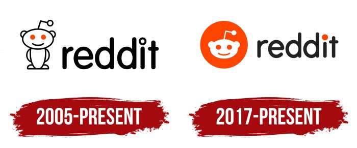
The news site’s first logo consists of two elements: a full-length Snoo and a Reddit caption. The original character has an oval head, semi-oval torso, semi-circular ears, legs, and arms. He also has a long antenna with a circle, which gives him an alien from another planet. The social media mascot is completely white, except for the orange eyes. Each part of the body is outlined with a separate black line. The creature smiles affably, emitting a desire to communicate and find new friends.
The word “Reddit” is on the right and is written in lowercase. Alexis Ohanian chose a bold font with rounded corners to showcase the friendly aspect of the social network. The dot above the “i” looks like a white circle surrounded by a black ring. This text mark appeared a long time ago but is still used in the online platform’s classic interface.
2017 – 2023
In 2017, a small redesign was carried out, leaving one head from the Snoo. She, as before, is painted white. The eyes and smile are the same color as the large orange circle that serves as the background. The inscription has become visually smaller. The small circle above the “i” resembles the alien eye from the first logo.
Every “Redditor” knows the mascot of his favorite social network – the sweet and good-natured alien Snoo from the alien race Snoos. According to legend, he flew to Earth to get to know people better, observe them, and communicate. The original character reflects the core values of Reddit: friendliness, openness, informational content, and sociability. Moreover, it was born before the site appeared and for a long time, existed in the form of a sketch. Alexis Ohanian included it in the logo for fun.
Interestingly, the social network allows users to edit the graphic part of the first logo freely. That is why Snoo is colorless – to make it easier for Redditors to create their versions of the picture for subreddits. There are only three restrictions here: the head must remain white, the eyes must be orange, and there must be no fingers on the hands.
Alexis Ohanian chose VAG Rounded for the logo. It lacks corners and serifs. Another distinctive feature of the Reddit caption is the circle above the letter “i”: it can be black and white or completely orange. All these nuances reflect the friendliness of the brand. The full palette of the emblem consists of three colors: orange-red (# FF4500), white (#FFFFFF), and black (# 000000).
2023 – today
The comprehensive brand refresh of Reddit, led by Pentagram New York and Natasha Jen’s team, represents a significant evolution in the site’s visual identity, marking its most extensive overhaul to date. This redesign encompasses several key changes:
- Introduction of a New Custom Font Family: The team introduced ‘Reddit Sans,’ a custom font family, enhancing the platform’s textual presentation.
- Streamlined Color Palette: A more cohesive and streamlined color palette has been implemented, bringing the brand a fresh and modern look.
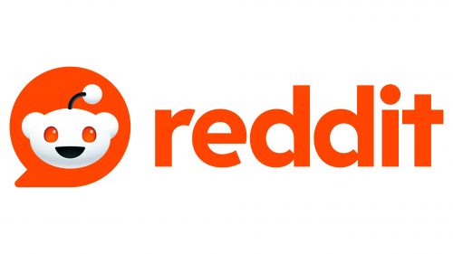
- Transformation of Snoo: Snoo, Reddit’s central mascot, has undergone a notable transformation, being rendered in 3D for the first time. This change modernizes Snoo and adds a unique flair, with a thumbs-up gesture enhancing its distinctiveness.
- New Logo Design: The new logo features Snoo’s head within a bright red chat bubble, visible on Reddit’s website. This design shift marks a return to Snoo’s original form, including its body and opposable thumbs, contrasting with the previous flat design. The 3D treatment of Snoo, with red, pupil-less eyes and a black mouth and antenna, maintains its alien character while ensuring it remains visually impactful across various sizes.
- Evolution of Snoo’s Design: Snoo, originally sketched by Reddit co-founder Alexis Ohanian during his college years at the University of Virginia, has evolved from a simple, single-color flat drawing to a sophisticated 3D rendering. This redesign is a blend of creativity and technology, reminiscent of characters from Disney/Pixar. The design successfully maintains Snoo’s alien essence while avoiding over-humanization.
- Debate over Speech Bubble in Icon: The decision to place Snoo’s icon inside a speech bubble has been met with mixed reactions. While it serves to distinguish Snoo from white backgrounds, some view it as an unnecessary addition, especially given the speech bubbles’ presence in the ‘d’ counter space of the wordmark. Concerns have been raised about these elements appearing overly whimsical and potentially losing clarity at smaller sizes.
- Typography Choices: Despite its corporate feel, the choice of a geometric sans serif font is seen as a balanced counterpart to the friendly new icon. However, there is some critique about the lack of innovation in this choice, suggesting a missed opportunity for a more distinctive typographic character.
Reddit: Interesting Facts
Reddit is like a big online clubhouse where people can talk about all sorts of things they like or are interested in.
- How Reddit Started: Two friends named Steve Huffman and Alexis Ohanian created Reddit in 2005 when they were in college. They first thought about making an app for ordering food but instead made a website where you can find all sorts of news and cool stuff.
- The Name: Reddit’s name is a clever play on “I read it on Reddit.” This is the place to be if you want to know what’s new and interesting on the internet.
- Lots of Mini-Clubs: Reddit has thousands of mini-clubs, called subreddits, for nearly every hobby or interest, from science to video games. If you like something, there’s probably a subreddit for it.
- The Alien Mascot: Reddit’s mascot is an alien called Snoo, drawn by one of the founders, Alexis. Snoo is supposed to be friendly and welcoming, and it changes outfits to match different mini-clubs.
- Upvotes and Downvotes: People can vote on posts and comments with upvotes or downvotes. This means the best or most liked stuff gets seen by more people.
- Ask Me Anything: Reddit has these cool sessions called “Ask Me Anything” or AMAs, where anyone from movie stars to astronauts answers user questions. It’s a chance to learn fun and interesting things directly from people who know a lot.
- Reddit Gold and Premium: You can get or give Reddit Gold to say “great job” on posts or comments. There’s also a premium version of Reddit that doesn’t have ads and gives you access to a special area.
- Making a Difference: Reddit users come together to do good things, like organizing charity events or protests. It’s a powerful place for bringing people together to support causes.
- Secret Santa: Reddit hosts a giant gift swap at the end of the year that anyone can join. Famous people like Bill Gates have even joined in to exchange gifts.
- Talking About Digital Money: Reddit is a big place to discuss cryptocurrencies like Bitcoin. People share news, tips, and thoughts on digital money.
Reddit started small, but now it’s a huge community where you can find a group for almost anything, share your stories, or learn new things. It’s unique because it lets anyone have a voice and find their people online.
Font and Colors
The introduction of Reddit Sans and Reddit Display fonts on Reddit reflects a deliberate effort to modernize and revitalize the platform’s typography. These fonts represent a fusion of traditional and modern design elements, enhancing the brand’s visual identity.
A combination of traditional humanistic proportions and modern aesthetics characterizes Reddit Sans. This balance creates a sense of familiarity while bringing a touch of innovation. The font is an important part of Reddit’s strategy to introduce a more modern and versatile typographic style aimed at catering to the diverse and dynamic nature of the community.
Complementing Reddit Sans is the Reddit Display font, which adds an extra level of uniqueness to the brand’s typography. This font incorporates geometric patterns and speech bubbles in certain letters such as “a,” “b,” “d,” “g,” “p,” and “q.” This creative touch is a stylistic choice and an indication that Reddit is a platform for conversation and discussion.
Reddit’s logo update retained the iconic bright orange color to maintain continuity with the brand’s visual heritage. The new design features subtle variations of orange hues, especially in the eye details, and black has been added to the main symbol. This subtle color scheme enhances the logo’s visual appeal, making it more cohesive and aesthetically pleasing.
FAQ
Did Reddit change its logo?
Yes, Reddit has updated its logo. The brand kept its iconic orangey-red color, which is its signature. The new design pairs this color with white and a hint of black. This gives the logo a fresher and more distinctive look.
The changes aim to modernize the logo while keeping its recognizable elements. Using white and black with the orangey-red creates a balanced and appealing design.
What color is the Reddit logo?
The brand’s logo has an orange-red background, a vibrant and energetic color. This specific shade, identified by the color code FF4500, is listed in the Pantone Matching System as PMS 172 C. The color choice aims to make the logo stand out in a busy digital space.
The Orange color grabs attention quickly, reflecting enthusiasm, creativity, and excitement, aligning with the brand’s values and community-driven platform. The brightness and warmth of Orange convey openness and inclusivity, which are the brand’s core values.
The Orangered background enhances the clarity and prominence of other logo elements. The contrast helps the white parts of the logo, like the iconic alien mascot and the text, stand out clearly. This makes the logo recognizable and memorable on digital screens or in print.
Who designed the Reddit logo?
The logo, known for its iconic Snoo Alien, represents the platform’s diverse and user-generated content. Alexis Ohanian, one of the co-founders, designed this character. Snoo’s whimsical look and wide-eyed expression capture the brand’s community-driven nature and its focus on creativity.
Ohanian originally sketched Snoo as a simple, friendly alien to reflect the brand’s fun and inclusive spirit. The design’s simplicity made it easy to recognize and adaptable to various themes on the platform. Over the years, the brand has kept the core elements of Snoo’s design, making slight updates to keep the logo modern.
Snoo’s cheerful and curious look invites users to explore and contribute to discussions and content on the platform. This design supports the brand’s goal of creating a space to share information, opinions, and stories.
What is a logo on Reddit?
The Reddit logo combines its mascot, Snoo, with the brand name in lowercase letters. Snoo is an alien with an antenna on its oval head, reflecting the brand’s unique and playful identity.
Snoo has a round, white face with a wide smile and curious eyes, making it friendly and inviting. The antenna adds a quirky touch, enhancing its approachable character. This simple yet distinctive design makes Snoo easily recognizable, helping build brand recognition.
The brand name “reddit” appears in lowercase letters next to Snoo. This choice gives the brand a casual and approachable feel, emphasizing its community-driven nature. The clean, sans-serif font complements Snoo’s design, creating a cohesive look.
Can I use the Reddit logo?
The logo is copyrighted and restricted. Only Reddit and its licensed partners can use it. The brand protects its trademark and can revoke permission without giving a reason.
You must get authorization to use the logo. Unauthorized use can lead to legal consequences, and using the logo without permission may result in immediate action to protect the trademark.
What is the Reddit logo called?
The Reddit logo is called Snoo. Snoo is a time traveler or alien with a smiling face, oval head, bent antenna, and rounded ears. The design is friendly and playful, reflecting the brand’s community-driven nature.
Snoo’s simple design is easy to recognize. Its wide smile and curious eyes make it inviting and encourage user engagement. The antenna adds a unique touch, making Snoo distinctive.
The name Snoo and its design make the logo memorable. This friendly alien helps build a strong visual identity that resonates with users worldwide.
