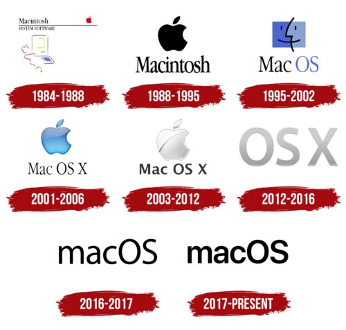
The macOS logo has changed many times for the operating system. This is due to its frequent updates, after which a redesign of the visual identity was required. Therefore, initially, the emblem was simple, and then it became more business-like and professional. Now, there is nothing unnecessary in it – only the name executed in the bold black grotesque.
macOS: Brand overview
| Founded: | March 24, 2001 |
| Founder: | Apple Inc. |
| Headquarters: | United States |
| Website: | apple.com |
Meaning and History
The original operating platform appeared simultaneously with the Macintosh PC. They were presented in parallel, so for some time, their logos coincided. But after the update in 2001, the Mac OS X system emerged, requiring a change in the visual identity. Before that period, computers were released with pre-installed Classic Mac OS. Its very first version was simply called System or System Software. The official name Mac OS was given in 1996.
Since then, it has changed several logos. The initial symbols represented both the computer itself and the platform on which it operates. Their clear visual distinction was introduced later. The basis of the emblem was an apple, in honor of which the creator named the personal digital device. The fact is that McIntosh was Jef Raskin’s (an Apple employee who came up with a simple and inexpensive PC) favorite apple variety.
What is macOS?
macOS is a family of operating systems for Apple digital devices created based on a graphical interface. The first version was released in 1984, simultaneously with the debut branded PC called Macintosh. The current name was given in 1996.
1984 – 1988
The first logo was featured on the boot disks of the OS. It was the same as the debut Mac PC. It depicted a computer with a monitor, keyboard, and mouse using outline strokes. There was also a thin horizontal line separating the words “Macintosh” (located in the first row) and “System Software” (the phrase occupied the second line). At the opposite end of the stripe, there was a red apple with a tiny leaf and a bitten side. A similar fruit in a colorless version was located next to the display. After each system update, a consecutive version number appeared next to the inscription.
1988 – 1995
Only one element remained from the large and complex composition – the apple. Designers enlarged it and colored it black. Below it was the inscription “Macintosh.” It was executed in lowercase letters (except for the first one) and contained small serifs. The glyphs were tall and semi-bold.
1995 – 2002
After the rebranding, the emblem was redesigned. The fact is that during that period, the program changed its name, as did the computer on which it was pre-installed. As a result, a friendly logo with the words “Mac OS” appeared. The first part was colored in black, and the second part was in a light shade of ultramarine. The different colors of the “faces” on the emblem symbolized a friendly monitor and a smiling user. They were arranged in such a way that together they formed a rectangle divided in half by a zigzag black stripe.
2001 – 2006
In the logo of this period, the inscription was increased to three words: “Mac OS X.” Each of them was black and contained small serifs. The complex graphic element in the form of a “smiling” rectangle gave way to a simple apple with a bitten right side. The designers preserved the ultramarine and blue colors and created a gradient with light highlights.
2003 – 2012
At the same time, an emblem with a large silver-chrome apple was launched. Like before, it was voluminous, but the texture was created by a diagonally curved line located at the top of the fruit. The serifs from the inscription disappeared: in place of the tall antiqua, a low grotesque appeared. The letters were wide and bold.
2012 – 2016
The logo featured text only – the graphics disappeared. The inscription consisted of the name of the operating system – “OS X.” It was set in a large uppercase font. All glyphs were gradient, silver-gray, and did not contain serifs.
2016 – 2017
Rebranding led to the appearance of the emblem in a new design. It remained textual and consisted of the words “mac” and “OS” written together. The first half was in lowercase, the second in uppercase. This allowed them to be distinguished, preserving the meaning of each part. The letters were semi-bold and black.
2017 – today
The modern macOS logo is textual. It features a bold font with rounded letters. Apart from the inscription, there are no other elements. The letters have become low, flattened, and rounded.
Different designs were used for it at different times. If initially, the options were exclusively graphic, now, on the contrary, the visual identity is predominantly text-based. Black letters on a white background are very clearly visible.
Font and Colors
For this operating system, developers chose various typefaces. Among them are Lucida Grande, Helvetica Neue, Charcoal, Chicago, and San Francisco. In the latest logo, the font resembles Movatif Regular by Typodermic Fonts Inc., and in the penultimate one – Myriad Pro Regular, created by Adobe. The current corporate colors of macOS are neutral and monochromatic. However, in the past, they included a rich palette consisting of several shades of blue, red, yellow, gray, and silver.
macOS color codes
| Black | Hex color: | #000000 |
|---|---|---|
| RGB: | 0 0 0 | |
| CMYK: | 0 0 0 100 | |
| Pantone: | PMS Process Black C |

