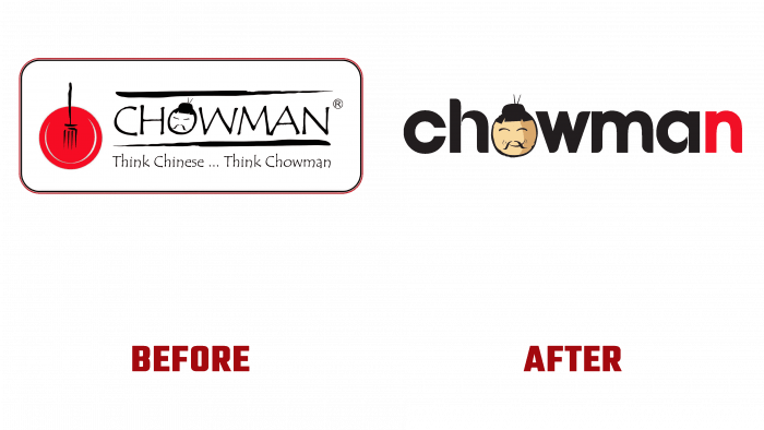
Patience, demonstration of respect, peacefulness, benevolence, and hospitality are especially characteristic of the Chinese nation. Reflecting on these features was the main task in rebranding the Chowman restaurant chain in Kolkata. At the same time, it was especially difficult to make it attractive since the people of India are characterized by a strong commitment to their own culture, which they value above others. A creative approach was applied to create a striking and unique brand emblem, which became a beautiful logo. Her execution combined the text and the sign with the creation of such a form that, when viewed from the general view of the emblem, immediately made an attractive smiling face of a benevolent and hospitable Chinese, who replaced the letter “O” in the name. It has become an ingenious way of combining Chinese national culinary culture with Bengali potential consumers. The owner jokingly called this face Mr. Chow, which the visitors positively received.
Today Chowman has taken new steps in its development, expanding beyond Bengal and setting up a network in other regions of India, which was primarily the reason for the rebranding. The success of this logo execution led to the decision to use Mr. Chow not only as an element of the logo but as the main mark of the entire brand. Drawing on its long history of organizing fine Chinese dinners, the brand especially needed something like Mr. Chow. As a result, a revolutionary visualization was created that conveyed the company’s national characteristics, demonstrating the desire for growth and the ability of two cultures to go hand in hand, sharing the best and tastes that are in both of them. It has become an effective way to promote the brand in the food and beverage industry.
The new identity, led by Mr. Chow, has helped ensure that the main motto is displayed – bringing all the common people together under a blend of the best Chinese taste. The new brand features a timeless identity organization with the ability to change as the brand continually grows. This has already become noticeable in how the size of Mr. Chow’s face gradually changes, gaining size as its weight grows in the formation of a positive opinion of visitors.
The brand’s color palette is also tied to the psychology of color and the significance of each shade in Chinese culture. The main red, which has a positive effect on appetite, which creates the desire to dine, is a symbol of fire in Chinese culture, which, when applied to restaurants, connects the main cooking process with visualization. At the same time, it is a symbol of prosperity and happiness. The gold one in which Mr. Chow is made symbolizes nobility and wealth.


