


Quartr’s in-house team and Rotterdam studio Offgrid, led by Fons Mans, spent a year and a half developing the company’s new identity. Unveiled on July 7, 2026, it puts the prominent QUARTR wordmark front and center, reserving the geometric emblem for smaller applications. The guidelines call for using the name and symbol separately.
The update follows changes in the business. The previous logo was introduced in early 2021, when the iOS app was in beta. The web app and API came later. By the time of the identity update, Quartr had become a provider of AI infrastructure for company research, serving financial institutions and the technology sector. Its team had grown to more than 150 people across Stockholm, Gothenburg, New York, and Dublin. The new identity needed to reflect the organization’s scale and the precision its professional clients expect.
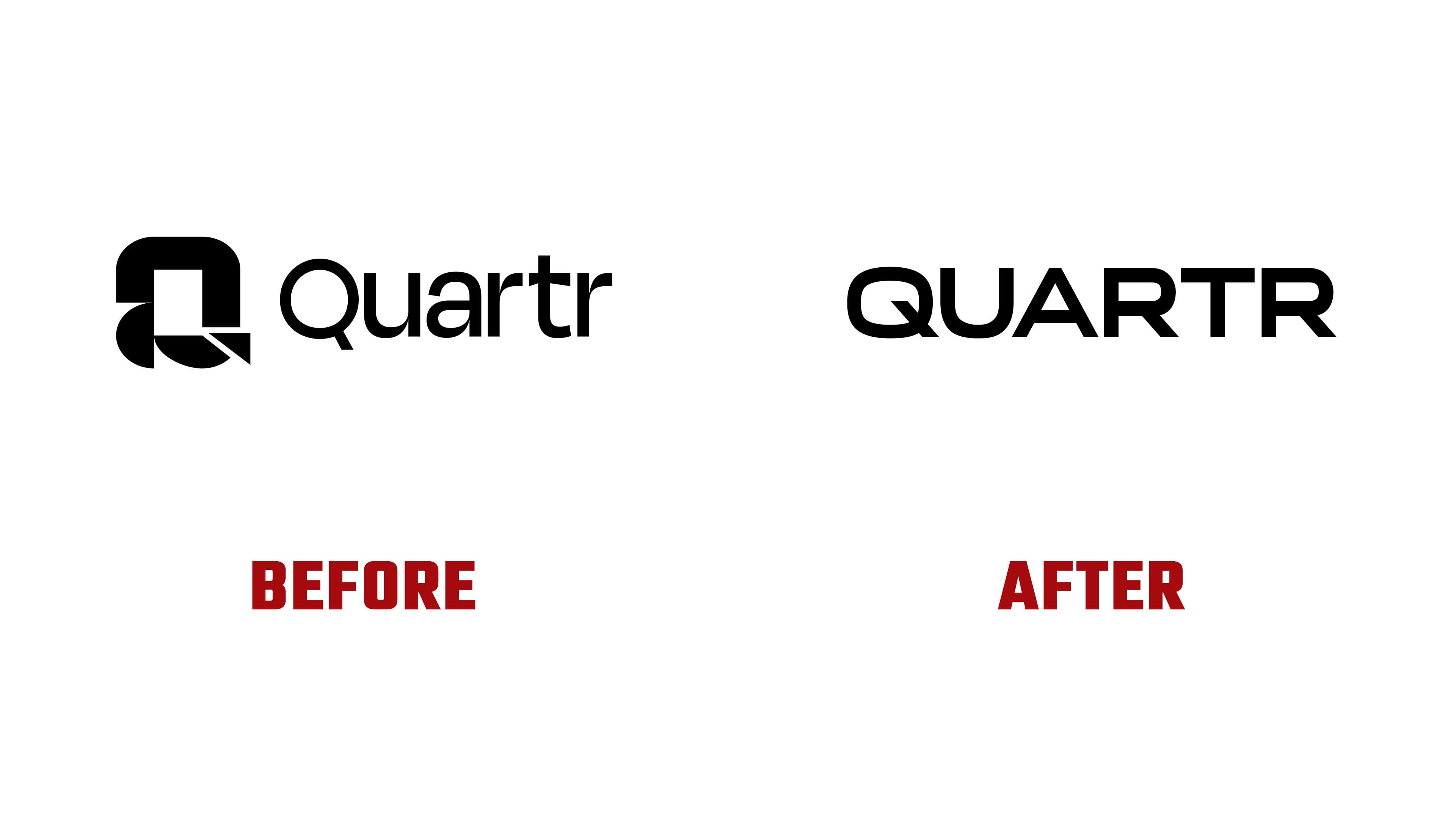
The team studied examples from three sectors. Autodesk, Hexagon, and Oracle provided references in technology and industry; Hermes, Loewe, and Prada in luxury; and Deutsche Bank, Barclays, and Moody’s in finance. The designers favored uppercase lettering, disciplined geometry, and the ability to use a wordmark independently of an emblem. Co-founder Oliver Hamrin proposed a thought experiment to test the design’s longevity. The logo should look at home in 1842, 1977, and 1995 while remaining relevant today.
QUARTR has replaced the previous combination of an uppercase “Q” and lowercase letters. The letters are wider and retain a sans-serif style. A diagonal tail crosses the rounded outline of the “Q” at the lower right. The “A” has a sharp apex, while both “R” letters have rounded bowls and diagonal legs. The “T” crossbar spans nearly the letter’s full width. Together, the letters form an extended horizontal wordmark.
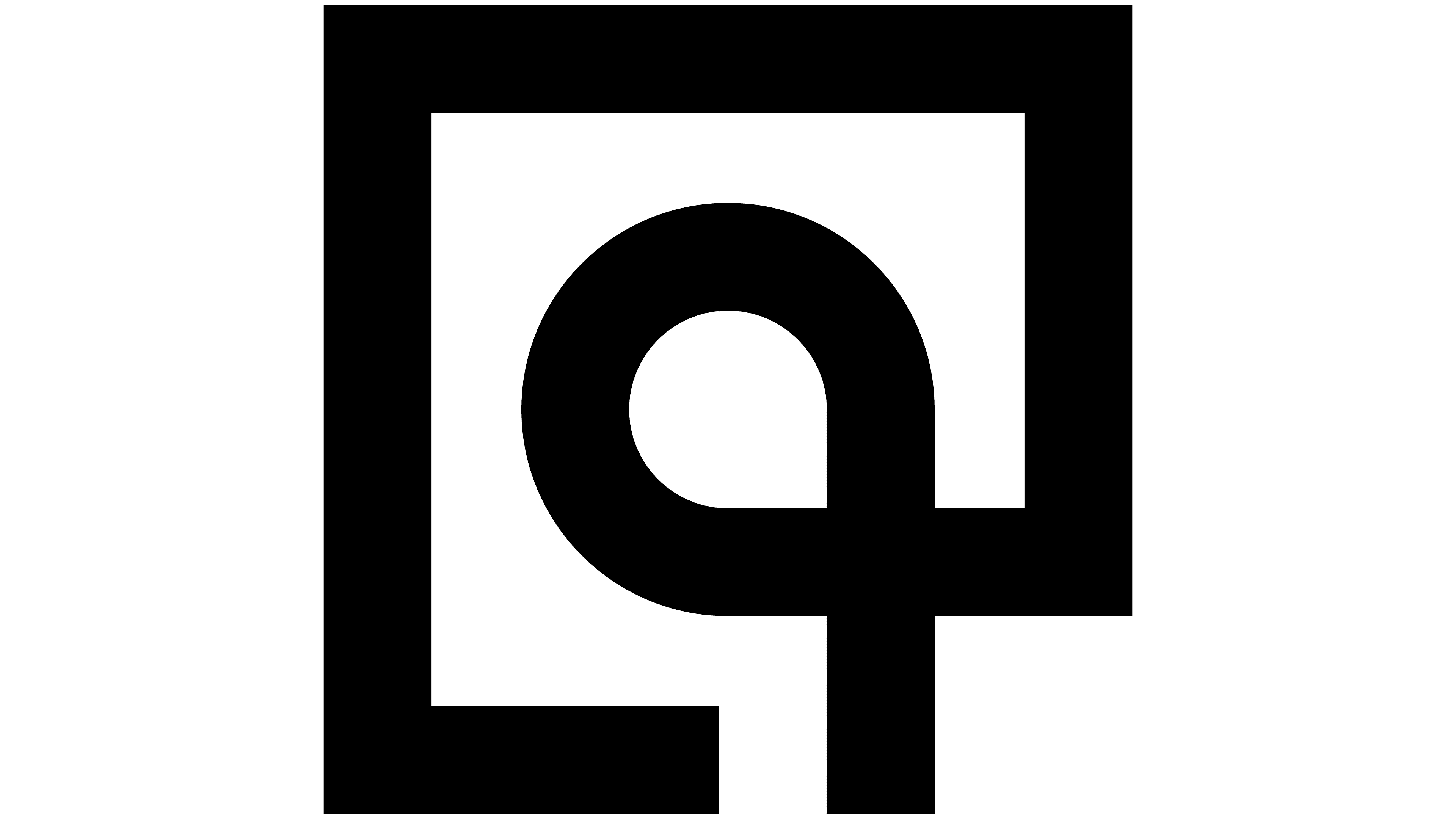
The search for an emblem involved six rounds of work with Offgrid, numerous internal experiments, and consultations with outside specialists. The team then revisited early work in Figma, using an option from the second round as its starting point. They replaced the inner square with a circle and refined the outline’s proportions.
The finished emblem resembles a lowercase “q” inside a square frame. Its rounded loop connects to the lower-right section of the outer outline. A vertical stroke reaches the bottom of the square, leaving a gap beside it. The inner and outer lines are nearly equal in thickness. The previous symbol also referenced a “q.” Still, it consisted of rounded and angular sections around a square opening, with diagonals crossing its lower portion. The letter association remains, while the construction has changed.
The team developed the symbolism during the design process. The square represents quantitative analysis, while the circle stands for qualitative company research. Their connection expresses the relationship between numerical data and business assessments. When rotated, the design resembles an eye, so the team called it the “Quartr Eye.” The corner gap also represents a quarter of a longer period and the study of a business over time.
The team created black-and-white versions of the emblem for profile images, small applications, and materials aimed at audiences already familiar with the brand. The QUARTR wordmark serves as the company’s primary identifier. Clear space around it must equal at least the height of the lettering. In running text, the name remains Quartr. The identity was tested at different sizes and on different materials, from a 16-pixel icon to business cards, fabric, and large signs.