The Barclays logo alludes to the era of kings and knights during which the institution was born. Duty and honor for the company are not empty words. They helped the bank rise and maintain its leading position for centuries.
Barclays: Brand overview
Meaning and History
It all began in 1896 when several English banks decided to merge and form a joint-stock financial institution, Barclays and Co. The group included Gurney Bank, Backhouse, and Bank Goslings Bank. In the following years, the new structure expanded to become a nationwide bank with its identity, charter, and services. Moreover, it was the first institution to use an ATM (in 1967).
Until then, Quaker John Freame and Thomas Gould opened a bankers-jeweler business in London on Lombard Street. James Barclay, John Freame’s son-in-law, later joined them and played a key role in the bank’s development. Under him, he moved into a building marked with the Black Spread Eagle, which forever became the basis of the corporate emblem. This happened in 1728. In 1736, the financial institution received its current name.
To become a powerful structure, the new player in the market made several important corporate acquisitions. In 1918, he acquired London, Provincial, and South Western Bank; in 1919, British Linen Bank; in 1975, Mercantile Credit; in 2000, Woolwich; and in 2008, the North American department of Lehman Brothers. Gradually, the sign of the black eagle began to spread everywhere, marking every important milestone with a redesign. In total, there are five logos.
What is Barclays?
Barclays is a full-service financial firm. It has two main divisions: British and International.
the 1960s – 1970
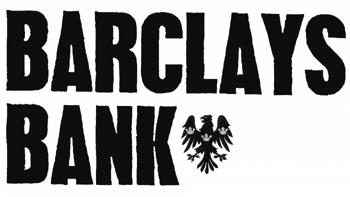
The emblem, introduced in the 1960s, consists of the bank’s name in wide, elongated uppercase letters. The inscription is in two lines: the first contains “Barclays,” and the second is “Bank,” with a miniature icon. The symbol looks like an eagle with spread wings and a head turned to the left. It features three imperial crowns. However, because of the space in the second row, the logo is perceived as heavy and unfinished.
1968 – 1970
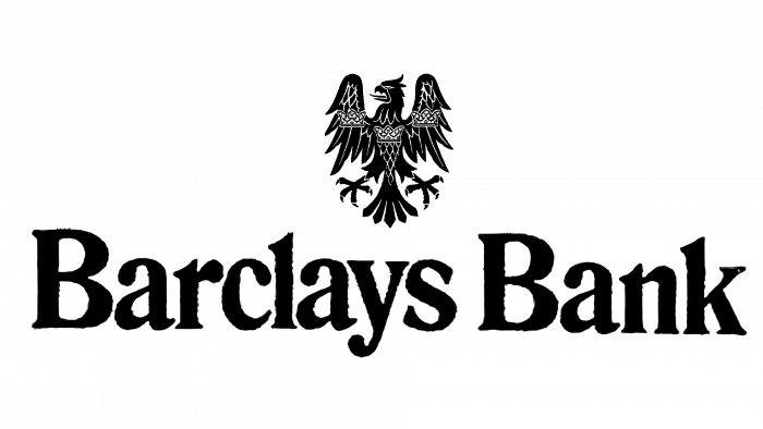
This version was used for some time in parallel with the previous logo. It consists of the same elements but is rearranged differently. The developers placed the heraldic bird in the center above the financial institution’s name and changed the font. They chose thin caps with serifs for the inscription.
1970 – 1999
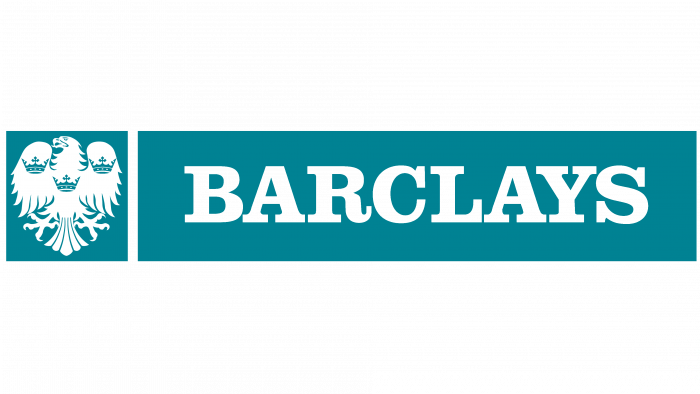
In 1970, the designers added color to the logo, approving one of the shades of light blue. The aqua horizontal rectangle contains an incomplete financial institution name—only its first part. The word “Barclays” is in white serif letters, bold and uppercase. On the left is a blue square with a heraldic eagle depicting three crowns.
1999 – 2002
The designers experimented with both shape and color. They placed a fragment of an eagle in a circle decorated with highlights and gradient transitions from ultramarine to cobalt. The bank’s name was placed below and written in fluid italics with elongated strokes. This combination perfectly balanced the emblem.
2002 – today
The current version of the logo is considered the most successful because it is more official than the others. The developers achieved this by removing the bird’s paws from the drawing and greatly expanding the tail. They removed the crowns from the logo and added two rounded protrusions to the wings. The word “Barclays” is written in the same style as before, with “L” and “A” connected at the bottom.
Barclays: Interesting Facts
Barclays PLC is a British bank that’s been around for over 300 years, making it one of the oldest in the world.
- Origins: It began in 1690 in London as a goldsmith banking business by John Freame and Thomas Gould.
- Banking Innovations: In 1967, Barclays introduced the world’s first ATM in London, changing how people access their money.
- Global Reach: Barclays operates in over 40 countries and offers various services, such as retail banking, credit cards, and wealth management.
- Evolving Leadership: The bank has adapted its leadership and strategies over time, which has been crucial for its success.
- Credit Card Pioneer: In 1966, Barclays issued the first credit card in the UK, the Barclaycard, influencing the global use of credit cards.
- War Contributions: Barclays played a significant role in both World Wars, from its staff joining the armed forces to financing war efforts and managing government accounts.
- Digital Banking: It’s been a leader in digital banking, introducing Internet banking in the 1990s and continuing to innovate with mobile banking apps.
- Entrepreneur Support: The bank supports entrepreneurs through accelerator programs, innovation hubs, and financing, promoting innovation and new business growth.
- Cultural Sponsorships: Barclays has sponsored the Premier League and various arts and community initiatives, showing its commitment to culture and sports.
Barclays isn’t just a financial institution; it’s a historic innovator and significant contributor to societal development.
Font and Colors
All logo modifications are minor changes to the debut version with the heraldic bird and company name. As a result, the designers created a simple logo with no background or small details. This choice is associated with the best visual perception of banking symbols in any media.
The typeface used in the logo is very close to the Baker Signet Regular serif glyph. This is the development of designer Arthur Baker. Bitstream first published it.
The bank’s signature palette is several shades of blue. The lightest is aquamarine; the most intense is dark cobalt. In some versions, there are gradient transitions between them.
FAQ
What is the logo of Barclays?
The logo features an eagle. This logo has changed significantly over time. In the early years, it was complex, with detailed feathers and a majestic pose. By the mid-20th century, it became cleaner and more streamlined, following modern trends. In the late 20th century, it became even more simplified and stylized for easy recognition and universal appeal. The current version is minimalistic, retaining the essence of the original design and optimized for digital use and global recognition.
The main color of the logo, a characteristic shade of blue, conveys trust, reliability, and professionalism. The eagle is encased in a shield, symbolizing protection and stability. The brand name accompanies the eagle in a clean, modern font for clarity and readability. The evolution of the logo reflects the brand’s journey to adapt to changing times while maintaining its core values.
What is Barclays’ motto?
Barclays’ motto is: “Be resilient and carry on: sustainable business means staying in business.” The brand believes sustainability is the key to survival and success in a competitive market.
The motto encourages perseverance in difficult times. This attitude is vital for maintaining stability and achieving long-term success. This means the company can consistently provide customer services, even during challenging times.
In practical terms, the brand focuses on proactively identifying and managing risks. Using new technologies and business models helps the company remain relevant and competitive. By demonstrating the ability to solve problems, the brand reassures customers of its reliability and stability.
Why is the Barclays logo an eagle?
The logo features an eagle, a symbol first appearing in the late 17th century. Many people were illiterate then, so businesses used symbols to represent their identity. Barclays chose the Black Spread Eagle Sign as its logo for its strong visual impact and symbolic meaning.
The eagle represents strength and protection. It is seen as a powerful bird, matching the brand’s image as strong and reliable. The black spread eagle was a distinct and memorable emblem, making it easier for customers to identify the brand without reading it. This choice has stood the test of time, evolving in design but maintaining its core meaning, making it a timeless brand emblem.
When was Barclays founded?
The story begins in 1690 when two goldsmith bankers, John Freame and Thomas Gould, started a banking business in London. This early bank provided financial services to merchants. Over time, the business grew to form the basis of a major financial institution.
Many consider the brand’s founding date July 20, 1896. On this day, several financial institutions, including Freame and Gould’s business, merged to form Barclays and Co. This merger brought together established banks, combining their resources and operations under one name.
The 1896 merger marked a turning point, transforming the bank into a more organized organization. This event began the modern brand, laying the foundation for its growth into an international financial center. Both dates are important for understanding the brand’s history and evolution.
What does Barclays do?
Barclays is a financial company offering a wide range of services. The brand accepts deposits, allowing customers to save their money securely. It issues credit and debit cards for convenient payments and provides various loans for individuals and businesses.
Barclays offers insurance products, including life and property insurance. It engages in investment banking activities, helping clients raise capital, advising on mergers and acquisitions, and managing assets. The company provides wealth management services, such as financial planning and investment advice to high-net-worth individuals. It offers online banking, allowing customers to manage their finances from anywhere. Barclays engages in market research and analysis, offering insights into market trends and economic conditions to help clients make informed decisions.
How old is Barclays?
The bank has existed for over 330 years. This early bank served merchants.
The brand has thrived through many historical events and economic cycles. Its long history provides a strong basis for trust and reliability among customers. Over the years, Barclays has played a key role in economic development. It supported businesses, contributed to infrastructure projects, and offered financial services to help people manage their finances and plan for the future.
