Austin-based nonprofit arts center Fusebox has embarked on a dynamic brand refresh that reflects its deep commitment to bringing together diverse art forms. Founded by art innovators in 2005, Fusebox continually strives to foster deep dialogues in eclectic arts venues, with an emphasis on live artistic interactions. Over the course of its existence, Fusebox has forged alliances with organizations ranging from local art enthusiasts to renowned art venues around the world. This collaborative spirit has given rise to flagship events such as the Fusebox Festival and Live in America Festival, as well as a host of annual events and initiatives.
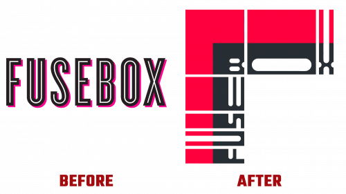
The fresh Fusebox logo was the foundation of this rebranding, reaffirming the essence of the institution. It features the symbol of a knot, representing the confluence of different artistic narratives, visions, and emotions. At the same time, its design remains expansive, suggestive of endless artistic possibilities.
The carefully crafted logo points to a meeting place, reflecting Fusebox’s desire for fusion and discovery. This intersection eloquently expresses Fusebox’s founding principle – the revitalization that results from the coming together of diverse creative forces be they artists, concepts, or sensory pleasures.
Drawing inspiration from Austin’s charismatic charm, Fusebox’s bespoke logo gives it a character that is unmistakably ‘Fusebox.’ The innovative corner-centric design is more than just a decorative element; it emphasizes versatility. Whether highlighting major art movements or enveloping sub-brands, this multifaceted design plan is easily adaptable.
Layering stands out as an artistic hallmark in the brand’s visual vocabulary. A multitude of elements – intersecting frames, images, overlays, motifs, etc. – merge together to create a visual tapestry of incredible appeal. The structural matrix of the Fusebox logo, underpinned by a methodical modular grid, ensures that the metamorphosis of content remains fluid, fast-paced, and consistently engaging. Combined with timeless design elements such as chroma blocks, this system allows the aura of Fusebox to remain intact without unnecessary updates.
Juxtaposing the outdated logo with its modern counterpart sheds light on the evolution of Fusebox’s design. The predecessor was pragmatic and flexible but often blended in with the crowd without leaving an indelible mark. In contrast, the modern version is a bold step towards differentiation. Its blocky design combined with curved edges brings a special twist, subtly hinting at the “box” motif. Expanded character traits enhance its distinctiveness by increasing its adaptability to different mediums.
Fusebox’s updated style combines avant-garde nuance with universal appeal. It reflects the organization’s ethos, positioning it as a beacon for multifaceted artistic exploration devoid of undue complexity. Fusebox’s updated style carves a niche for itself in a sea of art platforms, echoing its founding beliefs and distinguished legacy.


