


![]() Autodesk Logo PNG
Autodesk Logo PNG
The austere design of the Autodesk logo reflects the business character of the company it represents. It is precise, uncluttered, and practical, just like the products it produces. Indeed, its software is effective in most areas of life, including education, media, construction, architecture, and other industries.
Autodesk was founded in 1982 in Mill Valley, California, by programmer and entrepreneur John Walker and thirteen co-founders. Their goal was to build software for personal computers at a time when professional design systems usually depended on costly workstations or mainframes. The company saw a market in bringing CAD tools to engineers, architects, and designers who had limited access to large computing systems.
In November 1982, Autodesk introduced AutoCAD at Comdex in Las Vegas. It became one of the first professional CAD packages able to run on a standard IBM PC. Before its arrival, drafting was still handled manually in many offices or required specialized hardware. AutoCAD placed digital drafting on common desktop machines and became the company’s main product from its earliest years.
In 1985, Autodesk went public, gaining capital to develop AutoCAD and expand its position in the CAD market. Competition was strong, especially from Bentley Systems, whose MicroStation software served large infrastructure and construction projects. During the late 1980s and 1990s, Autodesk released new versions of AutoCAD and expanded through acquisitions. In 1994, it bought Softdesk, adding architectural and engineering tools. In 1996, it acquired Kinetix, a company linked to 3D animation and visualization, later associated with 3ds Max.
In 2002, Autodesk acquired Discreet Logic, a Canadian developer of software for film and television production, entering the media and entertainment segment. In mechanical design, it competed with Dassault Systèmes’ CATIA while promoting Inventor and, later, Fusion 360. In the 2010s, Autodesk moved from perpetual licenses to subscriptions, cloud services, Autodesk 360, and collaborative tools for professional design workflows.
Meaning and History
![]()
The corporation owes its appearance to the Interact program for computer-aided design. Its author is Michael Riddle, who created the product in 1979. However, it became famous not because of him but because of the programmer John Walker and his team. In 1982, he founded a company specifically for this utility: the program was renamed AutoCAD and underwent significant development. Currently, developers release not only this but also other software, labeling it with the same emblem – textual, two-dimensional, with minimal graphic elements. Of course, for so many years, it has evolved significantly, but it has retained its essence. It always contains the name “Autodesk”.
What is Autodesk?
Autodesk is the name of an American corporation that produces digital products for the modeling and design of various objects. Its software is in demand in both the educational sphere and mechanical engineering. The company was founded in 1982 by John Walker. Expanding beyond its hometown of Mill Valley, it has established offices in many major states across the country and abroad.
1982 – 1994
![]()
The graphic element takes up a significant portion of the logo. It is a black rectangle in a vertical orientation with three white figures shaped like drawing compasses. Thus, the designers linked the emblem with the computer-aided design program. At the same time, they symbolize the first letter of both the software itself and the company name. The capital letter “A” is devoid of a crossbar, so the space under it resembles a triangle.
Below is the text part of the emblem: the word “Autodesk.” It is typed in a serif font in uppercase. Each letter is a combination of thin and thick strokes that expand and narrow, giving visual dynamism. The serifs are classic, large, and expressive, with slightly refined tips. Spaces between glyphs are minimal, but due to the large size of the letters, this does not affect readability.
1994 – 2000
![]()
The designers changed the arrangement of the logo elements. They reduced the black rectangle using three compasses and placed it in front of the company name without changing any details. In addition, the font was converted to lowercase letters, keeping the serifs and variable stroke widths.
2000 – 2005
![]()
The software company’s graphic symbol disappeared. The name remained but received a new design. Now, it is in bold lowercase and has no serifs. The letters are rounded on all sides, but the tips are pointed: diagonal and straight cuts on one side form a sharp edge protruding outward. This is not the case only with the letter “o,” which, by its structure, always remains round. Glyphs are located close to each other and are painted in sky-blue color, the color of high achievements, great prospects, and aspiration to distant horizons.
2005 – 2013
![]()
The company returned to the old logo, used from 1994 to 2000, and slightly modernized it. To give it a new look, the designers made the letters bold and the serifs larger and more expressive. The letter “A” also changed: its crossbar moved below the middle. The letter “k” has undergone the greatest transformation: its lower leg now begins not at the upper diagonal strip but in the center of the vertical stroke. The font is lowercase, black, with serifs.
2013 – 2021
![]()
The Autodesk logo has moved away from minimalism, taking the form of a colorful graphic symbol. It looks like a wide ribbon bent into a triangular shape with a slightly raised left end that is narrower than the adjacent side. The outer side of the geometric figure is colored blue with a gradient, while the inner side is green, going from a light shade to olive. This symbol resembles the Google Drive emblem but is smoother and has an open bottom edge, hinting at the capital letter “A.” On the right is the company name, strict, grotesque, bold, with straight glyphs. The letter “T” has a diagonal cut on the end cap on the right side.
2021 – today
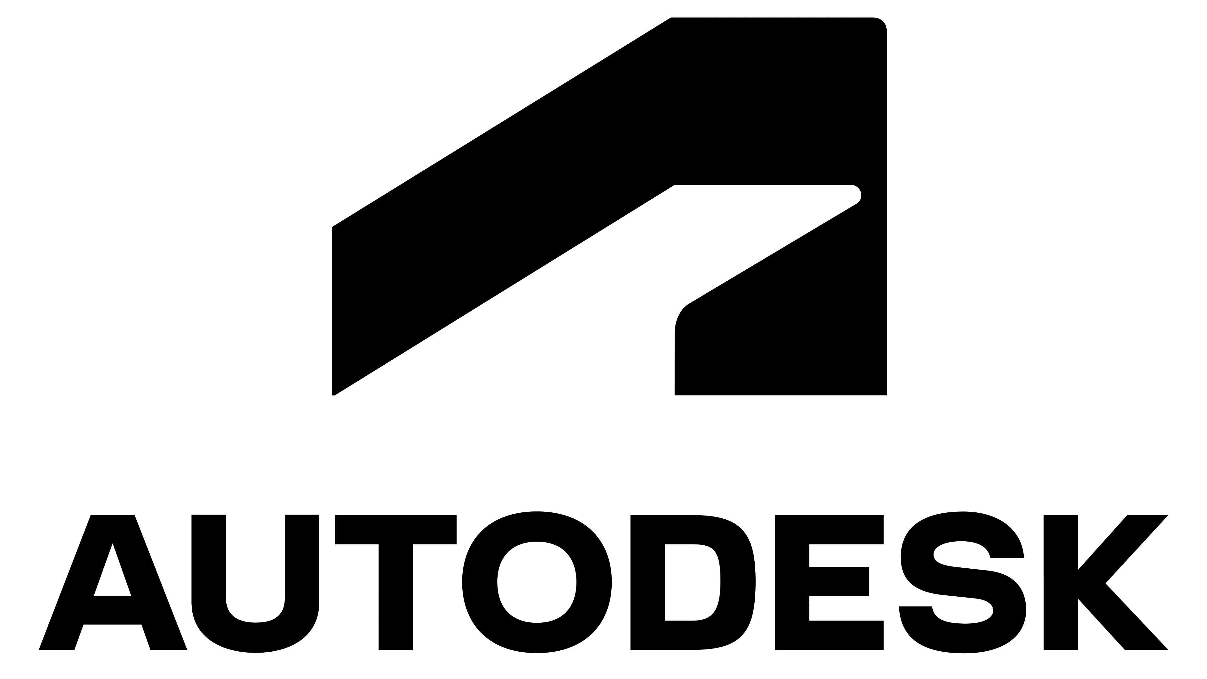
![]()
First, the emblem features an abstraction associated with continuous growth, increasing momentum, and high speed. According to the creators’ idea, it represents a three-dimensional curved figure. It also resembles a stylized letter “A” (the first letter of the company name) and a wide curved ribbon. Next to it is a massive inscription, also in black. The font is smooth, even, geometric, and bold. Optimal spacing between characters ensures clarity and good readability of the text.
Font and Colors
Since the Autodesk logo is text-based, typography receives a lot of attention. Each version uses a different style and completely different fonts. In particular, they resemble the fonts TeX Gyre Pagella Regular, Baskerville Old Face FS Regular (with a modified “t”), Myriad Pro SemiExtended Bold (with diagonally cut vertices), and Cantarell Bold (with beveled ends on the cap of the letter “T”). The modern emblem features lettering in Artifakt, a complex, technical, and beautiful grotesque palette designed by Eric Spiekermann of Edenspiekermann Studio with direct support from the Autodesk design team.

The palette is simple: it consists of the classic black-and-white combination. According to the company’s management, monochrome best conveys confidence, stability, reliability, and strength. In addition, black blends well with other colors, making it versatile and adaptable to any background.