


![]() Prada Logo PNG
Prada Logo PNG
The Prada logo looks luxurious. It conveys elegance without shine, confidence, and strength. It conveys the high style and exclusivity of the brand’s products, as well as the cold luxury and refined taste the brand is recognized for worldwide.
The history of Prada begins in 1913 in Milan, inside the Galleria Vittorio Emanuele II. Mario Prada opened a leather goods shop called Fratelli Prada, offering travel trunks, bags, and accessories made with imported materials, including walrus leather from England. In 1919, the brand received a royal warrant from the Italian court, allowing it to use the Savoy coat of arms in its branding.
After Mario died in 1958, the company passed to his daughter, Luisa, who ran it for about twenty years as a small family business. The turning point came in 1978, when Miuccia Prada took control and partnered with Patrizio Bertelli, who handled production and expansion while she led the creative direction.
In 1984, Prada introduced a black nylon bag with a triangular metal logo. The use of industrial nylon contrasted with the approach of Gucci and Louis Vuitton, which relied on monograms and traditional materials. In 1988, the brand launched its first womenswear collection, gaining attention by the mid-1990s.
The 1990s saw expansion. In 1993, Prada launched Miu Miu. By 1997–1999, the company acquired stakes in Church’s, Helmut Lang, and Jil Sander. In 2000, it partnered with LVMH to invest in Fendi, but financial pressure led to the sale of these assets between 2001 and 2006.
In 2011, Prada went public on the Hong Kong Stock Exchange, raising $2.14 billion and valuing it at about $13 billion. The listing reflected a focus on Asian markets, particularly China. In 2019, Raf Simons joined Miuccia Prada as co-creative director, marking a new phase in the brand’s development.
Meaning and History
![]()
The company was appointed as the official clothing supplier to the Italian monarchs. Thanks to the royal family’s support, the brand could include the House of Savoy’s heraldic elements in the logo. The trademark chose two details: the rope and the coat of arms. In addition to them, the couturier also included his distinctive sign.
The patronage of high-ranking individuals, as reflected in the fashion house’s official symbolism, helped the company survive and withstand fierce competition from other players in the fashion industry. No one else could boast such an honor. That’s why including monarchic symbols in the emblem was wise and allowed for recognition.
What is Prada?
This Italian fashion house is known for elegance and a modern design approach. Under the leadership of Miuccia Prada, the company became known for blending tradition with contemporary styles. Its distinctive style features unusual materials and nylon bags with a triangular logo, redefining the concept of luxury. The assortment includes clothing, footwear, bags, accessories, and perfumes characterized by minimalism and high quality. Particularly popular are the sportswear collections and classic bag models, such as the Galleria and Cahier, which have gained the admiration of fashion enthusiasts worldwide.
2002 – today
![]()
The Prada brand does not seek to prove its high status through complex symbols or decorative elements. For the fashion house, the name alone is sufficient. The 2002 logo version is minimalist, with carefully balanced forms and no theatrical effects.
The PRADA wordmark is set in large, wide letters arranged in a straight line. A serif typeface with varying stroke thickness is used. The typography is close to Didot or a lighter version of Bodoni, but with calmer proportions and softer transitions. There are differences in the details. The R has a nonstandard silhouette, while the A features a reinforced left stem and an added top serif.
The brand also uses other logo variants for different products. Bags often feature a triangular patch with a small crest and ribbon. The Prada Milano inscription is sometimes used, though the short name is often retained on its own. On hardware, tags, and buckles, the fashion house avoids decorative overload and excessive showy shine.
Font and Colors
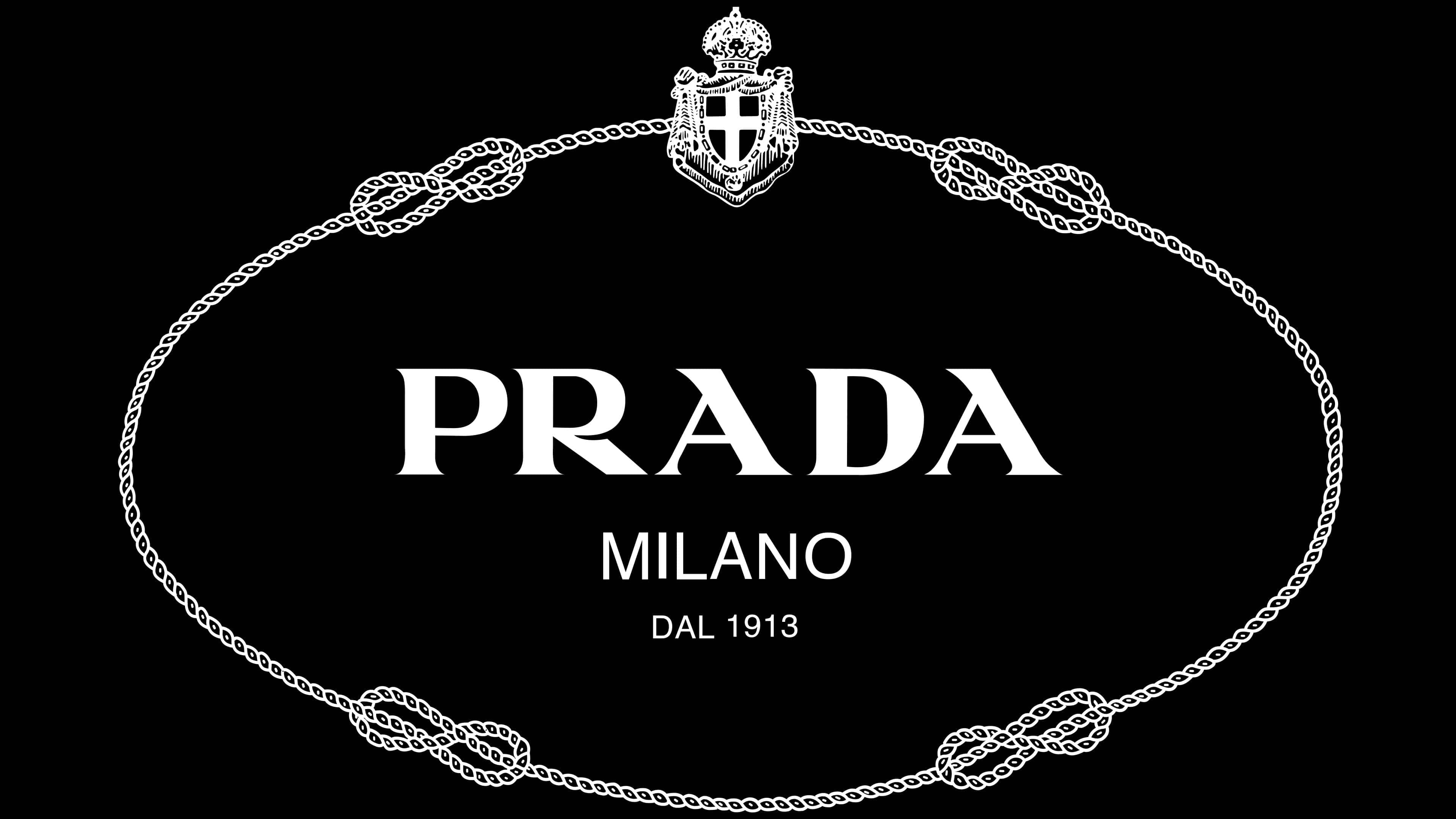
One of the versions featured details representing the royal family. It was a sign with the brand name, the year of its foundation, and the city of its foundation. They were located in the center of an ellipse. The oval formed a rope with four maritime knots and royal heraldry at the top.
The style of the logo’s text has not changed from its inception to the present day. The brand name, adopted in 1919, uses the same font in uppercase letters.
The Italian Fashion House’s color palette also emphasizes sophistication in minimalism. Therefore, whatever form its emblem takes, it is always depicted in monochrome, with a dark inscription on a light background. However, in exceptional cases, “Prada” is white or gold.
![]()