Adopted in 1969, the emblem of the sportswear brand still retains its relevance. Like its previous versions, the Kappa logo symbolizes the commitment to follow the principle of gender equality and demonstrates closeness to modernity and fashion trends.
Kappa: Brand overview
Kappa is a manufacturer and supplier of sportswear. It provides equipment for soccer players around the world. It has been operating since 1916. It is located in Turin, Italy, and was formed by the BasicNet company. It has several subsidiaries.
Meaning and History
The brand started with the production of socks and underwear. In 1967, it expanded production, after which a major redesign was conducted, and a widely recognized logo was developed. Thanks to the new concept reflected in the trademark, it became known in the fashion industry as a legislator of urban, sexual, and authentic fashion. But before this, it changed its symbolism several times until it found the most accurate one.
What is Kappa?
Kappa is an Italian manufacturer of sportswear and footwear for sports and active recreation. It was founded in 1978 and named after the tenth letter of the Greek alphabet. The brand became known thanks to its logo, which depicts two people sitting back to back. The company is also known for its collections of soccer clothing, as it has collaborated with many sports clubs, including “Benfica,” “Napoli,” and “Juventus.”
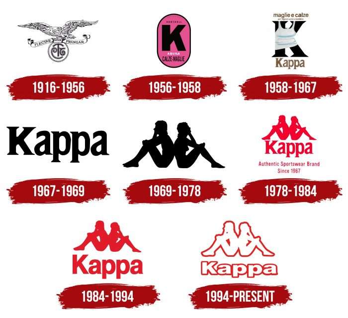
1916 – 1956
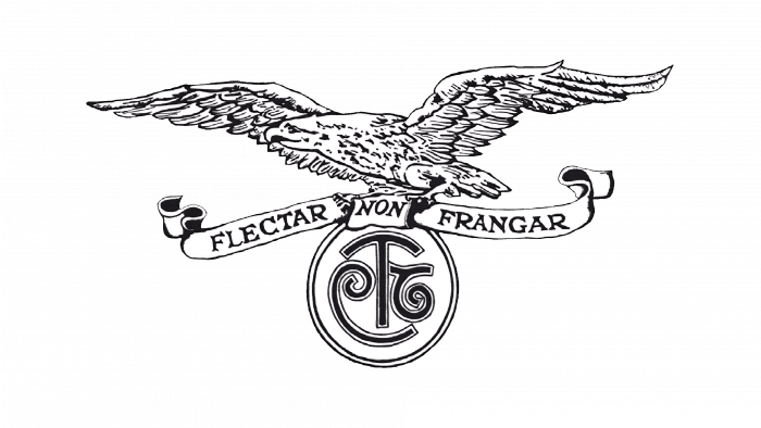
The debut contains the company’s first name – Maglificio Calzificio Torinese, which is represented as an abbreviation. It’s written in rounded letters and enclosed in a circle with a double end. The logo also depicts a flying eagle with spread wings and the slogan “Flectar non frangar.” The slogan is written in capital letters on a ribbon with curled ends. The logo’s color is black and white.
1956 – 1958
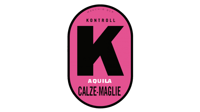
At this time, the company changed its name to Kontrollen, which was reflected in the brand style. It was then that the letter “K” first appeared. On the pink oval with a thin black edge, two inscriptions also appeared: “Aquila” (it replaced the image of the eagle) and “Calze-Maglie” (indicates the product – socks-shirts).
1958 – 1967
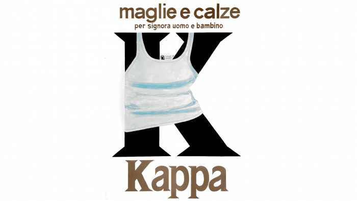
In 1958, the manufacturer first rebranded and then changed the design. As a result, only the large letter “K” remained on the emblem, but it now denotes a different name – Kappa, which is placed under it. The new name is related to the Greek roots and represents the tenth letter of the alphabet of Ancient Greece. The phrase “Maglie e Calze” is supplemented with the qualification “per signora, uomo e bambino,” meaning “shirts and socks for women, men, and children.”
The writing is different everywhere, depending on the importance of the information. The word “Kappa” is typed in a large serif font, “Maglie e Calze” – in capital letters, and “per signora, uomo e bambino” – in lowercase. The color of the text elements is dark gold. The letter “K” has a shirt, behind which the outlines of the letter are barely visible.
1967 – 1969
The updated brand received official registration and changed the emblem, simplifying it as much as possible. Black letters – uppercase font with serifs are depicted on a white background.
1969 – 1978
This is the most important period in the history of the emblem, as it was in 1969 that the famous version appeared – silhouettes of two people (a man and a woman) sitting back to back. This brand name appeared accidentally – during a photo shoot for a swimsuit catalog. The developers presented it in two colors – black and red. The ideological task of the logo is to show support and equality between the two genders.
1978 – 1984
In 1978, the designers added the inscription Kappa Sport. It was placed on the sign and made in thin red sans-serif font. But in 1981, it was removed, replaced with the inscription “Authentic Sportswear Brand” on one line and “Since 1967” on the second. The company’s name appeared under the figures of the man and woman. It is done in large letters and painted in red color, as are the other elements.
1984 – 1994
The artists enhanced all the logo details, outlined them with a white line, and placed them on a black background. Extra inscriptions (except for the brand name) were removed. The purpose of this version was to show closeness to modernity and fashion trends.
1994 – today
In 1994, the Kappa logo design was changed. Now, it consists of a white emblem and a word outlined in red. The absence of dark colors made the brand style brighter and emphasized the connection with the legendary origin and fashion.
Kappa: Interesting Facts
Kappa is an Italian company that makes sports clothes and shoes. It started in Turin, Italy, in 1967 and has become popular worldwide.
- How It Started: Kappa began as part of another brand in 1916 but became its own entity in 1978, focusing on sports products.
- The Kappa Logo: Their logo is pretty cool. It shows a man and a woman sitting back to back, which means they support each other and are equal. This logo came from a photo taken in 1969.
- Sponsoring Athletes: Kappa was one of the first in Italy to give sports teams and athletes gear to wear, which helped them become known not just in Italy but worldwide.
- Sponsoring Big Teams: They’ve given clothes and shoes to big soccer teams like Juventus, FC Barcelona, and Italy’s national soccer team.
- A Special Sports Kit: In 2000, Kappa made a special soccer outfit called the Kombat kit. It was tight so players could move better and not get their shirts pulled during games. Many teams liked this idea and started wearing similar gear.
- Cool and Fashionable: Kappa isn’t just for sports; it’s also become fashionable. Young people and famous people in music and movies like wearing Kappa because it looks good.
- More Than Sports Clothes: Now, Kappa makes casual clothes and shoes, too, not just sports stuff. This means more people can find something they like from Kappa.
- All Over the World: Kappa is now in more than 120 countries, showing that people everywhere like what they make.
Kappa has come a long way since its start in Italy. It now makes sports gear stylish clothes for everyday wear. Their logo and how they help athletes and teams are big reasons why many people like Kappa.
Font and Colors
For the emblem of the fashion brand, developers chose a commercial font closest to Helvetica Black, created by Max Miedinger. Among the free fonts, Kyrilla Sans Serif Black by Manfred Klein is the most similar version. The letters are classic, simple, grotesque, placed almost close to each other, which beautifully resonates with the pictogram in the form of two figures leaning against each other.
The color is bright and attention-grabbing: red contour lines and a white background with negative space. But other variations are possible – the use of black, white, and gray colors with and without contours on different backgrounds, based on the color of the fabric.
Kappa color codes
| Fire Engine Red | Hex color: | #c82426 |
|---|---|---|
| RGB: | 200 36 38 | |
| CMYK: | 0 82 81 22 | |
| Pantone: | PMS 485 C |
