


![]() Zara Logo PNG
Zara Logo PNG
One of the most prominent names in the fashion world uses a modest emblem: the Zara logo consists only of the company’s name. Its sophistication derives from the harmonious combination of thin and thick lines in the interconnected letters, forming a distinctive “structure” in which each preceding glyph becomes part of the subsequent one.
Zara’s history began before its first store. Amancio Ortega grew up in Galicia and started working at 14 as a shop assistant. He later joined a clothing store in La Coruña, where he learned production and retail. In 1963, with Rosalia Mera, he launched Confecciones GOA, producing robes and underwear.
In 1975, the first store opened in La Coruña. The original name Zorba was changed to Zara after a naming conflict. The concept focused on affordable fashion inspired by current trends. By 1983, the brand had expanded across Spain.
In 1985, Ortega founded Inditex, integrating manufacturing, logistics, and retail. This structure enabled a vertically integrated model, allowing Zara to control design, manufacturing, and distribution without intermediaries.
International growth began in 1988 with a store in Porto, followed by New York in 1989 and Paris in 1990. By the mid-1990s, Zara had expanded into multiple countries. Compared to H&M, the company reduced production cycles to about two weeks, delivering new items twice weekly.
In 2001, Inditex went public on the Madrid Stock Exchange. During the 2000s, Zara expanded across Asia, Latin America, and the Middle East, opening stores on Fifth Avenue and Oxford Street. Online sales launched in 2010.
In 2011, Ortega transferred the CEO role to Pablo Isla, later stepping down as chairman in 2022. By the mid-2010s, Zara became the largest clothing brand by revenue, ahead of H&M and Gap.
Meaning and History
![]()
The brand’s distinctive mark reflects its success, turning fashion into elite art. The logo’s purpose is to emphasize the elegant solutions offered by the Spanish entrepreneur. To shorten the “path” to its customers, the businessman decided to release not just one or two clothing collections a year but many more. Thus, he quickly made the brand popular and the logo recognizable.
What is Zara?
It’s a well-known Spanish company operating in the fast-fashion business model. It produces and sells clothing, jewelry, perfume, accessories, and footwear at relatively low prices. Unlike its competitors, Zara saves on advertising, not on wages. The retail chain belongs to Industria de Diseño Textil, S.A.
1975 – 1980s
![]()
In 1975, the first Zara store opened. The logo was a fold-out cardboard clothing tag, turned on its side. To make the drawing look realistic, designers added a dark shadow. The black tag was rectangular with two cut corners. On one side, artists depicted a rope threaded through a round hole and tied in a knot. The polygon contained a white inscription, underlined above and below, with stripes of the same color. The brand name was on one line, and the phrase “TIENDAS DE MODA” on another. The word “ZARA” is used in an original bold font with rounded corners. The rest of the text was written in bold sans-serif script.
1980s – 2008
![]()
The emblem of that time contains a clear inscription consisting of the company’s name. All letters are uppercase, with thickened strokes: for “Z” in the center, for “A” on the right, for “R” all. The font is classic, with small serifs. The word is precisely centered both horizontally and vertically. The extreme symbols almost touch the thin line outlining the rectangle’s perimeter.
2008 – 2019
![]()
Having lasted thirty-three years, the company’s logo received a new visualization. Developers decided to modernize it to make it equally suitable for advertising media, printed documents, clothing labels, and internal tags.
Although the font remained the same, the letter size was reduced: the letters became much smaller and more compact. There is more free space around the inscription now, visually making the word even smaller. Thanks to this stylistic move, all attention is now focused only on the brand name.
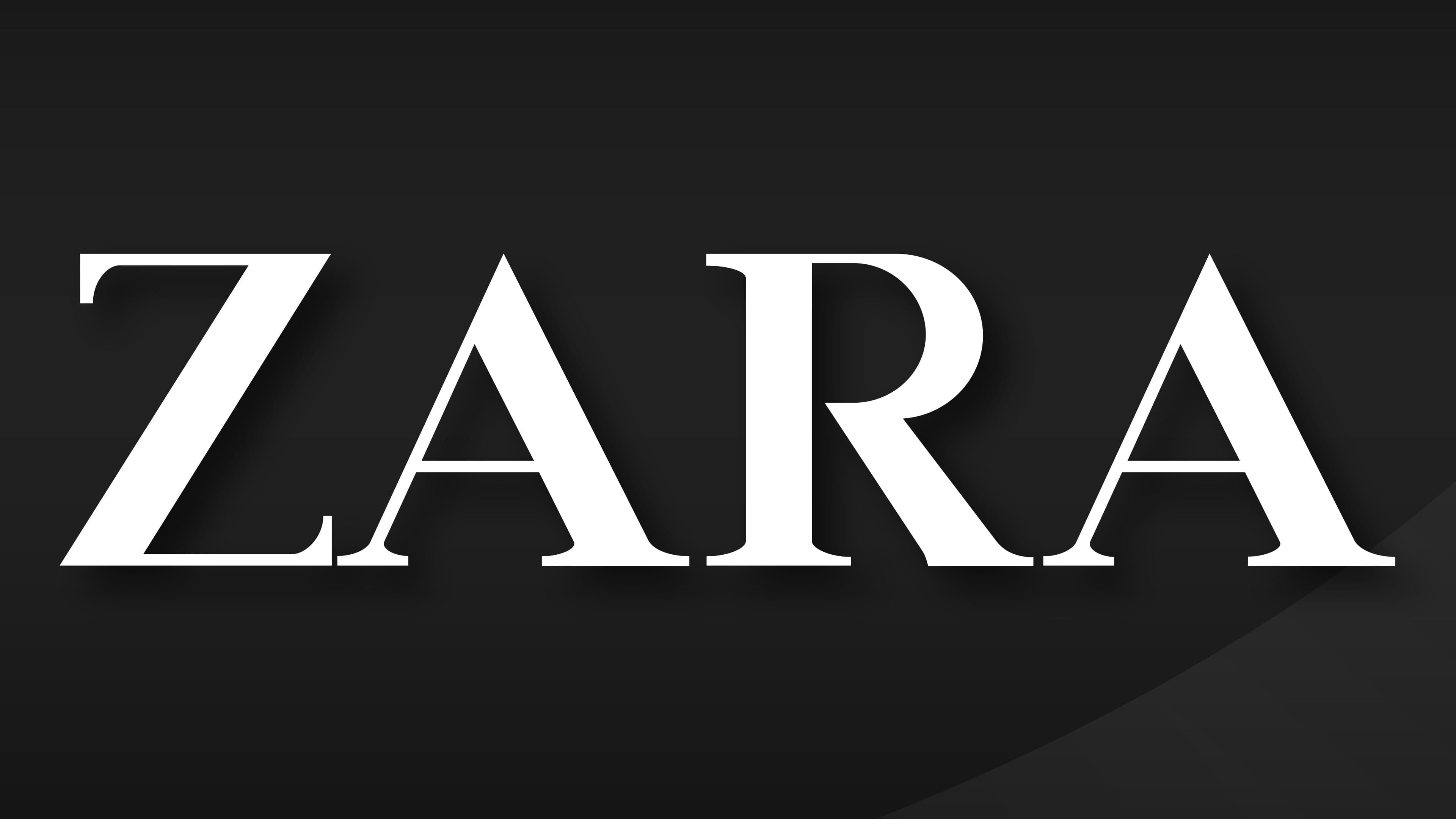
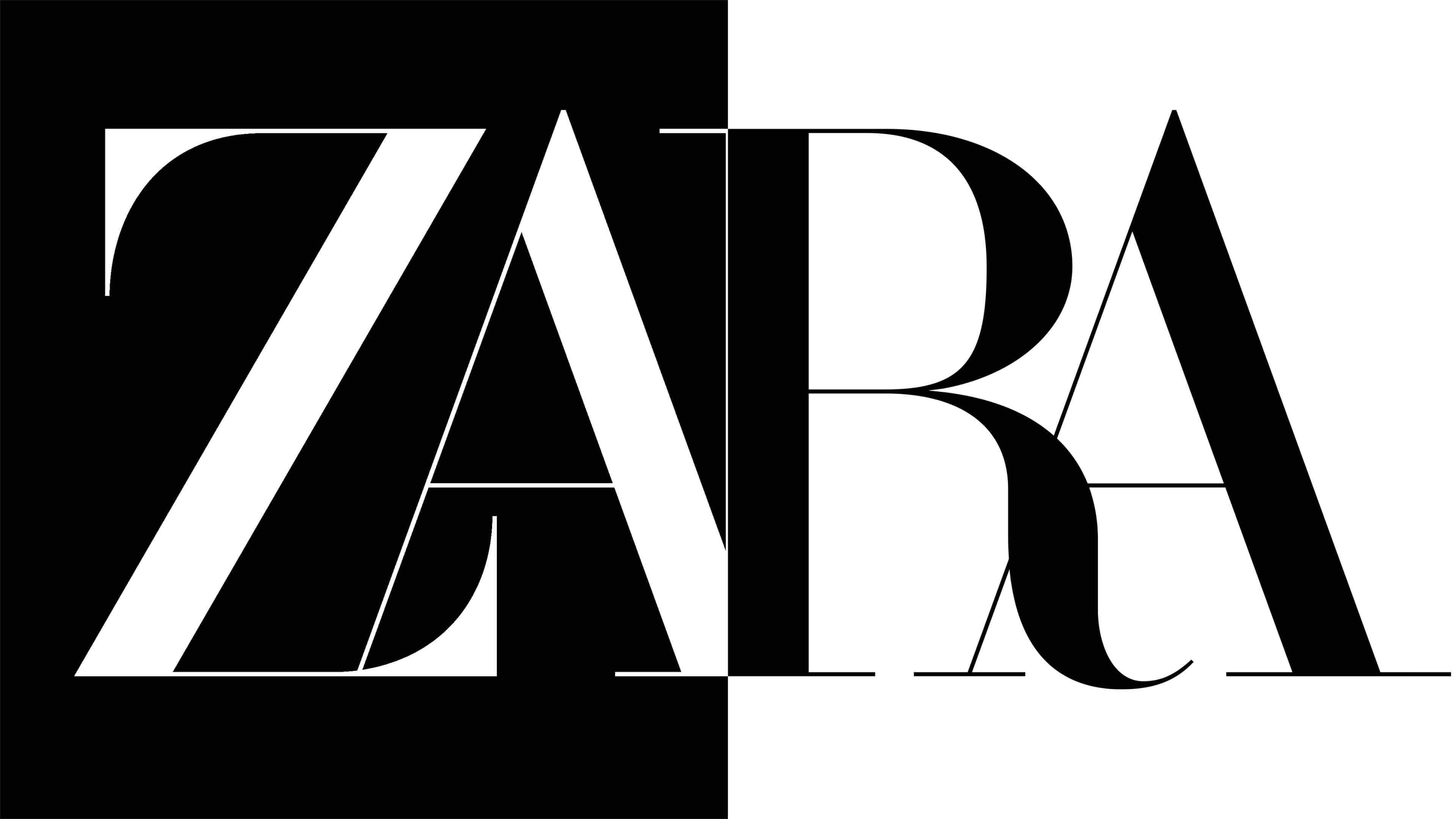
2019 – today
![]()
The current logo has received a designer twist – the developers made the graphics part of the text. For this, they changed the writing, size, and arrangement of the letters. In the modern version, the font is elongated, and the symbols overlap. Mainly, the legs are connected (“AR”) or intersect (“ZA” and “RA”). The letter “Z” has thickened serifs, distinguishing it from the rest.
Font and Colors
The Zara logo embodies the accessibility of luxury items and elite wardrobes. That’s why it contains only the name – simple, compact, and understandable to all fashion lovers. Such a marketing ploy has made branding popular worldwide, including among fashion legislators. Currently, the stylish brand adorns the signage of Spanish and French fashion boutiques, attracting customers’ attention. And to ensure the logo does not disappoint fans, more than 200 designers work on its prestige.
The company’s distinctive feature is a concise inscription executed in black on a white background. This emphasizes the accessibility of fashionable things to everyone. There are two additional logos associated with the main one: one for the men’s line and the other for Home.
The Zara Man variant is presented in monochrome, with the same writing as the main one. The word “Man” is located in the lower-right corner and is set in a bold, sans-serif font, with the capital letter “M.”
The Zara Home logo is used for home accessories. It consists of two parts, arranged in tiers: Zara at the top and Home at the bottom. Due to the equal number of symbols, the words are placed exactly one above the other. All letters have the same height, width, and style of writing. There are no serifs, as the emphasis is on practicality.
FAQ
What does the Zara logo mean?
The seemingly simple Zara logo signifies the clothing and accessories sold under this brand. It consists of only four letters, which are compact, concise, and easy to understand. At the same time, the letters Z, A, R, and A are positioned so closely that they overlap each other. This speaks to the company’s unconventional approach to fashion issues.
Why did Zara change its logo?
Zara changed its logo in 2019 to remain competitive among modern brands. The fact that the logo redesign was commissioned by the agency Baron & Baron, which developed the visual style for Dior, Burberry, and other luxury brands, indicates the company’s desire to move into the elite fashion-house category and to stop being associated only with fast fashion.
Why is the Zara logo black and white?
The Zara logo uses a black-and-white color scheme because the brand’s owners preferred it. Initially, the inscription was blue, but then it was made black to be more legible against a white background. Additionally, by using a restrained palette, fast fashion emulates the giants of the fashion industry.