The Adidas logo accurately reflects the brand’s unique design and the diversity of its sports products. The emblem symbolizes the dynamism of development and the reach across three continents with its offerings, reflecting the idea of confidently overcoming difficulties to achieve a high goal.
Adidas: Brand overview
Adidas is a globally renowned footwear company that gained fame thanks to its unique sports models. The company was founded in August 1949. It is located in Herzogenaurach, Germany, and was founded by Adolf Dassler.
Meaning and History
Unlike other global companies that prefer a thoughtful and philosophical approach to designing their symbols, Adidas’s choice is quite practical and somewhat banal. The fact that the company was given a name consisting of a shortened version of the name and surname of the owner: Adi (Adolf) + Das (slur). However, the graphic image still turned out to be complex and has evolved year after year.
What is Adidas?
It is a German company with headquarters in Herzogenaurach, Germany. It is engaged in the development and production of sports clothing and footwear. The brand was founded in 1924 by Adolf Dassler, later joined by his brother Rudolf. Initially, the company was called Gebrüder Dassler Schuhfabrik (Dassler Brothers Shoe Factory), but after a dispute between the founders, it received its current name.
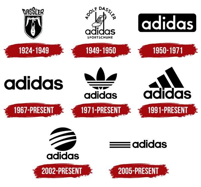
1924 – 1949
The debut emblem appeared much earlier than the brand itself. It represents a shield with a seagull holding a man’s shoe in its beak on a dark background. A contrasting border surrounds the main element; the other details are in monochrome. The text fragment (the word “Dassler”) used a constructivist font popular in Germany at the time. It echoes the font Futura and the grotesque experimental geometry of the Bauhaus era. It has an uneven distribution in height. It is placed above the shield, making it look like an improvised crown.
1949 – 1950
The company’s first official logo consists of a harmonious combination of verbal and graphic details. The central element is a spiked shoe. It is located between the posts of American football goals, which are made in the form of extended legs of the lowercase letter “d.” Below is the name – that’s when “Adidas” debuted, consisting of two parts. Under it is placed the last link with the direction of sports – the compound word “Sportschuhe.” The full name and surname of the company’s owner are written in the upper part of the semicircle.
1950 – 1971
In the 1950s, the company moved away from the graphic component and focused only on the verbal. The original name, which appeared in the previous version, was chosen as the key element. It is made in a simple sans-serif font. The letters are lowercase, bold, and of the same size. The letter “a” stem is cut at an angle and directed upwards.
1967 – today
Having lasted 17 years, the logo got a new design: now the background is white, and the name itself is black. The dots above “i” and on the sides of “d” have the same height. The leg of the letter “a” is rectangular, without cuts and vertices.
1971 – today
In the early 70s, the concern decided to rebrand and create a more dynamic logo that would characterize it as a manufacturer of various sports goods. The presentation of the final version coincided with the Olympic Games in Munich. The new logo represents a clover leaf and three horizontal lines.
To eliminate competition with the Finnish brand Karhu, which also had three stripes on the logo, the German company preemptively bought them for $1,800 and two bottles of whiskey. The cloverleaf symbolizes the world’s continents: the first – North and South America; the second – Europe and Africa; the third – Asian countries.
1991 – today
At this time, Adidas introduced a radically changed logo. The clover disappeared, and the lines were rearranged. Now, they form a schematic mountain – as a symbol of overcoming obstacles and the sports orientation of the products. The mountain effect is achieved by tilting wide vertical strips of different heights. Despite the wave of criticism that found the updated logo too boring and overly simple, it was approved as the main element of the corporate style.
2002 – today
With the transition to the new millennium, the famous manufacturer decided to revise the logo and make some changes to it. As a result, some products began to display a black ball with three white stripes. They are placed at a horizontal angle and resemble the tracks of some strong animal’s claws. This version is called Adidas Style and is mainly oriented towards the fashion industry. The logo represents the Y-3 series, developed by Yohji Yamamoto, and the SLVR line.
2005 – today
In 2005, the company introduced another logo in the form of alternating black and white stripes to the left of the classic name. For this, the logo uses three dark and two light lines and the word “Adidas” in the 1967 script.
Adidas: Interesting Facts
Adidas is a big name when it comes to sports clothes and shoes all over the world.
- How It Started: Adolf “Adi” Dassler made Adidas in 1949 in Germany. His name comes from his nickname, “Adi,” and the start of his last name, “Das.”
- The Three Stripes: The famous Three Stripes logo was bought from a Finnish brand in 1952. These stripes are supposed to remind athletes of the mountains they climb to reach their goals.
- Cool Shoes for Sports: Adidas has always been about making sports better. In 1954, they made a soccer shoe that helped players, especially when it was wet. These shoes were a big hit when Germany won the World Cup that year.
- More Than Soccer: Adidas doesn’t just make soccer shoes; it also makes clothes and gear for other sports, such as basketball, tennis, and running.
- Famous Shoes: The Stan Smith and Superstar shoes are well-known. Stan Smiths went from tennis courts to being fashion favorites, and Superstars were big in hip-hop during the 1980s.
- Working with Kanye West: In 2013, Adidas started making shoes called Yeezys with Kanye West. These shoes are super popular and hard to get.
- Helping the Planet: Adidas is trying to be good to the Earth by making shoes from recycled ocean plastic and plans to use recycled materials for all its products by 2024.
- Adidas and the Olympics: Adidas has long provided Olympic athletes with gear, making it known worldwide.
- Adidas sells products in almost every country, and many people work for them worldwide.
- Family Rivalry: The guys who started Adidas and Puma were brothers who split up and started their own companies. This started a big rivalry between the two brands for years.
Adidas started as a small shoe shop in Germany but is now known worldwide for making great sports gear, thanks to the hard work and clever ideas of its founder, Adi Dassler.
Font and Colors
The iconic three stripes of Adidas brought fame to the brand. Moreover, they exist in four versions, which have been equally frequently used over the past decades:
- A black clover with three white lines.
- Three wide diagonal quadrilaterals are tilted to the left.
- A circle with uneven arc-shaped breaks.
- Thin horizontal stripes.
All these are recognizable trademarks that distinguish Adidas products from other sports goods.
All manufacturer’s logos contain its name written in lowercase letters. Designers chose the TeXGyreAdventor font, which the GUST printing company developed. It is a typical geometric sans-serif with rounded elements and rectangular strokes.
The color palette is limited and represented by a classic combination of black (for graphic elements and inscriptions) and white (for intra-letter spaces, lines inside the circle/triangle, and background).
Adidas color codes
| Black | Hex color: | #000000 |
|---|---|---|
| RGB: | 0 0 0 | |
| CMYK: | 0 0 0 100 | |
| Pantone: | PMS Process Black C |
FAQ
What makes the Adidas logo unique?
The uniqueness of the Adidas logo lies in that it emphasizes dynamism. Styles convey this in every variation, and there are four of them:
- A clover with three horizontal stripes.
- A triangle consists of three diagonal elements.
- A black ball with strokes directed in one direction; the fourth is three long black lines in front of the company name.
What hidden message is in the Adidas logo?
The Adidas logo contains the idea of overcoming difficulties to achieve the ultimate goal – victory. This is evidenced by the three wide stripes of different heights forming an inclined mountain slope together. These are steps to glory and self-affirmation. That is, this emblem denotes a complete focus on a sports career.
Why does the Adidas emblem have a triangular shape?
The emblem in the form of a triangle represents a symbolic mountain that must be overcome to defeat oneself or opponents. Wide black stripes combine with each other, forming an inclined slope: first comes a small element, then a higher one. To get a mountain, designers tilted them and made them in the form of steps.
Why is the Adidas logo so successful?
The success of the Adidas logo lies in that it helps to identify the brand unmistakably. The emblem is maximally associated with sports, indicating product priorities – sports clothing and footwear. Experts recognized it as an excellent example of corporate style and a great marketing tool.


