


![]() Victoria’s Secret Logo PNG
Victoria’s Secret Logo PNG
The fashion industry pays special attention to visualization, aiming to reflect attractive features. Victoria’s Secret, a company based in San Francisco, adheres to this as well, with a logo characterized by minimalism, modernity, practicality, sleekness, and aesthetics.
Victoria’s Secret was founded on June 12, 1977, by Roy Raymond, who struggled to find a comfortable retail space to buy lingerie. The first store opened in Palo Alto with a Victorian-style interior, built on $80,000 in savings and loans.
In its first year, revenue reached $500,000. By 1982, the business grew to five stores and a 42-page catalog, generating $6 million annually, but financial pressure remained high. That year, Raymond sold the company to Les Wexner, owner of The Limited, for $1 million.
Wexner shifted the strategy toward a female audience, expanded the number of mall locations, and scaled catalog sales. By the early 1990s, the network reached 350 stores and $1 billion in annual revenue. In 1994, the Miracle Bra launched and became a defining product.
In 1995, the first Victoria’s Secret Fashion Show took place at the Plaza Hotel in New York. The event evolved into a major media format, with online streaming in 1999 and a TV broadcast on CBS in 2001, drawing over 12 million viewers.
The Angels line debuted in 1997, and the winged image became central thereafter. Models such as Tyra Banks and Gisele Bündchen gained global recognition through the brand.
In 2006, the PINK sub-brand targeted younger consumers. By 2018, viewership declined sharply, followed by controversy around public statements by marketing chief Ed Razek. He left in 2019, and the show was canceled.
In 2021, the company ended the Angels concept and introduced VS Collective. In October 2024, the show returned in a revised format.
Meaning and History
![]()
The logo of this fashion industry representative is minimalist. Over the years, it has undergone several minor transformations: what used to be a retro-style sign is now a modern and practical label.
The first version of the logo was introduced in 1977, coinciding with the brand’s catalog debut. It featured many small details, intricate elements, and vintage accents. However, in the mid-1980s, the company changed the brand name style to a more concise one.
The fonts are clear and easily readable, sometimes with serifs, sometimes without. Designers experimented with letter proportions until settling in the 1990s on a version very similar to the current one.
The company itself worked on the logo, occasionally involving agencies. Among those who participated in the logo creation was Mucca Design Studio. They provided an updated version of the “VS” graphic symbol, an internal brand book, a set of icons, and templates. Later, Studio 191 from New York joined the team. The artists worked on the textual part and proposed new versions for some sub-brands.
What is Victoria’s Secret?
This company is known as the largest lingerie seller in the USA. At the same time, its actual range is much broader, including decorative cosmetics, perfumes, and clothing lines. From its founding in 1977 until 2016, Victoria’s Secret aggressively expanded, but its products were increasingly displaced by sportswear.
before 2009
![]()
Until 2009, Victoria’s Secret was recognized by an elegant logo with pink letters. The first word of the name was above, the second below. They were centered and consisted of uppercase letters with thin, long serifs. A contrasting geometric font was used, looking like a slightly modified Adobe Trajan Pro 3 Regular.
2009 – today
![]()
Now, the brand is represented by a black wordmark. It is a single-line inscription, “VICTORIA’S SECRET,” with enlarged initials “V” and “S.” Despite the size difference, all glyphs are in uppercase. The font changed, but to maintain brand recognition, the designers chose a contrasting antiqua with fine serifs, similar to the previous version.
Font and Colors
![]()
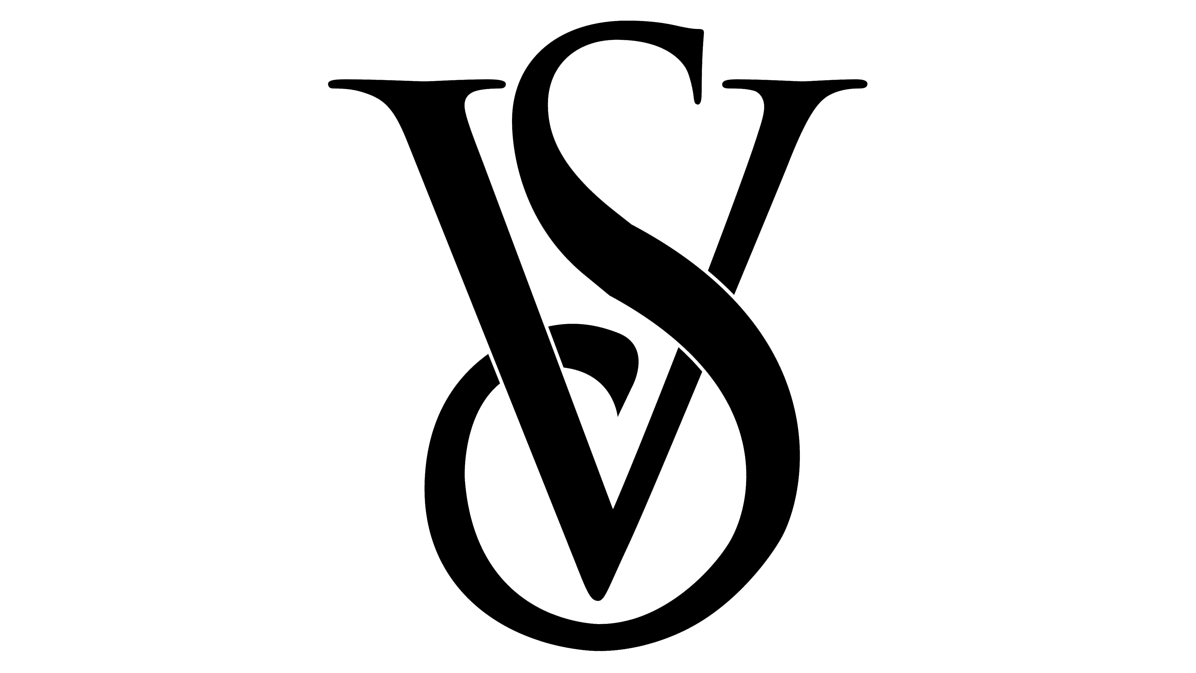
The graphic part of the logo is a simple black monogram on a white background. In the intertwining of letters, “V” and “S”, the abbreviation of the fashion brand name is visible. The “V” is positioned right in the middle, and the large lower fragment of “S” intertwines with it, so the sharp base of “V” is inside the circle. The upper “S” protrudes above the serifs of the first letter.
The verbal part of the emblem consists of the inscription “Victoria Secret”, built in two tiers. It is presented in uppercase and written with letters of equal height, except for the first. In addition, the brand uses other corporate names.
In the 2000s, for brand visual identification, the Adobe Trajan font, created by Carol Twombly in 1989, was chosen. Then, the company switched to the modified Monotype Bell font.
The brand palette consists of pink, black, and white. The dark color is the primary one, as it lends the logo a sense of seriousness and refinement. White often serves as a background or accent element, for example, as a border.