The Deutsche Bank logo embodies a securely sealed safe and ATM. The emblem evokes a sense of security and stability in customers. Symbols are like powerful pillars that cannot be broken or hacked. Only the one who has the access code can open the door.
Deutsche Bank: Brand overview
| Founded: | 10 March 1870 |
| Headquarters: | Frankfurt, Germany |
| Website: | db.com |
Meaning and History
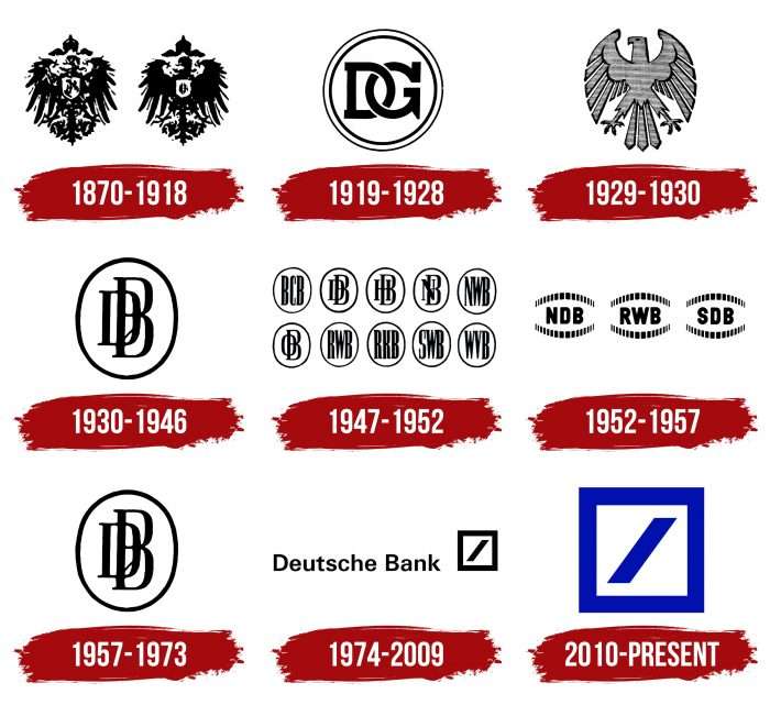
Deutsche Bank logos indirectly reflect Germany’s history because global events influenced their formation. The modern symbol “Slash in a Square” is considered one of the most famous symbols in the financial industry. Its appearance was preceded by other signs, mainly in the form of an eagle or a monogram.
What is Deutsche Bank?
Deutsche Bank is a German investment bank and financial company headquartered in Frankfurt. It appeared in 1869, and it has become an international structure with a permanent presence in 58 countries, including Asia, America, and Europe. It consists of four basic departments, which oversee the basic activities of the bank.
1870 – 1918
Deutsche Bank was founded in 1870 by several bankers and politicians. Its emblem resembled the coat of arms of Deutsches Reich, the German state that existed from 1871 to 1918. It showed an imperial eagle with its wings spread, and its head turned to the left. One version contained white details, and the second was completely black, except for the light coat of arms on the bird’s chest.
1919 – 1928
Disconto-Gesellschaft is a part of the modern Deutsche Bank, founded in 1851. They merged in 1929, and until then, one of the largest financial institutions in Germany used the logo with the monogram “DG” inside the ring.
1929 – 1930
When Deutsche Bank and Disconto-Gesellschaft became one, the eagle’s design changed. The artists made the bird white, changed its shape, and removed the coat of arms. The company then received the double name Deutsche Bank und DiscontoGesellschaft.
1930 – 1946
In the mid-1930s, the bank updated the logo again. The eagle was replaced by the monogram “DB” in an oval. This variation was similar to the old Disconto-Gesellschaft brand name.
1947 – 1952
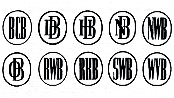
After the Second World War, the financial institution was on the verge of ruin. Because of this, as well as for political reasons, it was divided into ten parts. Each autonomous structure received its symbol, created in the style of the Deutsche Bank logo. This is how a whole series of monograms of the same type in ovals appeared. The letters were taken from regional organizations’ names – for example, BCB, NWB, NB, HB, or DB.
1952 – 1957
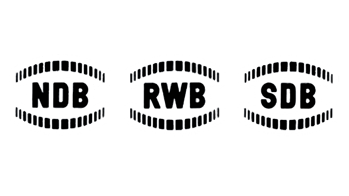
In 1952, ten small services merged into three large firms: Rheinisch-Westfälische Bank AG, Süddeutsche Bank AG, and Norddeutsche Bank AG. They continued to use the same logos, but the design changed:
- The ovals are gone.
- Abbreviations began to be written in a line, without interlacing letters.
- A semicircular ornament in ribbed rims of coins appeared on the top and bottom.
1957 – 1973
1957, the three successor institutions merged to revive the classic Deutsche Bank. Together with him returned his old symbol of 1930: the monogram “DB” in a white oval with a black outline.
1974 – 2009
The executives revamped the bank’s visual identity to highlight its international presence. To this end, they organized a competition for the best logo in 1972, promising all the contestants 3,000 German marks. Eight graphic artists, including Coordt von Mannstein, Armin Hofmann, and Anton Stankowski, participated in the competition. On February 6, 1973, an expert jury headed by designer Jupp Ernst announced the winner. It turned out to be Anton Stankowski with his square diagonal line. The triumphant received 100 thousand marks for his work.
First, the brand name was presented to employees in the company magazine Deutsche Bank, and only then was it publicly advertised at the annual press conference. So, in April 1974, the world saw for the first time the iconic symbol with which the German financial sector is now associated.
But not everyone liked the simple design. The media wrote that Stankowski was “an artist who earned 100,000 marks with five strokes.” However, this did not correspond to the truth because his studio simultaneously submitted nine projects to the competition. Among them were different variants with the letters “DB.”
2010 – today
After a minor redesign, the “DEUTSCHE BANK” label disappeared, and the square and forward slash turned blue. The new logo conceptually continues the old one because it is one of the most famous finance trademarks.
Deutsche Bank: Interesting Facts
Deutsche Bank was created in 1870 to help businesses trade internationally, a fresh idea at a time when most banks only focused on local markets. It quickly became a global leader in finance.
- International Trade: It set out to connect Germany with the rest of Europe and beyond, making it easier for companies to do business worldwide.
- Financial Innovation: Deutsche Bank was crucial in starting foreign exchange trading in the early 1900s, changing how money was traded across borders.
- Worldwide Operations: Today, it operates in over 70 countries, offering services like corporate and investment banking, asset management, and private banking.
- Art and Culture Support: The bank has a huge art collection and supports artists and cultural activities, showing its dedication to the arts.
- Focus on Sustainability: It was among the first big banks to tackle climate change, investing in clean energy and aiming to meet the Paris Agreement’s goals.
- Iconic Buildings: The Deutsche Bank Twin Towers in Frankfurt are notable for their eco-friendly design and landmark of the city.
- Investment Banking is a leader in helping companies merge, go public, or obtain financial advice, making big deals happen.
- Facing Challenges: Like many large banks, it’s had its share of scandals and legal issues, but it’s working on improving its practices.
- Embracing Technology: The bank is updating its technology to serve customers better and stay competitive, including partnering with tech companies.
- Giving Back: Deutsche Bank invests in the arts, education, and environmental projects through its foundation and social programs, showing its commitment to community support.
In short, Deutsche Bank has played a major role in finance worldwide, facilitating international trade, investing in sustainability and technology, and supporting cultural and social causes.
Font and Colors
Stankowski painted pictures in the past and often experimented with oblique lines. It was his favorite motif and eventually became the basis of the current Deutsche Bank logo. The designer admitted that he did not put a specific meaning into geometric abstraction; everyone can interpret it differently. At the same time, he compared the diagonal stripe with growth dynamics and called the square a symbol of security. Development and stability—this is exactly what customers expect from a bank.
In 2010, the company decided to focus on the icon to be used in any context without being tied to language. A little earlier, against Anton Stankowski’s wishes, there was a word sign next to the geometric figures. It was “DEUTSCHE BANK” in the Univers font, which became famous after the Munich Olympics. Currently, the logo only has a diagonal line and a square border. They are colored blue (shade # 0018A8).
FAQ
What does the Deutsche Bank symbol mean?
The symbol has a square frame with a diagonal slash inside it. This design supports the brand’s uniqueness by providing a consistent frame of reference. The slash represents the brand’s commitment to growth and dynamic development, showing progress and forward movement.
The square frame around the slash signifies security and a controlled environment. It shows that the brand operates within a stable and secure framework, ensuring reliability and trust for its clients.
Is Deutsche Bank a German bank?
Yes, it is a German bank. It was founded in 1870 to help German businesses expand internationally. From the start, the brand has operated across borders, supporting German enterprises in their global ventures.
The bank’s headquarters are in Frankfurt, Germany. Over the years, the brand has become one of the leading financial institutions in the world, offering a wide range of banking and financial services.
German roots are clear in its support for the country’s economic interests and strong international presence. The brand plays a significant role in domestic and global financial markets, showcasing its expertise and reliability.
Did Deutsche Bank change its logo?
Yes, the brand introduced its current logo in 1974 and has remained the same. The logo turned 50 this month and remains attractive with its clean, minimalist design. It was a big change from the previous logo when it first appeared.
Its simplicity and modern look made it stand out and become easily recognizable. Over the years, this design has represented the brand’s identity, so there has been no need to change it. The logo’s lasting nature reflects the brand’s stability and consistent presence in the financial world.
What does the Deutsche Bank logo mean?
The logo, created by graphic artist Anton Stankowski, is minimalist and meaningful. It features a slanting line inside a square. The line slopes to the right, symbolizing financial growth and progress. The square stands for stability, protection, and security.
Stankowski’s design was selected from seven competitors’ submissions. The logo’s simple and clear design has remained relevant, reflecting the brand’s commitment to steady growth and reliable service. This emblem communicates the brand’s core values, making it recognizable and enduring.
What was the first-ever logo of Deutsche Bank?
The first logo featured the German coat of arms from the Deutsches Reich, the state from 1871 to 1918. It came in two versions: black and white and solid black.
The logo showed an imperial eagle with spread wings and a head turned to the left. Each eagle had a small shield with symbolic signs on its chest. This design highlighted the bank’s connection to the German state and its heritage at that time. It strongly symbolized the brand’s early uniqueness and role in the German financial system.
