


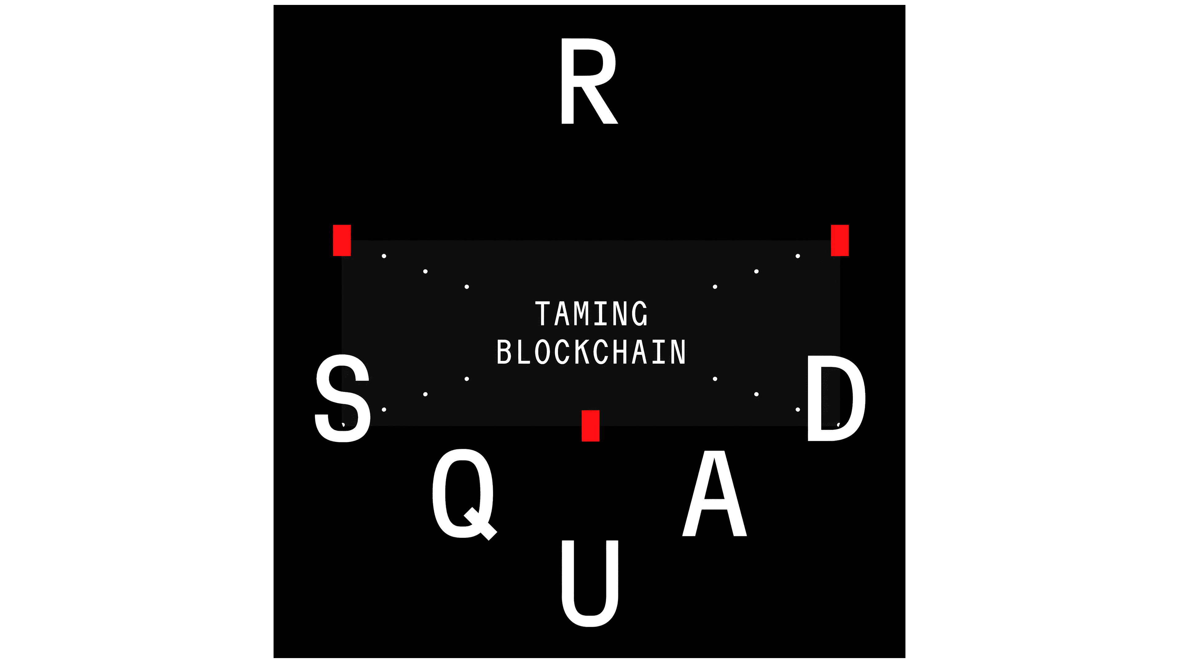
KOJI designed the company’s new logo, featuring the letters RSquad on a heraldic shield. The San Francisco agency cast the engineering team as a medieval order devoted to “taming blockchain.” The idea grew out of conversations with clients who compared the company’s technical work to magic.
RSquad Blockchain Lab has been operating since 2015, building blockchain infrastructure, DeFi protocols, and cryptographic tools. The team works on cross-chain Bitcoin transfers that keep users in control of their funds, implements advanced cryptography, and develops blockchain nodes from scratch. The identity, aimed at a professional audience, blends engineering references with humor and the team’s love of experimentation.
KOJI discussed the project’s direction with RSquad cofounder and CTO Roman Nguyen. The agency arranged examples from conventional to radical, and Nguyen gravitated toward the boldest options. Early ideas included aliens before the designers turned to magic. Arthur C. Clarke’s third law, which describes advanced technology as indistinguishable from magic, became the foundation. The team became “blockchain alchemists,” turning complex technical work into functioning infrastructure. The medieval theme blended the company’s professional image with its employees’ rebellious culture.
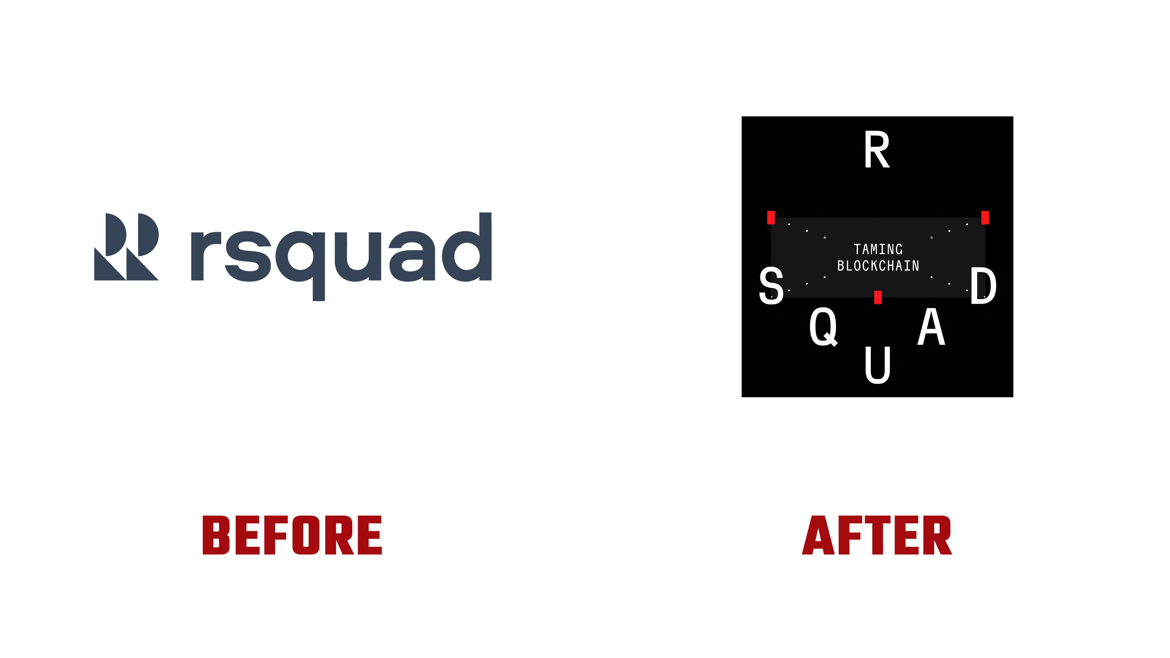
The previous logo paired a lowercase rsquad wordmark with 2 identical symbols on the left, each assembled from semicircles and triangles to resemble an “R.” The name used tightly spaced, rounded sans-serif lettering in the “s,” “q,” and “a.” A dark blue-gray color united the wordmark and symbols. In the new version, the emblem consists of the name’s 6 uppercase letters.
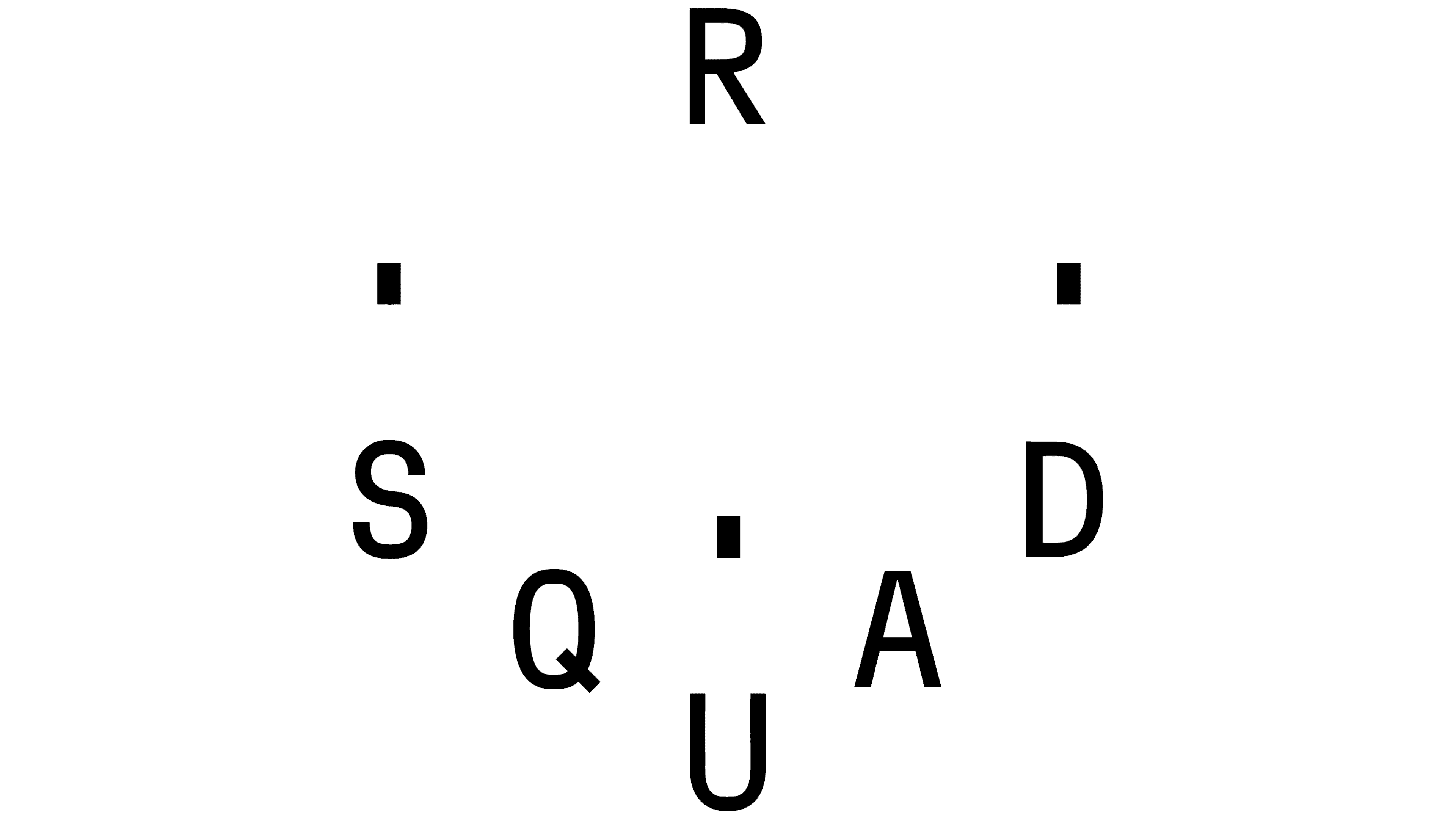
The “R” sits at the top, with “S” and “D” on either side, “Q” and “A” below them, and “U” at the bottom point. To read RSQUAD, the eye moves from the top “R” down the left side to the base, then up the right. The letters remain upright, while their arrangement creates a shield silhouette that narrows toward the bottom. The spatial construction also resembles a cube, referencing the technology’s block-based structure. In animation, the form rotates in different directions.
Inside the shield, TAMING BLOCKCHAIN appears on 2 lines in narrow uppercase letters on a dark gray panel. In the black-background version, 3 red vertical shapes accompany the white lettering. Two sit near the panel’s upper corners, while the third marks the center of its lower edge. Dotted diagonal lines connect them. Another version leaves the space between the letters open.
A 3-stone motif connects the emblem to the TON Rust Node story. In a KOJI film released in March 2026, a courier discovers an ancient artifact with hidden power. The stones correspond to the product’s core attributes. The shield becomes part of a fictional order whose artifacts extend the team’s engineering story.
On the website, a white background and businesslike design give way to medieval imagery, red, fire, ornamentation, decorative ligatures, and digital glitches. The scrolling experience is divided into 7 cycles, with transitions marked by a scene featuring a pennant and stones being gathered against a sunset. Through fire, writing, electricity, and the internet, the designers tell the story of discoveries that became everyday tools. Blockchain completes the sequence. For the TON Rust Node film, the team used AI to help develop the script, storyboards, characters, and animation.
At Nguyen’s suggestion, the team applied heraldry to items for the team and clients. The collection included 150 titanium goblets, 30 signet rings, 70 coins, and 200 T-shirts. AI helped develop jewelry concepts, heraldic sketches, and staged images with medieval settings. KOJI then refined the sketches by hand. KOJI estimates that combining AI generation with craft production reduced the jewelry production budget by approximately 40% and shortened the time needed to develop heraldic sketches by 25%.