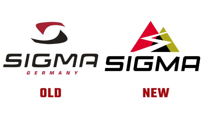
In addition to a new visual identity, the brand intends to participate in other image projects in the future.
Sigma is a company from Germany that produces bicycle accessories. The brand was founded in 1982, and since that time, the assortment consists of the following items: lighting systems, navigation systems, and bike computers for bicycles. The company manufactures products for both athletes and those who use vehicles for outdoor activities.
Sigma is now positioning itself as a brand for young people, and the company plans to expand into the international market. The designers have added two mountain peaks, which consist of three triangles in black, red, and green. There is a zigzag line between them, which symbolizes the road for cyclists. As stated by the brand, the graphic represents all cyclists’ personal goals and achievements who use the company’s products.
The primary colors remain the same as in all the logos before. The brand only added a green hue as a symbol of nature. Also, the general appearance of the inscription, the angle of inclination remained unchanged. The designers changed the font, making it clearer, without curly details, emphasizing remembering the emblem.


