


Berlin Museum is the new name uniting 8 museum locations previously known collectively as Stadtmuseum Berlin. The city unveiled the name and identity on July 27, 2026. Agency Stan Hema put the city’s name first and built the logo around typefaces connected to Berlin’s streets, buildings, and signs.
Audience research drove the change. Awareness of the previous brand was low, and its image felt disconnected from city life. The institution’s collection holds approximately 4.5 million objects and documents related to Berlin’s history. Its locations include Ephraim Palace, Knoblauchhaus, St. Nicholas’ Church, Düppel Museum Village, the BERLIN GLOBAL exhibition at the Humboldt Forum, and Jeanne Mammen’s studio. The shared name presents them as parts of one museum.
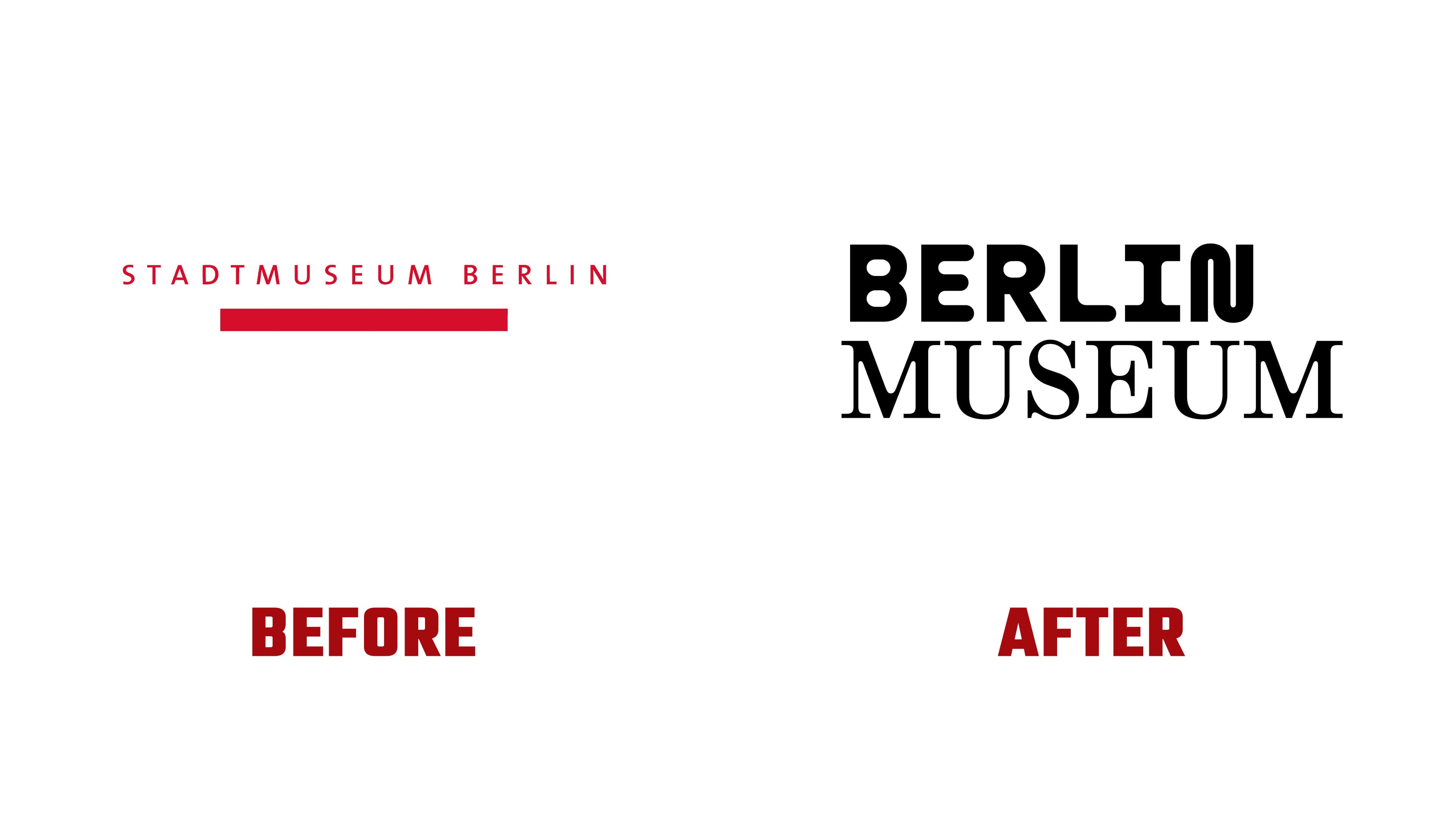
Berlin Museum comes from the institution’s own history. It previously belonged to a West Berlin museum that joined the foundation in 1995. The name now applies to the entire network and addresses both Berlin residents and international audiences. The legal name remains “Stiftung Stadtmuseum Berlin”.
The new logo uses 2 left-aligned lines, with BERLIN above MUSEUM. Each word is set in a different typeface drawn from a selection of 9. The arrangement and word order remain fixed, while the font pairings change. Refreshing the website, for example, brings up a different version of the wordmark.
The previous logo set STADTMUSEUM BERLIN in a single red line. Small sans-serif capitals were widely spaced, with a short, thick red bar beneath the name. The new identity uses the two-line arrangement as its consistent structure, uniting versions with rounded, stencil, handwritten, and other letterforms.
The differences between the lines reflect the coexistence of eras and communities, including the experiences of East and West Berlin. The designers made the contrasting letterforms an intentional part of the identity. Some typefaces trace back to specific signs around the city, while others reference its architecture, trades, and culture.
Moskau Grotesk is based on the Café Moskau lettering on Karl-Marx-Allee. Another source was the Deutsche Oper station, where lettering is integrated into the 1970s architecture. Futura Black Stencil references illuminated postwar signs, old Charlottenburg shops, and 1960s apartment buildings. Gaps in its strokes follow the construction of stencil lettering. WT Bobine connects to West Berlin architecture, including the Bikini Berlin complex.
The rounded forms of ABC Maxi recall the curves of neon tubing on signs at late-night shops in Neukölln, and food stands near Kottbusser Tor. Crack evokes graffiti on Warschauer Strasse and lettering on electrical cabinets in Kreuzberg. EK Roumald references late-19th-century Gründerzeit facades in Prenzlauer Berg and Moabit. CMM Coda recalls typewritten documents, old forms, and institutional notices. Neureal connects to club and digital culture, temporary exhibition spaces, and new technologies.
Stan Hema worked on the project in 2025 and 2026. The team included André van Rueth, Daniela Vogel, Lisa Geisler, and Mathias Illgen. The agency developed an advertising campaign and museum materials, drawing color combinations from the city’s surfaces, materials, and lighting. The rollout began in summer 2026. Signs, brochures, and other materials are being updated as they come due for replacement across the museum’s locations.