


“Danimals” latest update focuses on children’s growth and discovery of new skills. The Danone USA yogurt brand has redesigned its logo and Bongo monkey mascot and reformulated its products. Announced on May 20, 2026, the launch preserves a playful presentation for children while helping parents understand the products’ nutritional benefits.
Erin Beth Bosik, who handled positioning and copywriting, explained why they made the change. In her view, Bongo’s costumes and flavors such as cotton candy and birthday cake made Danimals feel more like a dessert, overshadowing its nutritional qualities. The team proposed focusing on children as they grow, develop physically, and make everyday discoveries. The designers needed to connect that message with the playfulness already associated with Danimals.
Danone’s in-house design team led the project. Adam Vicarel, Carly Salzman, and Matthew Andreus Narca worked on the wordmark. The company supplied initial digital sketches, which the designers used to explore options and refine the letterforms. Hyobin K., Kaitlyn Froboese McBride, Jamie Kelley, and Lauren Koprowski Bodner provided creative direction.
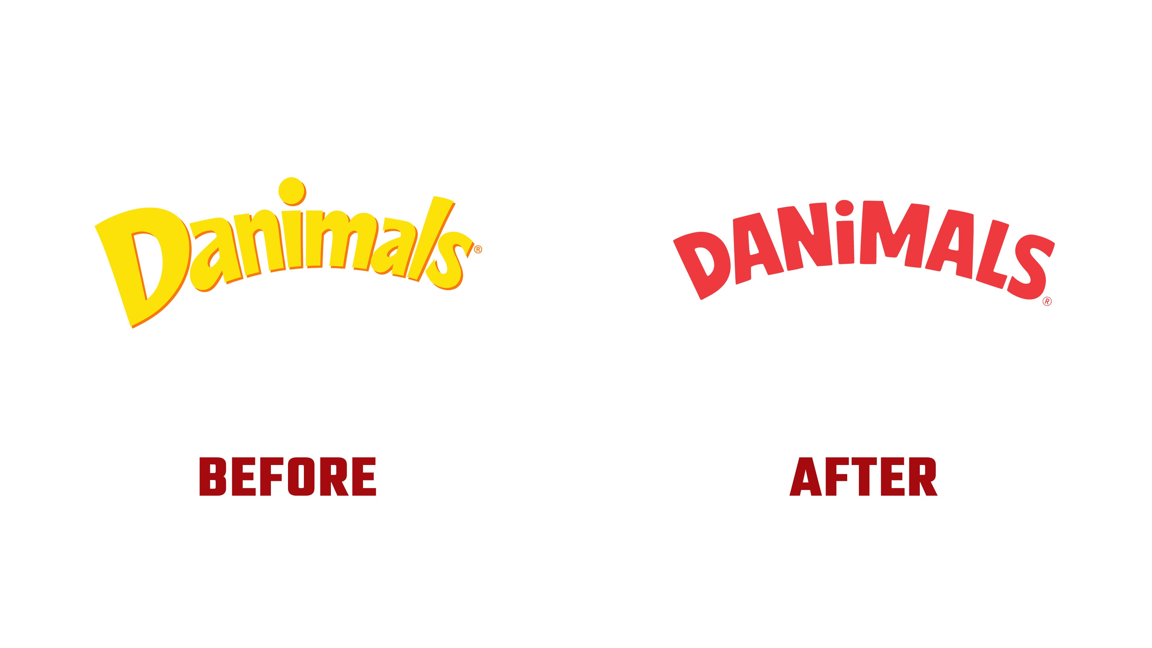
The logo’s proportions and mix of uppercase and lowercase letters have changed. Previously, the large “D” extended above and below the rest of the word. Near the end of the name, the tall lowercase “l” echoed its height. The “D” is now closer in size to its neighbors. At the same time, an uppercase “L” with a horizontal lower stroke replaces the lowercase letter.

The wordmark combines uppercase DAN and MALS with a lowercase “i” and its round dot between them. Angular “A” and “M” forms replace the rounded “a” and “m.” Mixed cases and individually tilted letters preserve the name’s playful style. The heavy strokes are sans-serif, and wider spacing gives the letters more room.
The word’s arched shape maintains a connection to the previous logo. The earlier version formed its arc from tightly spaced yellow letters against a saturated red background. The new name is light cream, while the red behind it is lighter and warmer. The lettering’s curve and the pairing of light letters with red continue the brand’s established color theme.
Illustrator Mark Riedy redrew Bongo with Scott Hull Associates. The character now looks more like a curious young monkey, with natural poses and an athletic build. Across the illustrations, he climbs, reaches for objects, swings, and expresses delight. Exaggerated antics and human mannerisms give way to behavior centered on exploring the world around him.
The update is united by the message “Let Them Grow,” which appears on packaging, the website, and in advertising. Photographs of children now appear alongside Bongo, while ingredient information is grouped under “No Monkey Business,” a phrase that plays on the mascot’s identity. According to Danone, the smoothies contain 25% less total sugar than the previous formula and now include fiber. The company also highlights calcium and vitamin D. A summer program with MAGNA-TILES and pediatric dietitian Dani Lebovitz supported the launch, introducing children to nutrition through play.