The Danone logo, vibrant and insightful, has showcased the French company’s ethos since its inception in 1919. This ambitious design reflects the company’s vision, symbolizing its recognition of the connection between planetary health and societal well-being and its commitment to friendliness and care.
Danone: Brand overview
Today, under the Danone trademark, healthy foods made exclusively from natural ingredients are sold in 140 countries worldwide: dairy products, mineral water, juices, whole grain snacks, infant nutrition, and dietary foods.
In 1919, Isaac Carasso, a forward-thinking pharmacist from Thessaloniki, Greece, started a company in Barcelona that would make a big splash in the food world. He named it Danone after his son Daniel, who saw a bright future in dairy, especially yogurt, because of its health benefits, especially for kids with stomach troubles.
Daniel Carasso took over in 1929, spreading his dad’s yogurt across France and making it a must-have. But when World War II hit, Daniel moved to New York, bringing yogurt to America with Dannon Milk Products, Inc.
After the war, Danone grew even bigger, introducing fruit and baby food such as yogurt in the ’50s and ’60s and becoming a favorite around the globe. The company didn’t stop there; it got into bottled water and beer in the ’70s with Evian and Kronenbourg. It later added LU biscuits and Royal Numico to its lineup, even diving into medical nutrition with Nutricia.
Lately, Danone has focused on health and sustainability, leading the way with probiotic yogurt Activia and plant-based drinks from Alpro. In 2017, Danone bought WhiteWave Foods, a big player in organic and plant-based products, for $12.5 billion, cementing its place as a leader in healthy and sustainable food.
Danone is active in over 120 countries, with famous brands like Dannon, Activia, Actimel, Alpro, and Evian. It’s built around three main areas: dairy and plant-based products, specialized nutrition, and bottled water.
From Isaac Carasso’s small dairy business in Barcelona to becoming a global leader, Danone has always been at the cutting edge of the dairy and wellness industry. It adapts to consumers’ wants and focuses on nutritious, sustainable foods. With its long history and eye on the future, Danone is all set to keep leading in the world of healthy eating.
Meaning and History
In 2019, the Danone company celebrated its 100th anniversary. It was created by Isaac Carasso, an ordinary pharmacist from Barcelona, to help children with dysbacteriosis, which was very common at the time. The pharmacist learned about the beneficial properties of yogurt from the Russian scientist Ilya Mechnikov. Carasso ordered yogurt cultures from the Pasteur Institute and began making yogurt in his home laboratory, pouring it into clay pots. Every day, he sent out 400 such pots to hospitals and pharmacies. This tasty “medicine” really helped, and soon, Danone yogurts began to be sold in pharmacies, confectioneries, and grocery stores. In 1973, the French bought the company, and now the Danone brand is known worldwide.
The company’s name is the basis of the logo. The founder named it after his son Daniel, whom he affectionately called Danon. This word is present in all logo versions but only slightly changed in size and font. According to the designers, this speaks to the stability of the quality of the products and the manufacturers’ respect for their consumers.
The Danone logo is a mark of quality, a reflection of trust and loyalty to the company. As one of the world’s largest dairy producers, the company has an impeccable reputation, and its goal is to provide its consumers with the best food products.
The Danone logo has hardly changed throughout the brand’s history; it has always been a stylized mark, and only in the 1990s was a graphic emblem created.
What is Danone?
This is the name of a multinational corporation from France and its eponymous flagship brand. Danone owns over 180 manufacturing sites, several hundred trademarks, laboratories, and agro-industrial enterprises.
1968 – 1972
Before 1968, there was no logo, and the company’s name was written on labels in blue letters.
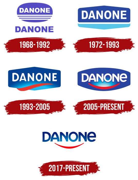
The famous design group Fletcher/Forbes/Gill created a full-fledged logo. The basis is a horizontally placed blue-violet oval. Above it are three white stripes, and at the bottom is the brand name, written in white capital letters.
1972 – 1993
The overall concept of the emblem changed, but its recognizability was preserved. The sign is a horizontal hexagon with rounded side corners. The upper part is larger, the color is dark blue, and the brand name is written in white letters. A white stripe separates the lower blue part.
1993 – 2005
Changes are noticeable, but the image remains the same. The hexagon became solid, blue with a lightning bolt at the bottom. The letters remained the same, large, white. A red wavy stripe was added at the bottom. The concept with a bright accent was meant to attract people’s attention to healthy food.
2005 – 2017
The new version of the Danone logo became warmer and more human. The plate again acquired an oval shape; the sides are cut off, and the corners are softly rounded. The background is the usual blue, with a highlight in the center. The brand name remained unchanged. The red stripe turned into a stylized smile, symbolizing the benefit of the branded products for people.
2017 – today
In July, the brand introduced an updated logo and corporate slogan. It is planned to be kept at least until 2030. The concept of the emblem was radically changed.
The new logo is a blue circle on a white background with a child looking at a star in the sky. Under the image in blue letters with a small gradient is the company name, stretching the brand name DFNON; below it is the slogan “One Planet. One Health”, executed in a handwritten font and translated as “One planet. One health”. The second official version is a picture with a child on the left and inscriptions to the right of him, one under the other.
With this metamorphosis of the already familiar logo, the company is trying to attract the attention of the planet’s inhabitants to the problems of ecology and healthy eating, which bring life to society and the Earth as a whole.
At the same time, Danon manufacturers have the right to use the old logo for product labeling until 2025.
Danone Early Life Nutrition
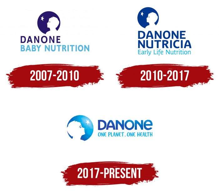
Evolution Danone Early Life Nutrition Logo
For most of its history, Danone used the brand name as a logo for its visual identity, but in the 1990s, the brand finally decided to create an emblem that would reflect all its values and vision.
2010 – 2017
The basis of the new emblem was the image of a child’s face looking at a star. The boy looks to the left. The star and boy were located on a blue circle background and were made in white. The figure of the boy was an image of Daniel Carasso, the founder’s son.
2017 – today
The logo’s color palette has changed slightly; the blue color has become lighter and more gradient today. The boy turned his face to the right. Under the image appeared the slogan “One planet—one health,” executed in handwritten uppercase blue letters.
The Danone logo reflects the brand’s heritage and roots, as well as its goals and tasks for the future.
Danone: Interesting Facts
Danone is a big company in Paris, France, that makes many different foods like yogurt, plant-based stuff, water, and baby food. It started in 1919 and is known for developing new ideas and caring about the planet.
- How It Began: Isaac Carasso started Danone in Spain because of his son, Daniel. He made yogurt to help kids feel better when they had stomach aches.
- Growing Bigger: Daniel, Isaac’s son, helped the company grow, moving it to France and then all over the world. Now, Danone is in more than 120 countries.
- Yogurt Magic: In the 1940s, Danone made yogurt even better by adding fruit flavors, which made more people like it.
- Joining Forces: Danone joined up with BSN, another company, in 1973. This made Danone even bigger, with more kinds of food to sell.
- Healthy and Green: Danone wants to make food that’s good for you and the Earth. They work hard to make healthier food and care for our planet.
- Buying Companies: In 2017, Danone became even bigger by buying other companies, like WhiteWave, which helped them sell more plant-based products.
- Doing Good: Danone tries to do well in business and do good things for people and the planet. It looks after its workers and wants to improve the world.
- Healthy Planet, Healthy People: Danone believes caring for the Earth helps us all stay healthy. They try to grow in a way that’s good for everyone.
- A Big Honor: In 2018, Danone in North America received a special certification for its positive impact on society and the environment.
- What They Make: Danone is good at making dairy and plant-based foods like Activia yogurt and Silk. They also make water, baby food, and special nutrition food.
Danone is about new ideas, health, and caring for the world. They make many different foods and always think about improving things for everyone.
Font and Colors
The evolution of Danone’s visual identity is associated with changes in the background, letters, and lines. At the same time, the changes are not immediately noticeable, as they occur naturally – without critical edits and abrupt innovations. For example, initially, the dividing line was white (actually, there were three), then it was left. It changed color to red, acquired an arcuate shape, and finally turned into a benevolent smile. The same thing happened with the rectangle, which became a hexagon before the oval disappeared completely. The shape of the letters changed from simple to curved.
The Danone logo uses the Futura Heavy font. Designer Paul Renner created it, and it first appeared in Linotype. The font represents simple geometric symbols. But in 2005, it was especially changed to get a modernized version with a curved crossbar at the letter “N.”
If the early versions used a monosyllabic (blue and white) color palette, now it is blue with highlights and gradient transitions from pale blue to dark blue. White and red colors are also used.
FAQ
What is the meaning of the brand name Danone?
The name “Danone” comes from a very personal place, named after the founder, Isaac Carasso’s son Daniel, who was affectionately called ‘Danon.’ Back in 1919, Carasso started selling yogurt under this name with a vision to promote health. The brand, tied closely to Carasso’s family, reflects his dedication to creating a simple yet powerful product to improve health. He used the age-old fermentation method to make yogurt that was nutritious and good for digestion. “Danone” represents Carasso’s blend of family love and his goal to positively impact health with one of the oldest food-making methods.
What is the purpose of the Danone brand?
Danone’s mission is to improve people’s health through its food and drinks. It’s a big name worldwide, focused on four key areas: dairy and plant-based products, water, nutrition for babies and young kids, and medical nutrition.
They aim to offer a mix of healthy dairy and plant-based foods to suit everyone’s tastes and needs, keeping up with the growing interest in plant-based eating. Danone’s water brands promote staying hydrated as part of staying healthy, making clean and safe water available globally.
For little ones, Danone provides nutrition that supports their growth and development, emphasizing the importance of good eating habits early on. Their medical nutrition products offer tailored nutritional support for those with specific health issues to help them manage and recover from various conditions.
Where does Danone operate?
Danone is a global company operating in many countries, including Belgium, Canada, China, the Czech Republic, France, Germany, Indonesia, Israel, Italy, Japan, Mexico, Poland, Russia, Spain, the United States, and Turkey. These places have special centers under the Danone Institute International, which focuses on improving health and nutrition through research.
These centers are key to Danone’s goal of encouraging people to eat and live healthily. They are found in important markets globally, helping Danone greatly impact public health and nutrition. This wide presence lets Danone meet the different food needs and preferences of people worldwide and participate in research and community projects that support its aim to make food a source of health for everyone. Through these efforts, Danone works to change how communities think about diet and health, sticking to its main principles of being innovative, sustainable, and socially responsible.
What are the values of Danone?
Danone’s core beliefs are summarized in their ‘HOPE’ Values: Humanism, Openness, Proximity, and Enthusiasm. These values guide everything they do, from making decisions to creating products.
Humanism means they care deeply about everyone, aiming to be respectful and considerate. This leads them to make their workplace welcoming and to create products that make a difference in people’s lives.
Openness is about being transparent and willing to learn. Danone values different opinions and new ideas, which helps it innovate and improve constantly. It also listens to what customers and partners say to better serve their needs.
Proximity means Danone wants to be close to and understand its customers, employees, and partners. They focus on building trust and strong relationships, ensuring they’re always connected and relevant to the people they serve.
Enthusiasm drives them to strive for excellence and to have a positive impact on the world. The energy pushes them to tackle challenges, grab opportunities, and aim for a healthier future.
These HOPE values are crucial to how Danone works, influencing its business approach, how it interacts with society, and its goal to deliver healthy food to as many people as possible. It shows their commitment to being responsible, innovative, and purposeful in everything they do.
What does the Danone logo mean?
The Danone logo tells a special story. It shows a boy who reminds many of the Little Prince looking up at a star. This boy is Daniel Carasso, son of Isaac Carasso, who started Danone. The logo smartly uses the space inside a blue circle to form the boy’s head, making him the focal point.
This design choice does more than just look good; it means something. Linking the logo to the little prince brings out ideas of curiosity, innocence, and chasing dreams, which align with what Danone stands for. The star in the logo acts like a goal or guide, pointing to where the company aims to go.
Adding the founder’s son to the logo makes it personal, showing how much family and history matter to Danone. The color blue in the logo is often linked to trust and reliability, further underlining Danone’s dedication to these principles. Overall, the Danone logo mixes personal history, symbolism, and the company’s identity, showcasing where it comes from, its core beliefs, and where it’s headed.
What companies does Danone own?
Danone owns over three hundred food brands globally, catering to different health and nutritional needs. Its most popular brands include Nutricia, known for medical nutrition and baby foods; Milupa, focusing on infant nutrition; Actimel, famous for its probiotic drinks to boost immunity; Activia, offering yogurts for better digestion; Danone, synonymous with a variety of yogurts; Prostokvashino, serving the Russian market with traditional dairy products; and AQUA, a leading bottled water brand promoting hydration.
These brands highlight Danone’s commitment to offering healthy, nutritious products from early life to adulthood. Each brand has its specialty, from supporting babies’ growth to enhancing adults’ health with probiotic drinks and nutritious yogurts. Danone’s portfolio also emphasizes sustainability, showing its dedication to improving consumers’ health and caring for the planet. Through these efforts, Danone aims to positively impact eating habits worldwide, supporting its mission to bring health through food to as many people as possible.
What products does Danone produce?
Danone is a global company that produces various foods and drinks to improve health and meet people’s dietary needs. The company produces special nutrition products for specific health conditions, including formulas for babies and people with allergies or digestive problems. It also offers a range of bottled water brands, emphasizing the importance of staying hydrated for good health.
Danone’s line-up includes fresh fruits, vegetables, and berries to help customers maintain a balanced diet. These are often in convenient forms to encourage more fruit and vegetable consumption. The company is well-known for its yogurts, which are available in many types, some with added probiotics to aid digestion.
They also make ice cream, blending indulgence with healthier options, and offer a variety of coffee and juices. Their coffee aims to be sustainable and ethically sourced, while their juices are an easy way to get vitamins and minerals.
Danone focuses on health, nutrition, and sustainability across its product range. The company strives to make nutritious and tasty foods and drinks accessible to people everywhere, catering to various tastes and dietary needs.
Is Danone a representative of France?
Yes, Danone is closely linked to France. Its headquarters and the company’s registration are in France, where its founder, Isaac Carasso, came from. This French origin is a key part of Danone’s identity. As the company has expanded globally to become a leading name in the food and beverage sector, it still carries the influence of French culinary tradition and focuses on nutrition. Danone embodies French innovation and commitment to quality food and health, showcasing these values worldwide.
What does the Danone Logo symbolize?
The Danone logo symbolizes the health benefits of its fermented milk products, like aiding digestion, improving gut health, and boosting overall energy. The logo’s colors and design elements subtly communicate these ideas. Previously, the logo had a wide arrow, suggesting body cleansing and highlighting Danone’s offerings’ health benefits. Now, the logo is more rounded and features a smile below the brand name, making it look friendlier and more welcoming. This smile signifies Danone’s focus on improving physical health and positively affecting people’s lives, showing the company’s holistic view of health and happiness.
Which Danone brand is the best-selling?
Danone has a wide range of brands that have gained significant success worldwide. Activia and Actimel stand out among its many products in the fermented milk category. Activia is known for its probiotic yogurts that help with digestion, while Actimel is popular for its fermented milk drinks that boost the immune system. Both have become favorites globally.
Evian is another star in Danone’s lineup. It is the top-selling bottled water brand in the world. Available in 120 countries, Evian is praised for its natural purity and minerals from the French Alps, making it a global leader in bottled water.
Nutricia is a leader in medical and children’s nutrition. It provides a wide array of nutritional products for infants, young children, and those with specific health needs, earning the trust of consumers looking for healthy options for their families.
Activia, Actimel, Evian, and Nutricia are key players in their fields, reflecting Danone’s commitment to offering nutritious, high-quality products. Their success highlights Danone’s role as a global food and beverage leader, focusing on health, nutrition, and sustainability.
