Popular with Internet users, Avast’s family of cross-platform web security applications has redesigned its visuals. Avast today provides desktop and browser security, antivirus and firewall, anti-phishing and anti-spam, anti-spyware and tracking software, web threat scanning, and an easy-to-use cloud console highly praised by business users. Against the background of the scandal with the Avast Antivirus subsidiary over the sale of confidential customer data, having decided to close it, Avast developed a new strategy, which it hastened to reflect in its updated corporate identity.
The main objective of the update was the need to isolate ourselves from the scandalous situation and demonstrate a new innovative approach to improving digital security and application capabilities. The modern logo has acquired a more strict visual form, which demonstrates the seriousness of the application’s intentions and the importance of their tasks. A departure from some playfulness of the past, which is more characteristic of such a direction as protecting computers from visiting the Network for games, communication, private needs, has become a direct necessity. Modern security covers more areas. One of them was business security, without which critical problems can arise associated with much greater losses than those of individuals. Here is the theft of information and finances, business and secret data, and much more, which can cause the loss of positions and the complete collapse of the business. This provides a visual call to users to change their minds about network security, turning their attention to the innovative approach of Avast One.
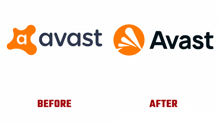
The altered logo should help solve this problem – its updated composition, which, while retaining the general concept of the previous version, provided a completely new approach to the brand’s visual identity. First of all, the changes affected the font of the text, for which a variant of the Luxora Grotesk Medium type was selected. With some modifications – smoothing of the acute right corner of the top of the lowercase “A,” a closer arrangement of the text letters, it provided ease and quickness of memorability with some of its “seriousness.” The second step was to change the sign in front of the brand name completely. While maintaining the color scheme, it acquired a clear outline of a circle, in which drop-shaped figures with varying sizes are made in white. Each upper one is larger than the previous one.


