


The history of local bowling leagues inspired AMF’s new identity, unveiled on July 21, 2026. New York studio DoBAD, short for Department of Branding and Design, drew on mid-20th-century American sports culture and the tradition of gathering at neighborhood bowling alleys. For the chain, part of Lucky Strike Entertainment, the designers reworked its historic shield with a red background and large cream-colored letters.
AMF’s connection to bowling history dates back to American Machine & Foundry. The initials come from the company’s name, established in Brooklyn in 1900. Originally a manufacturer of industrial equipment, it later expanded into sports and recreation products. In 1946, the company introduced an automatic pinsetter, which entered mass production in 1952. The identity revisits the era when bowling grew in popularity through team gatherings and local league tournaments.
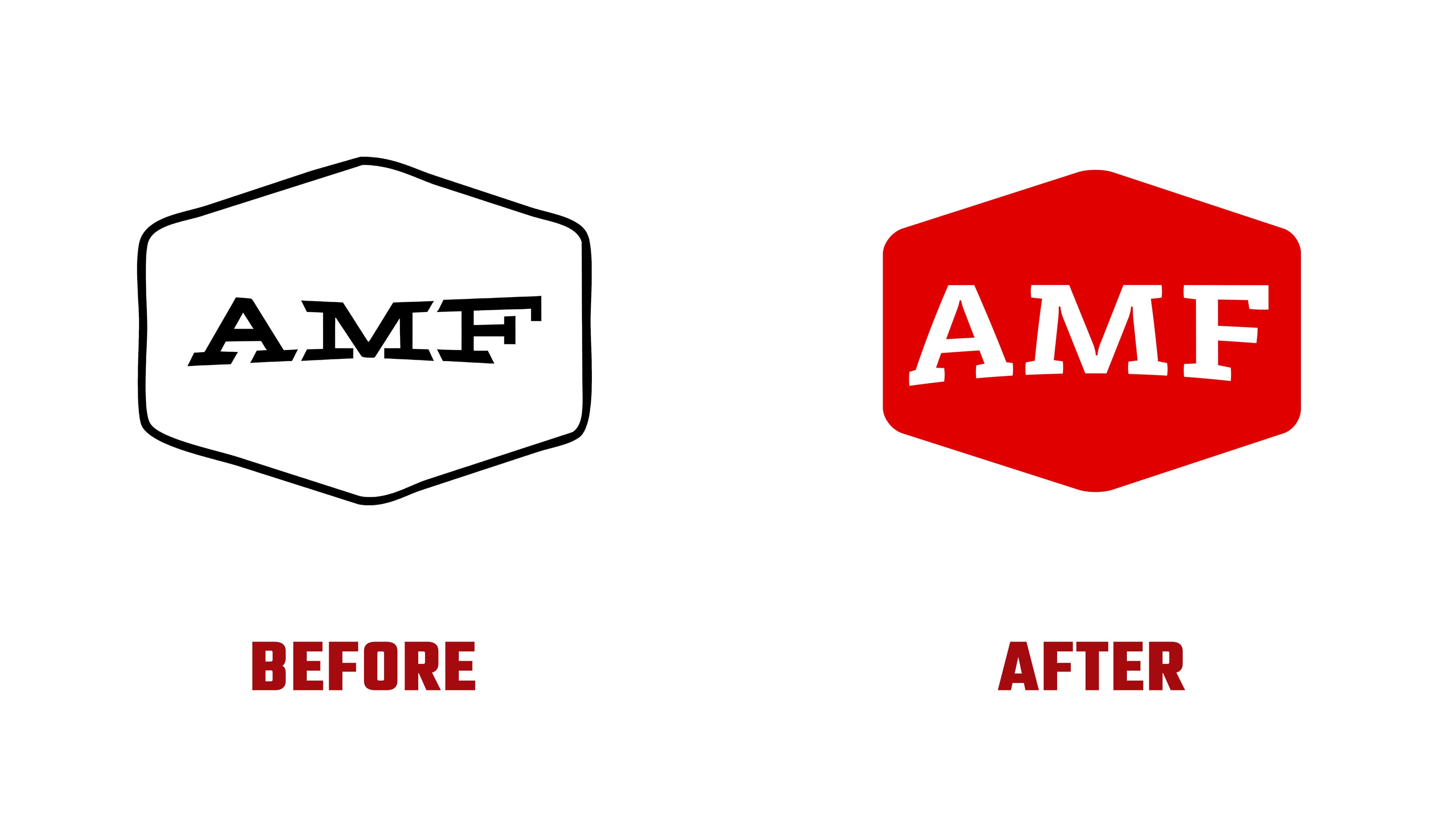
The logo retains its horizontally elongated shield, with rounded corners and points at the top and bottom. Previously, a dark outline surrounded a light interior containing short, heavy-serif letters. Open space remained above and below the name. DoBAD increased the letters’ height and stroke weight, bringing the wordmark closer to the edges. The red field and cream-colored name form the basis of the new emblem.
The serifs remain, but the proportions of “AMF” have changed. The triangular opening in the “A” is wider, the “M” is taller and narrower, and the balance between the vertical and horizontal strokes of the “F” has been adjusted. The lower edge of the lettering follows a shallow arc that rises in the middle. The letterforms are more consistent while retaining their substantial weight. They now resemble lettering on collegiate sports uniforms, extending the theme of team competition.
Alongside the primary three-letter logo, the studio created a version with a bowling pin. In the previous design, a starburst sat beside the pin, and the name sat lower. The pin and “AMF” are now centered within the shield. The shared outline connects both versions to the emblem familiar to regular visitors.
The identity is intended for experienced league bowlers and first-time AMF visitors alike. The chain presents bowling as an accessible way to spend time close to home with family, friends, or a rival team. The tagline “A Classic Since Always” connects that promise to the brand’s history. At the time of the announcement, roughly 80 AMF centers welcomed 10.4 million guests annually. Another 60 locations were slated to adopt the AMF name, so the identity was developed for a network of more than 100 venues.
Blue, white, and gold complement the red. At launch, the new identity appeared across digital channels and on select materials inside the centers. Later phases include replacing signs, updating interiors, and creating bowling memorabilia displays. Retro signage and sports pennants bring the local league theme into the venues.