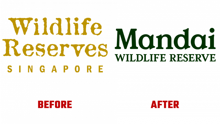
 A wildlife sanctuary was established in Singapore in 2000 and has recently changed its visual identity, changing its name. Today the reserve is called Mandai Wildlife Group is the steward of Mandai Wildlife Reserve and occupies over 300 acres, uniting five parks, an eco-resort, and a natural fund. The central zone of the reserve is the Singapore Zoo, which opened in 1973, which presents more than 300 species of animals, represented by 4,200 individuals. The group includes Jurong Bird Park, Night Safari, River Wonders, and Rainforest Wild. Mandai’s mission is to bring all such organizations together to provide a meaningful and unforgettable experience of the region’s unique and inimitable wilderness. At the same time, the brand pays special attention to the protection of the environment and the biological environment, striving to preserve in its diversity all the representatives of nature in Singapore. The Singapore-based studio Anak designed and implemented the identity changes, whose work is characterized by creativity and aesthetics.
In connection with the reworking of the entire system of visual elements of the brand from scratch, the studio decided to apply a new approach to forming the corporate identity and strategy. The main focus of the visualization was the reflection of the important goal of the group – the preservation of biodiversity in the region. To achieve this goal, every decision, from organizational changes to typography, meets the general understanding that wildlife and people are correct in their importance. The brand in its new form balances people and animals, demonstrating its vision of life around it.
The new logo is a wordmark – Mandai, executed in an original and natural typeface such as Value Serif Colophon Foundry. As well as nature itself, the text looks natural and easy to remember. Bold letters have significant “pinched” angular serifs, giving it an organic similarity to the leaves of trees. The typefaces are characterized by pleasant and comfortable roundness, low ascending elements, and high heights. And the text located under the first word of the title – Wildlife Reserve, aligned to the width of the first, executed in capital letters, only enhances the effect of a positive impact on the viewer.
For each group member, their visual architecture was developed, which was built on the common foundation of the graphics of the brand itself. Each of the signs has acquired its individuality, emphasizing the features of its nature and rich heritage. They are full of vitality, supported by a timeless style.


