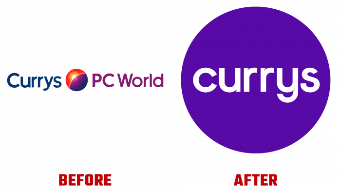
The leading retailer Currys, founded in 1884 by Henry Curry in England, introduced its new image in October this year. She specializes in the sale of innovative technology products. Once a modest enterprise, today it occupies a leading position in the global market. Having a wide range of household and computer equipment in its catalog, the company also provides service for its consumers. In addition to selling retail in the United Kingdom and Ireland, it has service centers in more than three hundred mega-stores worldwide. The network employs thousands of employees.
Currys PC World owes its visual brand redesign to FutureBrand, a leading brand transformation agency. Thanks to a professional approach, the designers conveyed individuality and uniqueness to the brand, both in physical and digital space. The new style has become bright, recognizable, and memorable while retaining all the best. The round shape of the logo symbolizes the globe and implies the operation of the enterprise around the globe. The developed color palette presents the necessary visual brand identity. Its pleasant purple color has a positive effect on the visual perception of the consumer, leaving only positive emotions. The same shade was added to the company’s an advertising and marketing communications, significantly distinguishing them from the tonality of competitors’ logos.
The custom-made Dashing Alternate by Twinletter typeface features white caps set against a Persian indigo background to make the text stand out. The three-dimensional graphics in pastel colors, similar to the plate, act as a passive and, at the same time, active background to support products and headlines. This combination of the palette, type, and graphics creates a positive composition. Convenient conditions are created for reading and memorizing the logo. Even though the font has some “irritability,” it will look the same for many years without being perceived outdated.
Here, minimization is appropriate and effective, which is required by modern trends from all graphic compositions. Thanks to this creativity and technological features, the logo is easy to read in print and all digital media.


