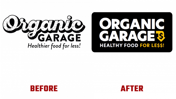
In 2005, the Organic Garage was founded in Toronto, Canada, in the wake of the popularization of organic plant food. Its founder, a fourth-generation grocer, set the goal of national expansion throughout the country. The brand is a company that sells organic products of plant origin, made according to its recipe. The brand has carried out a thorough analysis of the market and its relevance to its needs throughout its existence. The company’s new strategy was to expand the store in the short term. As a result of in-depth analysis, it was decided to create a new logo that would reflect current and future changes more clearly.
The new logo has received a bold font that is easier for visual perception. Its use has become the best way to reflect the value of a brand’s offering. The graphic design made it easy and simple to create the logo, both in print and digital form. It is convenient and easy to apply on any surface, including complex shapes, whose task will include a clear and complete message to the consumer. This is ensured by the applied symbolism – an arrow pointing downwards, on which an element symbolizing the price is applied. In this way, the brand seeks to draw the buyer’s attention to an important point – a constant decrease in prices, which is explained by a significant increase in the number of sites on which the brand’s products will be offered.
The new logo is a way to reinforce all the upcoming changes announced by the company. Made in the form of a rectangular plate with rounded edges and black fill, it is visually well perceived and attracts attention. The brand name, made in white, stands out clearly in contrast to the general background. The selected font, which is similar in its execution to Mymoon Heavy by Tour De Force, is distinguished by its clear contours and strict adherence to the size of each letter, which makes it readable and easily perceived visually. The use of yellow in the creation of the arrow and the execution of a thinner and smaller font in the spelling “FOR LESS!” creates an accent composition that first attracts attention.
The new identity will be implemented within six months. During this time, the logo will be used on all products that are placed in existing stores. It will also be systematically carried out on all media resources, print media.


