Vitenskapsmuseet, also known as VIMU and translated to “Science Museum” in English, has long been a cornerstone of cultural and natural history in Trondheim, Norway. Established in 1760 and integrated into the Norwegian University of Sciences and Technology (NTNU) in 1996, VIMU is celebrated for its comprehensive collections that bridge the gap between the natural world and human civilization. Its archives, comprising over 2.6 million objects, encompass various disciplines from archaeology to zoology, reflecting the museum’s commitment to preserving and interpreting the tapestry of life and history.
In a strategic move to establish a distinct identity from NTNU, VIMU has unveiled a new visual identity crafted by Oslo’s TRY Design. This rebranding initiative marks a pivotal shift for the museum, aiming to strengthen its connection with the public and enhance its visibility in a competitive cultural world.
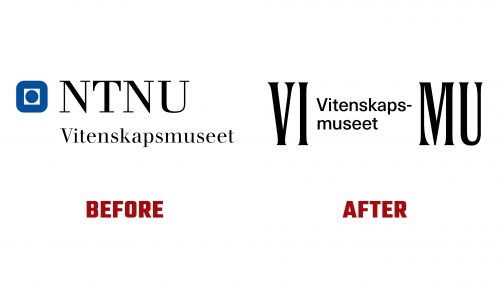
The introduction of the new VIMU logo signifies a major departure from its previous branding, which served as a sub-brand under the NTNU identity. While prestigious, the former logo’s affiliation with NTNU limited VIMU’s brand recognition and presented practical challenges due to its length. The refreshed branding addresses these issues head-on, adopting “VIMU” as its official shorthand. Whether from internal use or as a deliberate branding strategy, this move represents a thoughtful consideration of accessibility and audience engagement.
The design of the new logo itself is a masterstroke of simplicity and elegance. It employs a condensed flared serif typeface, strikingly balancing thick and thin strokes and a subtle interplay between flat-ended and spiked serifs. This detail imbues the logo with a sense of craftsmanship reminiscent of Roman numerals, lending an air of timelessness and archaeological intrigue. The clever division of “VIMU” to incorporate the museum’s full name in a two-line format, connected by a hyphen, resolves the challenge of integrating the institution’s lengthy name into the logo. This solution enhances the logo’s legibility and aesthetic appeal, allowing the museum’s full title to be presented without compromising the design’s integrity.
This bold rebranding effort by VIMU, highlighted by unveiling the new logo, encapsulates the museum’s ambition to redefine its local and global presence. By distancing itself from NTNU’s umbrella and embracing a unique identity, VIMU is poised to attract a broader audience and reaffirm its role as a guardian of heritage and a catalyst for discovery. The new visual identity, anchored by the VIMU logo, represents a commitment to innovation, engagement, and the enduring value of history and science.


