


CORE POWER unveiled a new identity by Chromatic Brands at its annual European summit in London on June 17, 2026. The company develops nuclear energy systems for maritime applications, and its updated logo combines a trident with a power button symbol.
CORE POWER is developing floating power plants for coastal customers and nuclear propulsion systems for commercial shipping. The agency’s task was to explain these technologies to audiences beyond energy and shipbuilding specialists. The identity and messaging speak to investors, regulators, shipyards, engineers, and government organizations, introducing the company’s projects and intended applications.
The phrase “Energy That Moves” expresses the overarching idea. It connects delivering energy systems by sea with their anticipated contribution to industry, trade, and local communities. In the emblem, the trident represents the maritime focus, while the power button signifies energy production. Chromatic provides both interpretations.
The emblem is symmetrical. Its outer prongs extend into vertical sections, then angle inward to meet at a point below. A separate stroke with an upward-pointing tip sits between them. The outer contours are angular, while the inner opening is rounded at the bottom. The central vertical stroke and surrounding open shape recall a power button. The three upper tips form a trident.
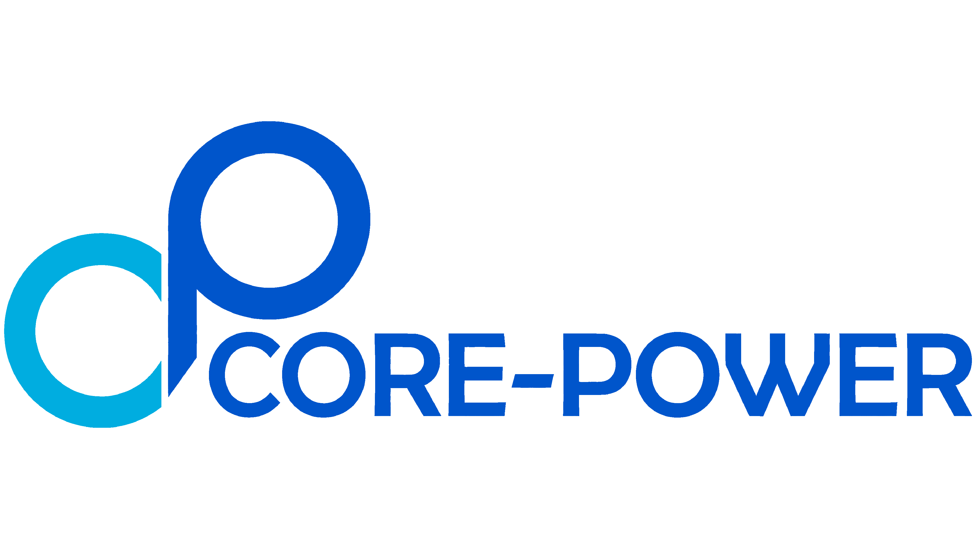
The previous logo was based on lowercase “c” and “p” forms. A turquoise “c” occupied the lower-left section, with a blue “p” rising above it. Both letters had large, rounded counters. The CORE-POWER name sat beside the lower portion of the monogram. The company now uses recognizable symbols to communicate its specialization in place of initials.
The name remains uppercase, with heavier lettering and a space instead of a hyphen. CORE POWER and the emblem sit on a single horizontal line. The symbol is now shorter relative to the wordmark. In the version presented, a bright turquoise trident accompanies light-colored lettering on a very dark teal background. Blue and green shades extend the maritime theme across other materials.
A modular grid unifies the identity. The team developed an animated pattern called “Moving Energy,” technical diagrams, and vessel imagery reviewed with marine engineers. Drawings and plans provided the basis for photorealistic scenes and films.
The new website launched on the evening of June 16, ahead of the summit. An introductory film and dedicated sections explain floating power plants and shipboard systems, presenting CORE POWER’s two areas of work.