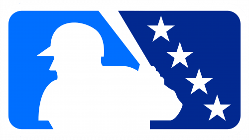
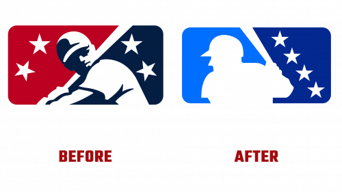
To symbolize its close affiliation with Major League Baseball (MLB), Minor League Baseball (MiLB) has rolled out a revamped logo that echoes the well-known MLB emblem. By featuring the recognizable silhouette of a batter, the new design aims to fortify MLB’s “One Baseball” strategy that highlights a unified organizational approach.
The emblem seeks to establish MiLB’s place under the MLB umbrella and draw attention to its new structure under the MLB Player Development League. Nonetheless, the Minor League Baseball logo has retained certain unique elements to distinguish itself. Four diagonal stars, a carry-over from the old logo, represent the four levels players ascend in their minor league careers, ultimately pointing to their future potential as MLB stars.
In a departure from the MLB’s visual identity, the redesigned logo avoids red, opting for a monochromatic scheme instead. This deliberate choice aims to set the Minor League Baseball logo apart from its major league counterpart, although critics argue that the similarities still outweigh the differences.
The unveiling has generated quite a buzz, particularly on social media platforms. Fan reactions have been varied; while some appreciate the cohesive branding, others worry that the new logo may signal MLB’s overwhelming influence over MiLB. Phrases like “too blue” and “strikingly similar” have dominated online discussions, with many fans advocating for distinct identities for the two leagues.
This controversy indicates broader trends in sports branding that stress the importance of a unified brand identity. Recent redesigns in other major sporting events, such as the World Cup and the Super Bowl, follow a similar pattern. However, the debate stirred by the Minor League Baseball logo underscores the fine line that sports organizations must walk. While a unified brand image offers benefits, it also risks overshadowing the unique characteristics that make affiliate organizations special.
The updated logo will be the face of MiLB’s 14 leagues and 120 teams across four classification levels. Its reception provides a compelling study into the delicate balance required in sports branding. Whether this move will enhance or diminish MiLB’s standing within the MLB framework and in the larger baseball world remains to be seen.
As we consider the evolution of branding strategies in the sports industry, the mixed reviews surrounding the new Minor League Baseball logo serve as a potent reminder: achieving unity and uniqueness is a complex yet essential task.


